Kirin New Beer Cans POSM Advertisement
Topics
Details
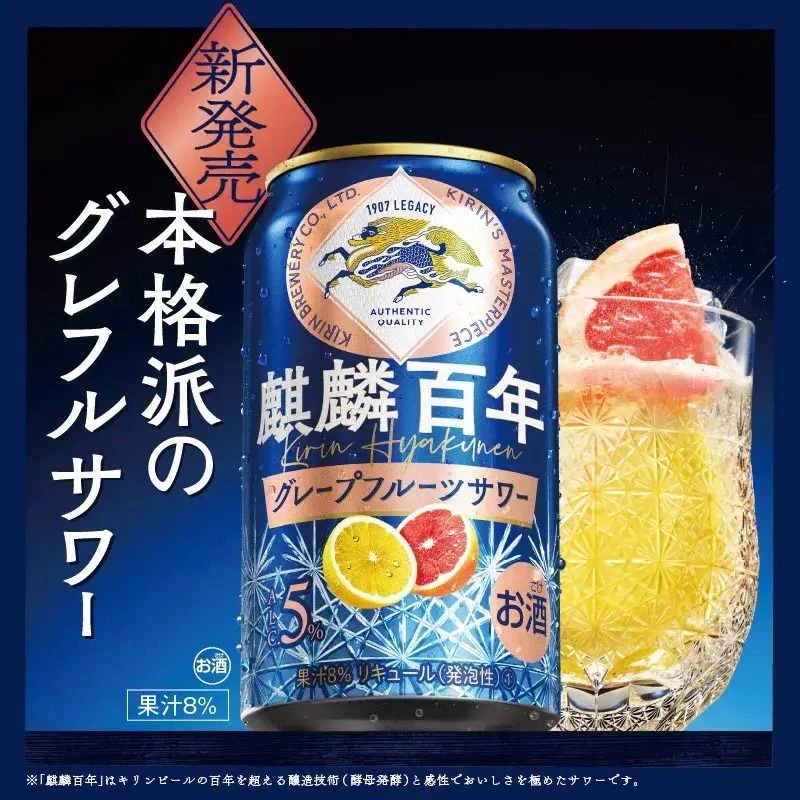
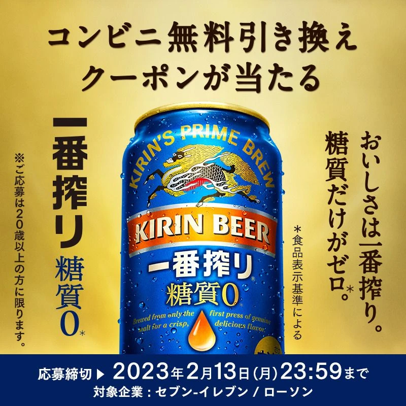
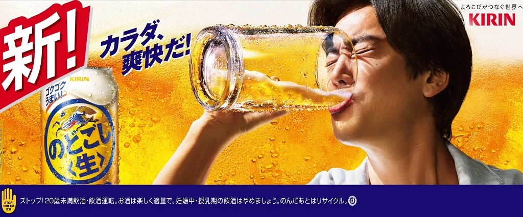
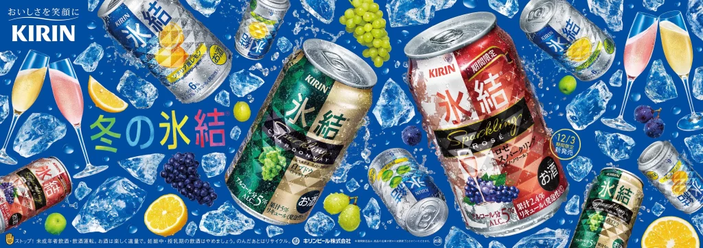
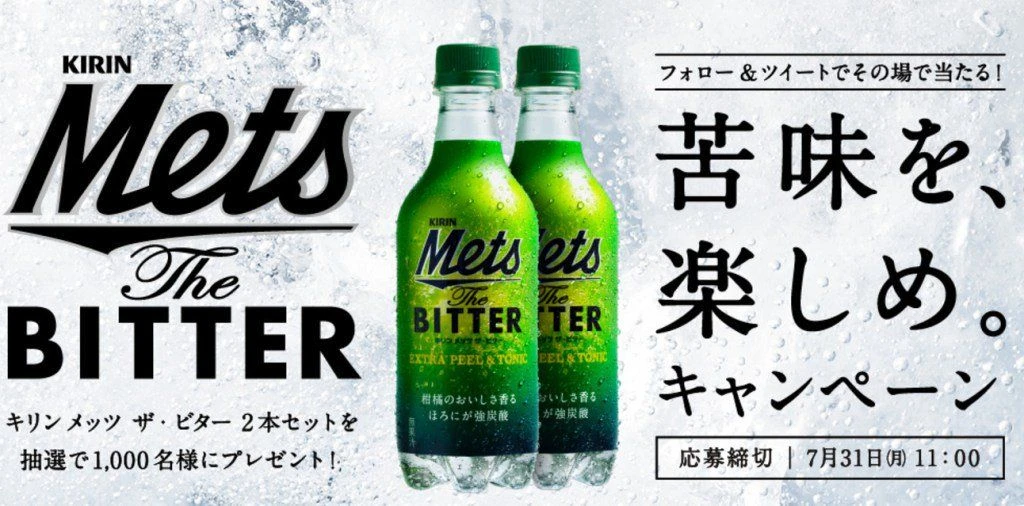
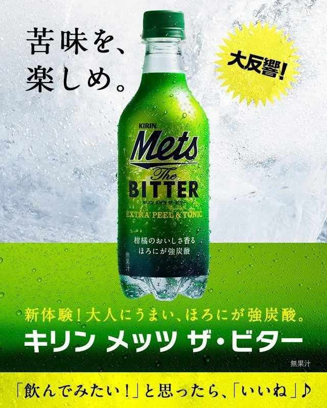
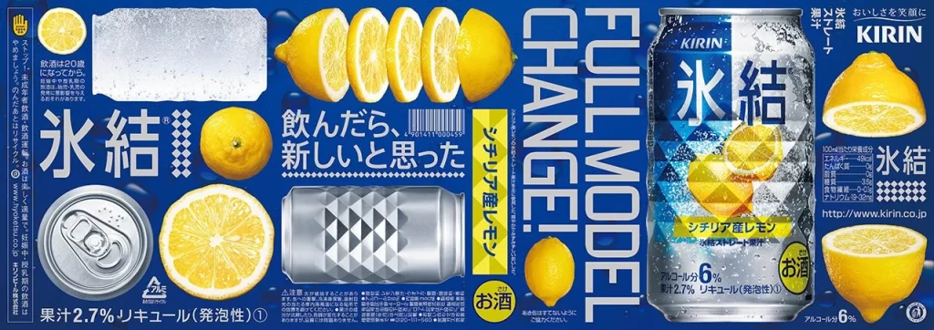
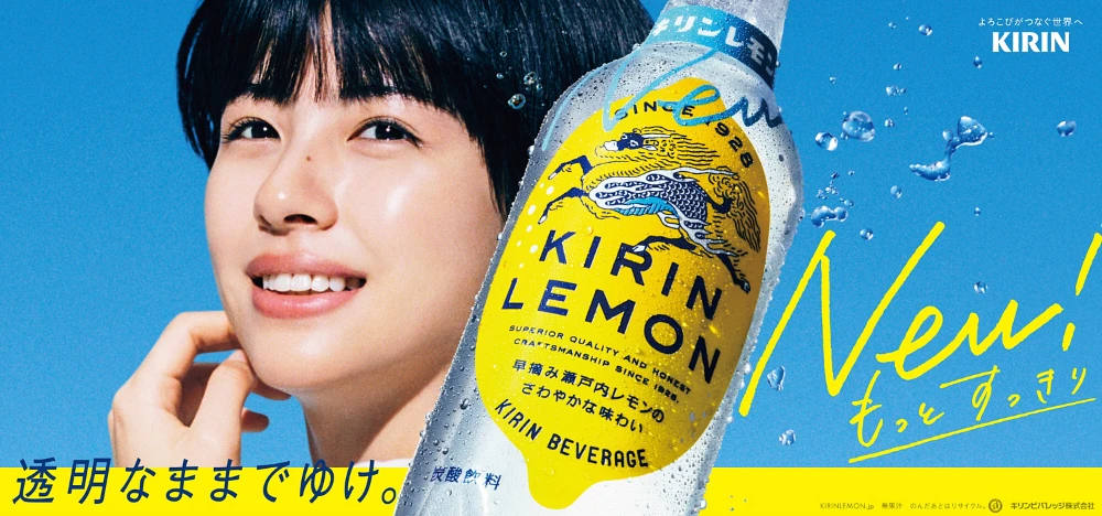
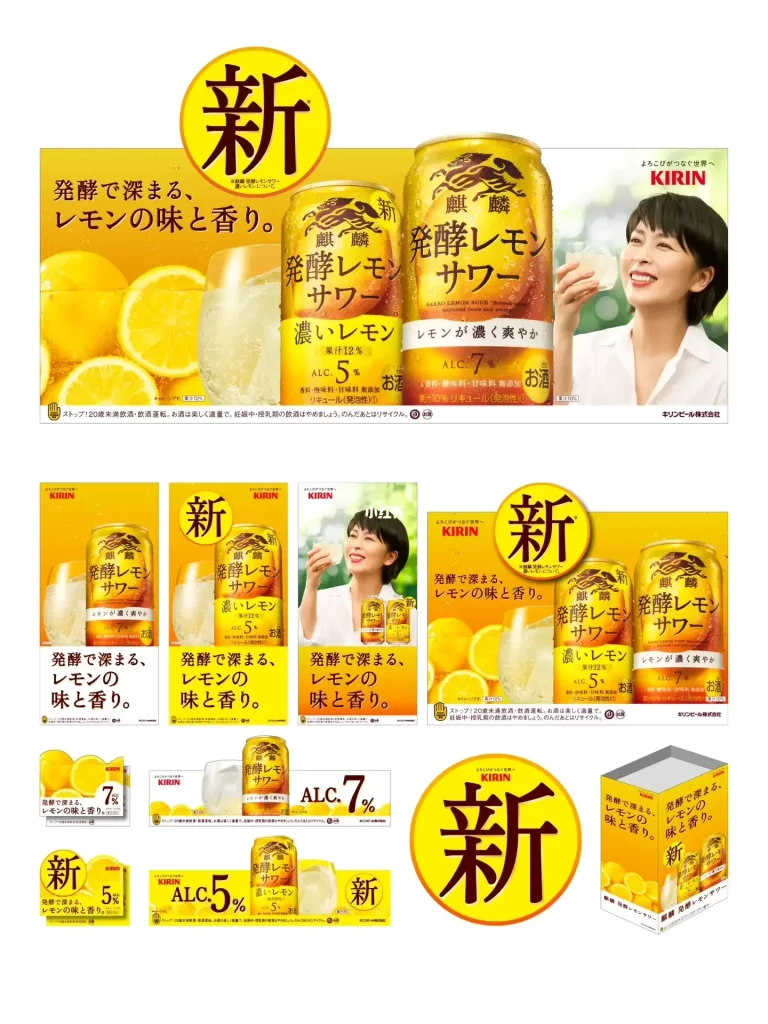
Approaching the advertisement, one sees Kirin’s new ‘Hakkou Lemon Sour’ canned beverage showcased in a vibrant yellow and white color scheme. The composition features two distinct can designs—one labeled with 5% alcohol content and another with 7%—alongside fresh lemon imagery and a smiling woman holding a glass. Japanese text dominates the layout, with the prominent character ‘新’ (meaning ‘new’) displayed in bold circular badges across various poster formats.
Design elements employ a high-contrast palette of bright lemon yellow against clean white backgrounds, creating immediate visual impact. Typography utilizes bold, rounded Japanese characters with strategic placement of the ‘新’ symbol to emphasize product novelty, while photography style emphasizes freshness through crisp citrus imagery and approachable human presence. The modular layout system demonstrates versatile applications across different media formats while maintaining consistent brand recognition.
Marketing professionals reference this campaign when analyzing effective seasonal beverage launches and color psychology in alcohol advertising. Packaging designers study the can’s visual hierarchy and information architecture for alcoholic ready-to-drink products. Brand strategists utilize the material as a case study for maintaining product line consistency while introducing new variants to existing markets.