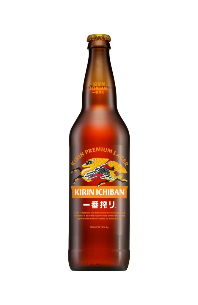
Kirin Ichiban Lager Bottle
DownloadTopics
Details
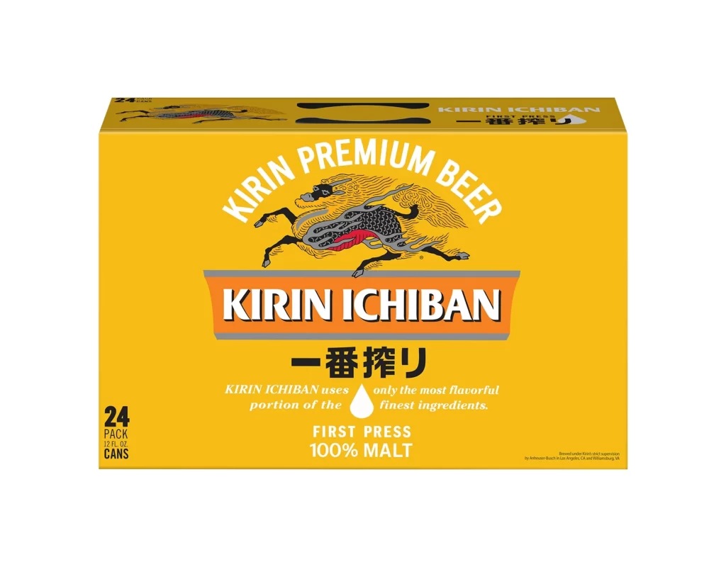
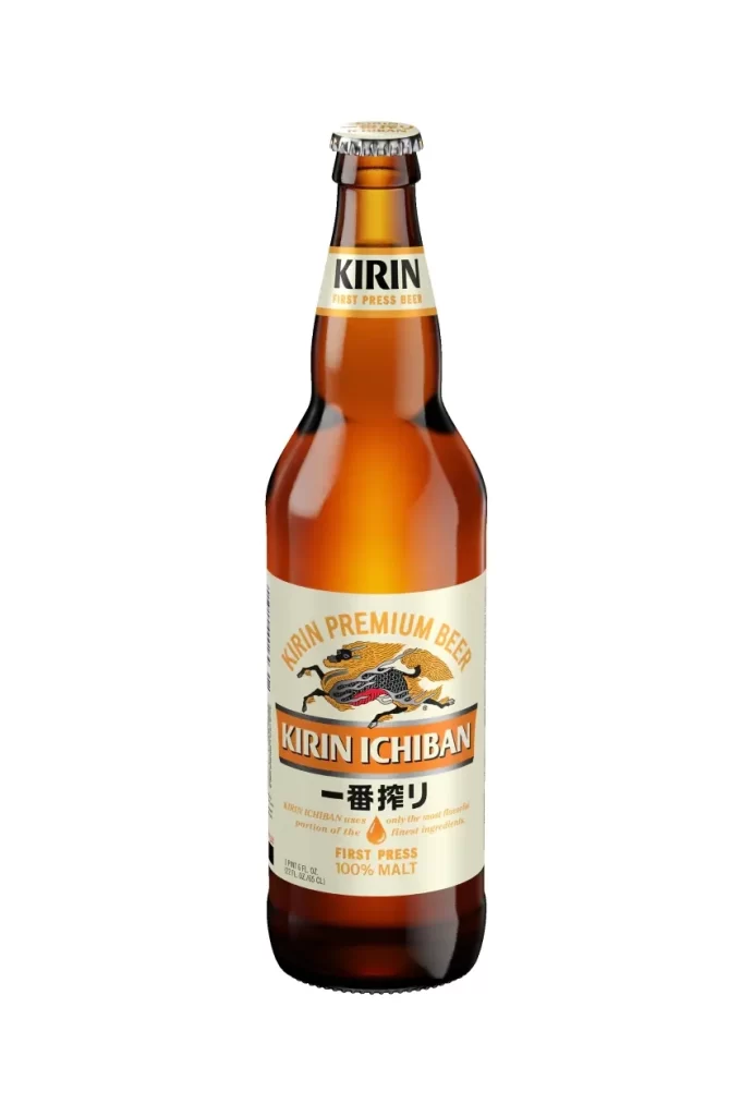
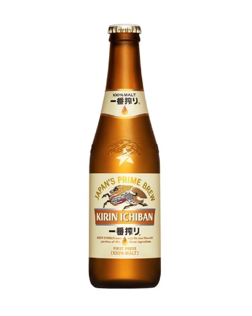
A tall, amber-brown glass bottle stands upright with a gold-capped crown seal catching light at the top. The main label features a vibrant orange banner displaying 'KIRIN ICHIBAN' in bold white Latin letters above the Japanese characters 一番搾り, while a stylized Kirin dragon in yellow and black leaps across the center. Above this sits curved orange text reading 'KIRIN PREMIUM LAGER', and smaller English copy appears at the bottom against the bottle's dark glass surface.
The label artwork draws immediate attention through its mythical creature illustration, which combines traditional Japanese heraldry with modern beer branding aesthetics. Orange and white typography creates strong contrast against both the amber glass and the dragon's detailed scales, establishing a clear visual hierarchy that guides the eye from brand name to product description. Designers studying packaging can grab the full-resolution file to examine how these color choices and typographic weights work together on a cylindrical surface.
Product photographers might use this shot to study lighting techniques for transparent containers, noting how the glass reveals depth without losing label legibility. Brand identity researchers could analyze the cultural fusion of Eastern mythology with Western lager conventions, while 3D modelers reference the bottle's shoulder curve and neck proportions for digital asset creation. Packaging students often compare such examples to understand how premium positioning communicates through material choice and graphic placement alone.
































![Kirin Beer Packaging ]](https://gropicture-1323946364.cos.na-siliconvalley.myqcloud.com/wp-content/uploads/2026/07/CLG-4443841-0__87553-1024x842.webp)