Kirin Ichiban Beer 12 Pack Bottle Packaging
Topics
Details
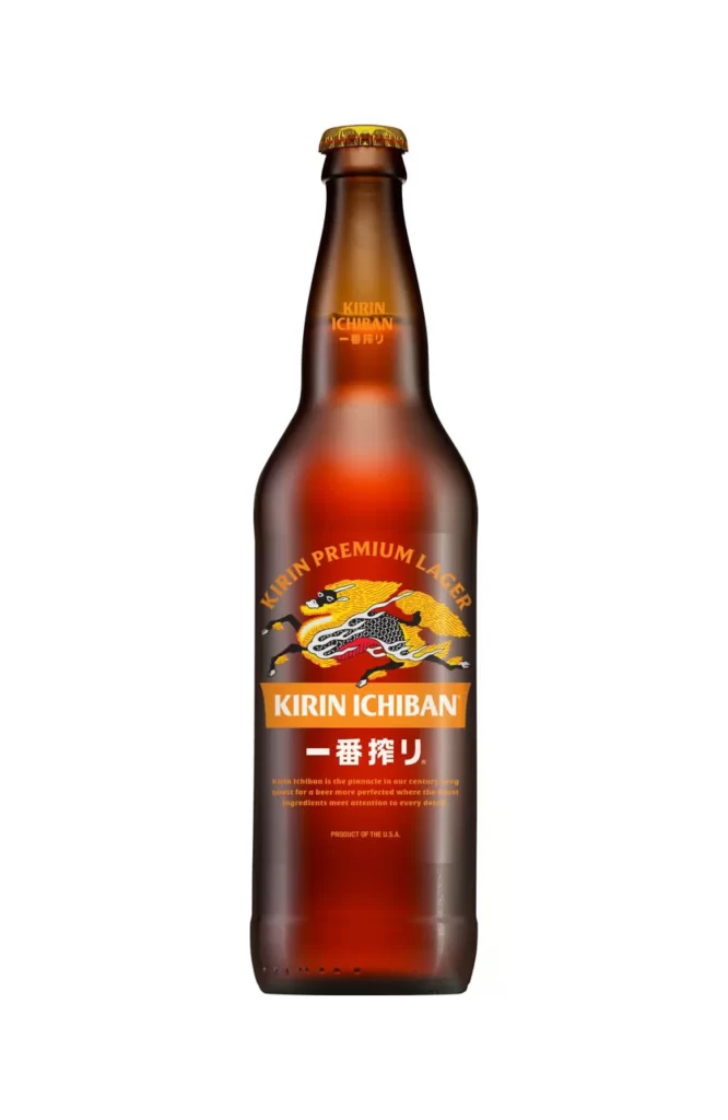
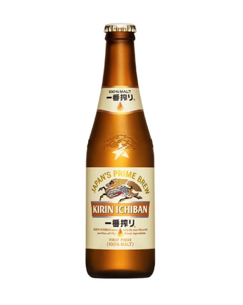
A twelve-pack carrier for Kirin Ichiban beer stands in a clean, frontal orthographic view on a white surface. The white cardboard substrate features the brand's iconic Kirin—a mythical dragon-horse hybrid—rendered in intricate black linework with golden-yellow flowing mane and tail accents. Bold typography dominates the hierarchy: 'KIRIN PREMIUM BEER' arcs above the creature in golden-yellow lettering, while 'KIRIN ICHIBAN' anchors the center in cream-colored serif font against an orange horizontal band.
Visual distinction emerges from the deliberate juxtaposition of Eastern mythological iconography with Western industrial packaging conventions. The limited palette of white, orange, gold, and black creates high-contrast legibility while the detailed creature illustration provides organic complexity against geometric text blocks. Notable is the integration of bilingual typography and the amber droplet icon, which visually reinforces the ‘First Press’ brewing methodology claim without cluttering the overall minimalist aesthetic.
Brand strategists analyzing cross-cultural market positioning would examine how traditional Japanese symbolism adapts to mass-market American retail contexts. Packaging engineers might reference the structural fold lines and weight distribution indicated by the carrier’s silhouette when developing similar multi-unit containers. Students of commercial illustration could deconstruct the line-weight variations in the Kirin creature to understand how fantasy elements ground premium product narratives in heritage storytelling.