Grand Kirin JPL Beer Can
Topics
Details
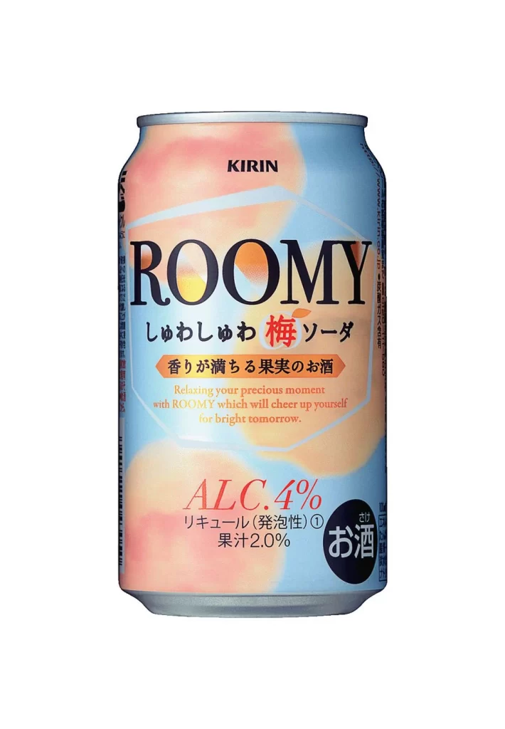
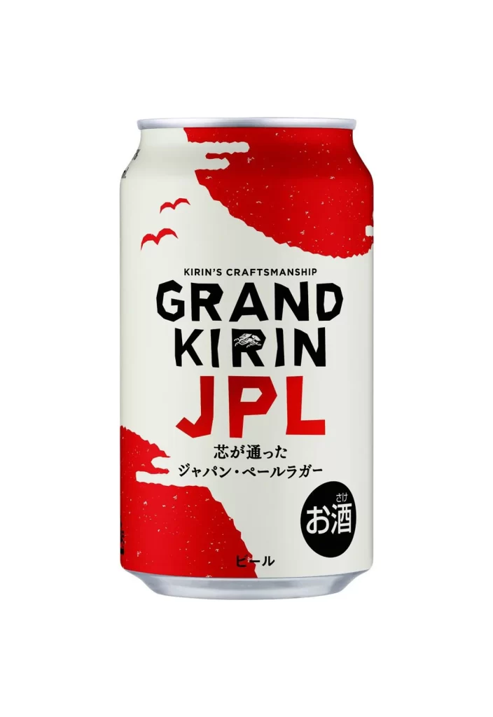
The image displays a Grand Kirin JPL beer can set against a plain white background. The packaging features a cream-colored base with bold red graphic shapes resembling stylized clouds or waves at the top and bottom. Prominent text includes ‘KIRIN’S CRAFTSMANSHIP’ and the large product name, alongside Japanese characters indicating a Japanese Pale Lager.
Typography plays a central role with heavy, sans-serif lettering for the brand name, where "JPL" stands out in vibrant red. The layout balances negative space effectively, using minimalist bird illustrations to add movement without clutter. A circular black badge containing the Japanese character for alcohol anchors the lower right corner, creating a distinct visual focal point.
Graphic designers often examine such assets when developing modern beverage identities or studying international label layouts. Marketing teams utilize these visuals to analyze how traditional Japanese elements merge with contemporary Western design trends. Art directors reference the color blocking and font hierarchy when planning new craft beer releases or premium lager branding campaigns.