Kirin Roomy Canned Drink
Topics
Details
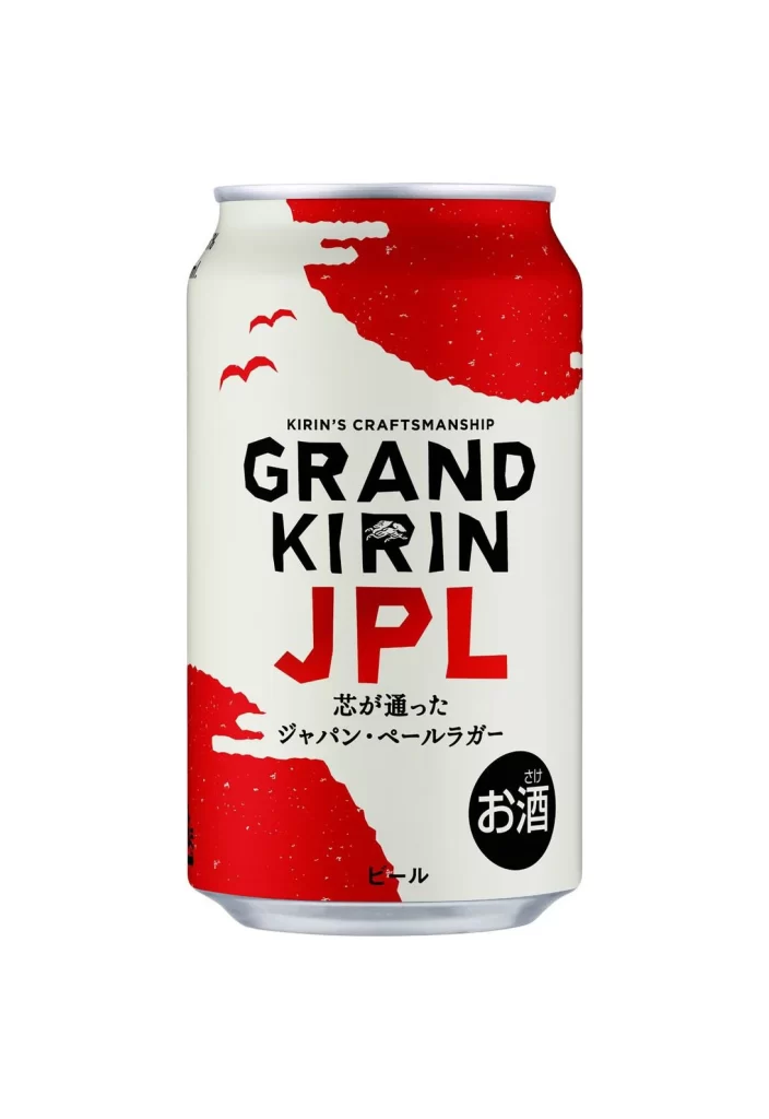
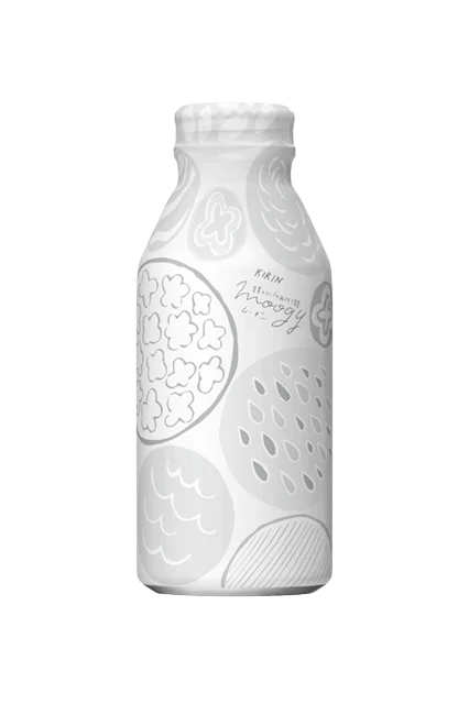
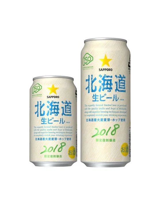
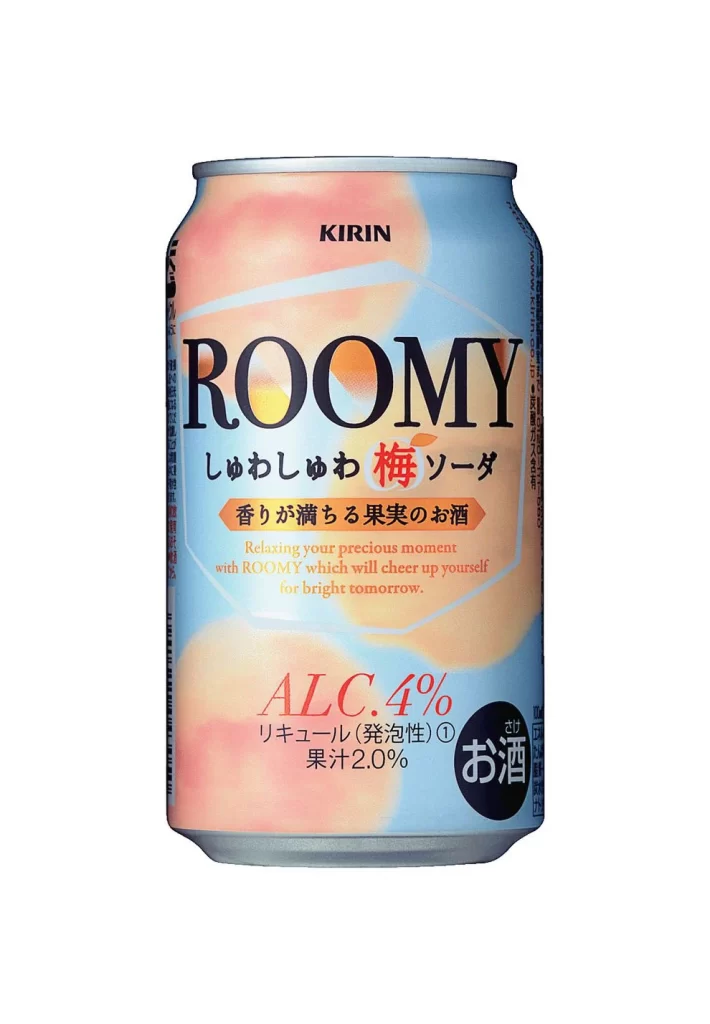
A single aluminum can of Kirin Roomy stands centered against a plain white background. The packaging features the brand name 'KIRIN' at the top, followed by 'ROOMY' in large, bold serif lettering. Japanese text identifies the flavor as 'Shuwa Shuwa Ume' (fizzy plum), with an alcohol content of 4.0% and 2.0% fruit juice clearly labeled near the bottom.
The visual design employs a soft, ethereal color palette of pastel blues and peachy pinks, creating a blurred, bokeh-like effect that suggests fruit and refreshment. Typography is layered effectively, using strong black for the main product name and vibrant red for the plum character to draw the eye. A clean, modern layout balances the English and Japanese text, while the circular 'Osake' badge provides a solid anchor in the lower right corner.
Graphic designers often utilize such images to analyze the intersection of typography and illustrative backgrounds in beverage marketing. Brand identity specialists study the can to understand how established companies like Kirin maintain visual consistency across different product lines. Students of label design examine the hierarchy of information, noting how alcohol percentage and flavor profiles are presented to meet regulatory standards while remaining aesthetically pleasing.