Misfit Green Juice Blend
Topics
Details
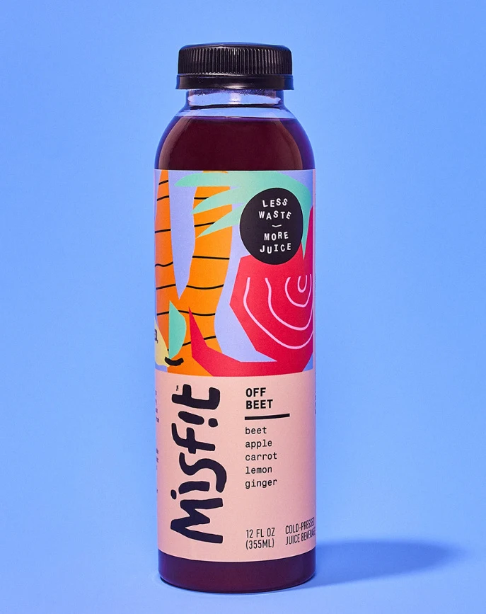
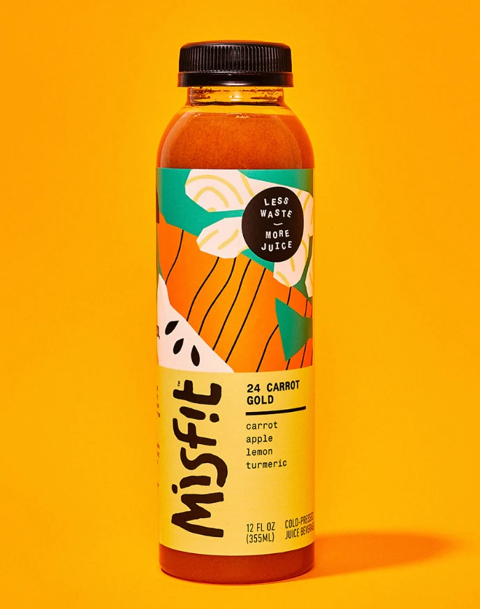
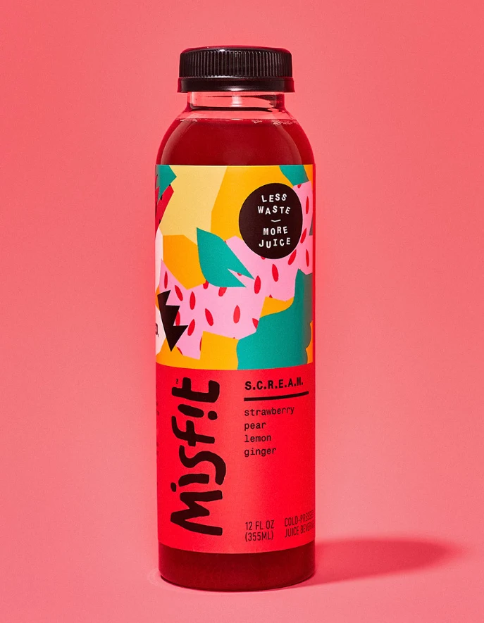
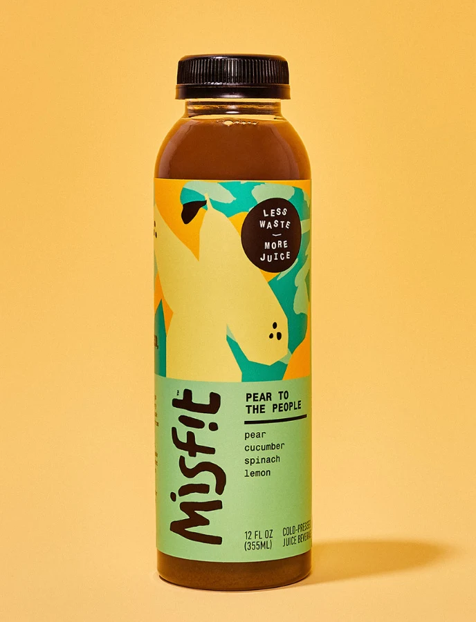
A 12 fl oz bottle of Misfit juice stands against a solid peach background, containing a dark brown liquid visible through the clear plastic. The label features the brand name 'Misfit' in bold black lowercase letters, with the flavor 'PEAR TO THE PEOPLE' and ingredients listed as pear, cucumber, spinach, and lemon. A circular badge in the upper right corner reads 'LESS WASTE MORE JUICE' in white text on a black background.
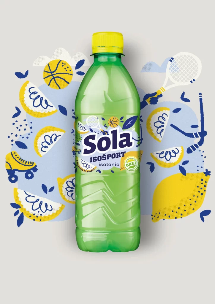
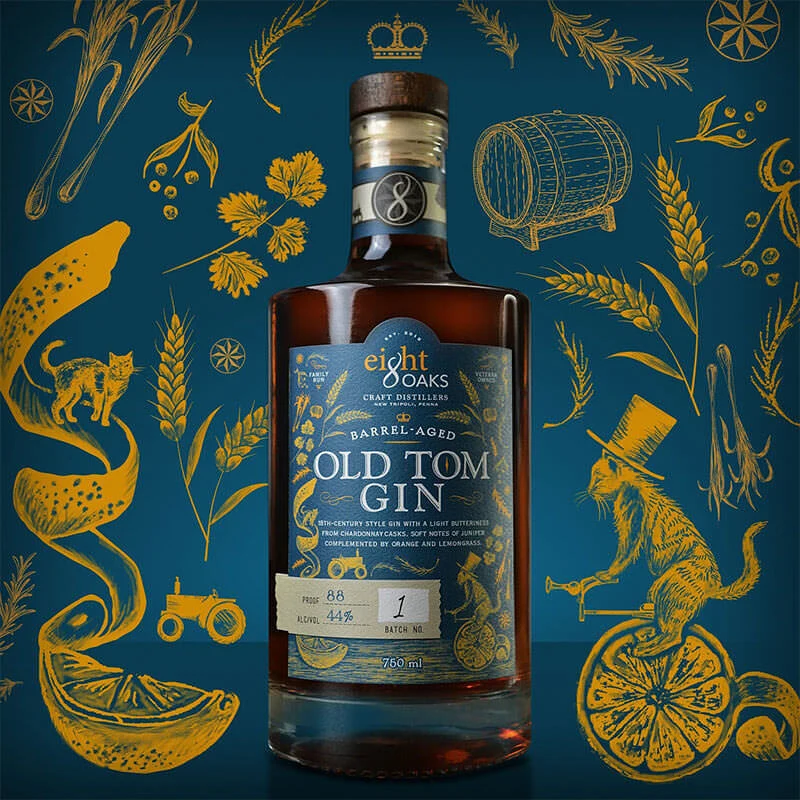
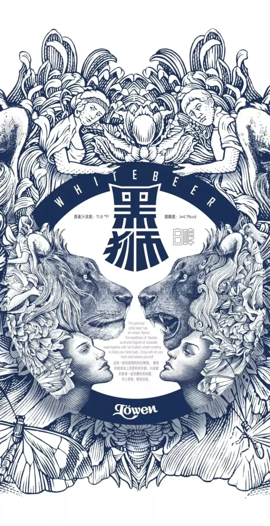
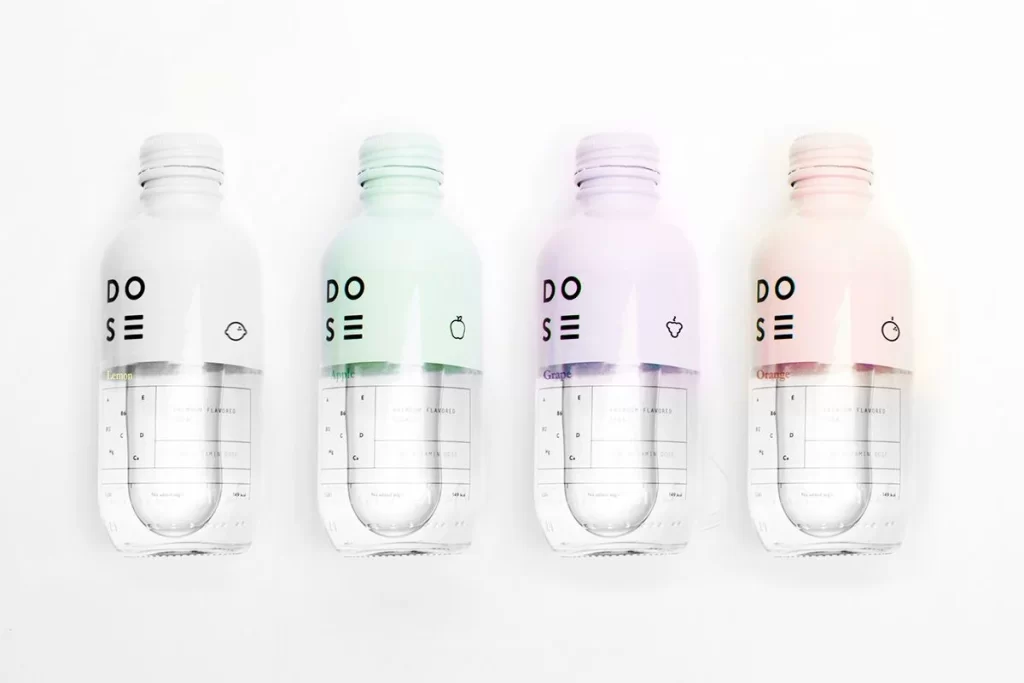
The packaging design employs a vibrant color palette of teal, yellow-green, and orange with abstract organic shapes suggesting fruit forms. Typography combines a playful, rounded sans-serif for the brand name with clean, minimal text for product details. The illustration style uses flat, overlapping color fields creating a modern, approachable aesthetic that emphasizes freshness and sustainability messaging through visual hierarchy.
Packaging designers reference this image when developing beverage label systems that balance personality with clarity. Brand identity professionals study how the color blocking and typography work together to convey eco-conscious values. Label design teams examine the spatial arrangement of elements to understand effective information architecture for cold-pressed juice products.