Sola Soda Bottle Illustration
Topics
Details
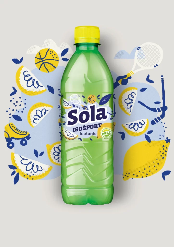
Centered in the frame is a green plastic bottle of Sola Isosport isotonic drink, capped with bright yellow and featuring a label with the brand name in bold dark blue. The product name appears in Polish as 'ISOSPORT' with the descriptor 'isotonic' below it, alongside a small green badge reading 'BEZ'. Surrounding the bottle is a playful arrangement of illustrated elements including lemon slices, a basketball, a tennis racket, roller skates, and hockey sticks, all rendered in yellow and navy blue against a pale blue cloud-like backdrop.
The composition employs a flat, vector-based illustration style with textured linework that gives the graphics a hand-drawn, organic feel. Typography on the label combines a heavy, rounded sans-serif for the main logo with lighter weights for supporting text, creating clear visual hierarchy. The color palette is strictly limited to citrus yellow, deep navy, mint green, and soft sky blue, establishing a fresh, energetic aesthetic suited for sports marketing.
Packaging designers frequently examine this layout to understand how to integrate product photography with surrounding graphic motifs without losing focus on the container. Brand identity professionals use the label treatment as a case study in balancing bold wordmarks with functional nutritional information. Advertising art directors reference the spatial arrangement when planning campaigns that require dynamic backgrounds for static beverage shots.