Calpis Soda Bottle Advertisement
Topics
Details
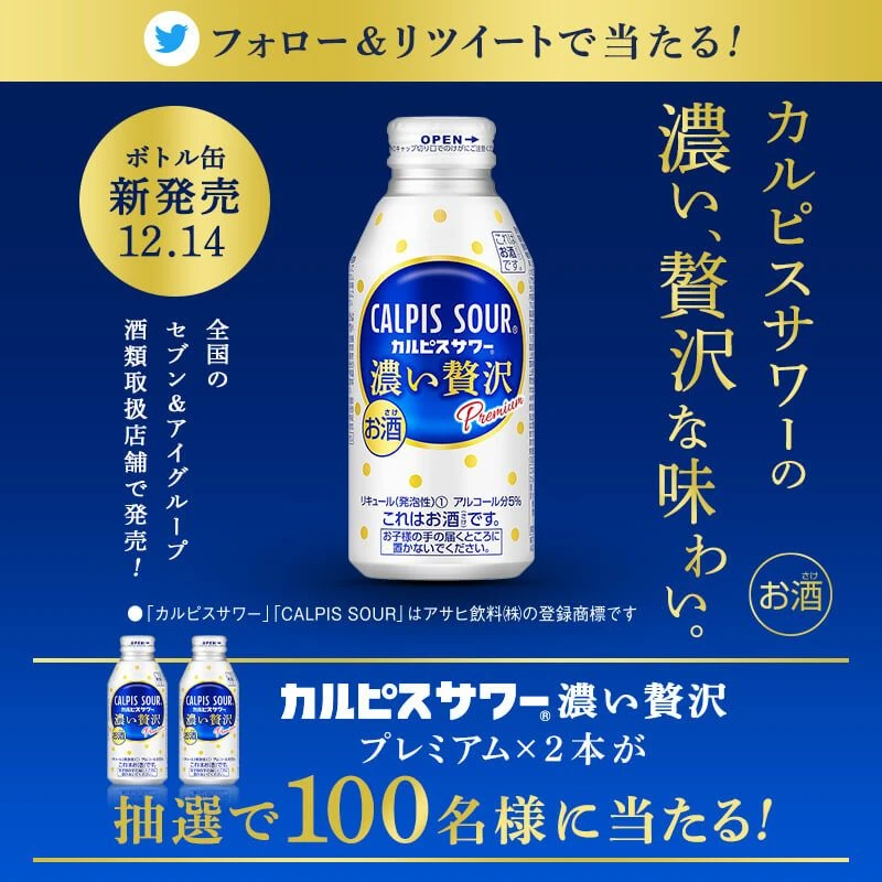
A Calpis Soda bottle stands prominently against a bright cyan-blue background, accompanied by a glass filled with the beverage and a blue straw. The product label features the brand name 'CALPIS SODA' in bold English typography, surrounded by a pattern of light blue polka dots. Large, stylized Japanese text reading 'シャキッと、ほぐれぬ' appears in white dotted patterns across the background, while smaller red and black Japanese characters in the bottom right corner highlight the drink's lactic acid bacteria content.
The layout employs a clean, centered composition that draws immediate attention to the bottle as the hero element. Typography is treated with a playful, textured dot-matrix effect for the headline, contrasting with the crisp, modern sans-serif font on the packaging. The color palette relies heavily on cool blues and whites to evoke freshness, complemented by the photographic style that emphasizes the drink's clarity and carbonation through soft lighting.
Advertising professionals frequently examine this poster to understand effective use of negative space and color psychology in beverage marketing. Marketing students analyze the visual hierarchy and cultural integration of bilingual text elements for Asian market campaigns. Packaging designers reference the balance between graphic patterns and product photography when developing new brand identities.