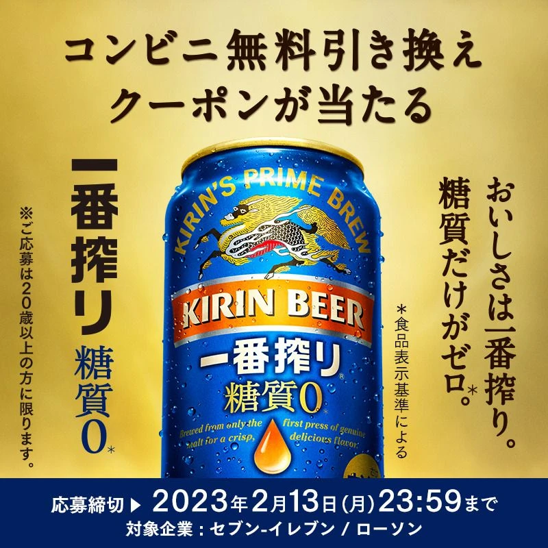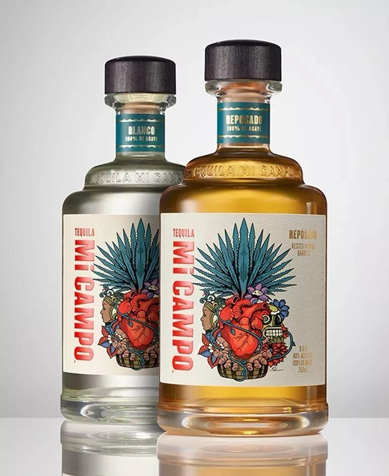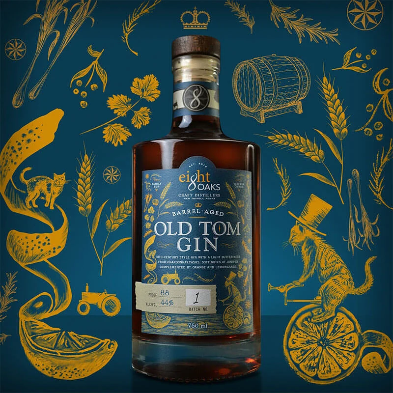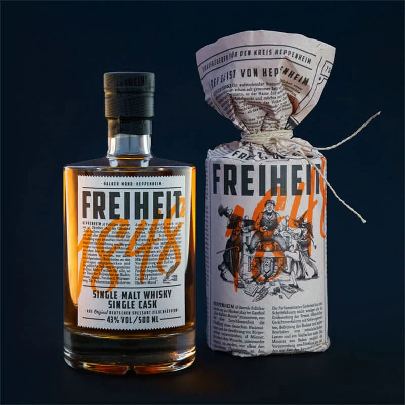
Kirin Hyoketsu Pear Soda Advertisement
Topics
Details
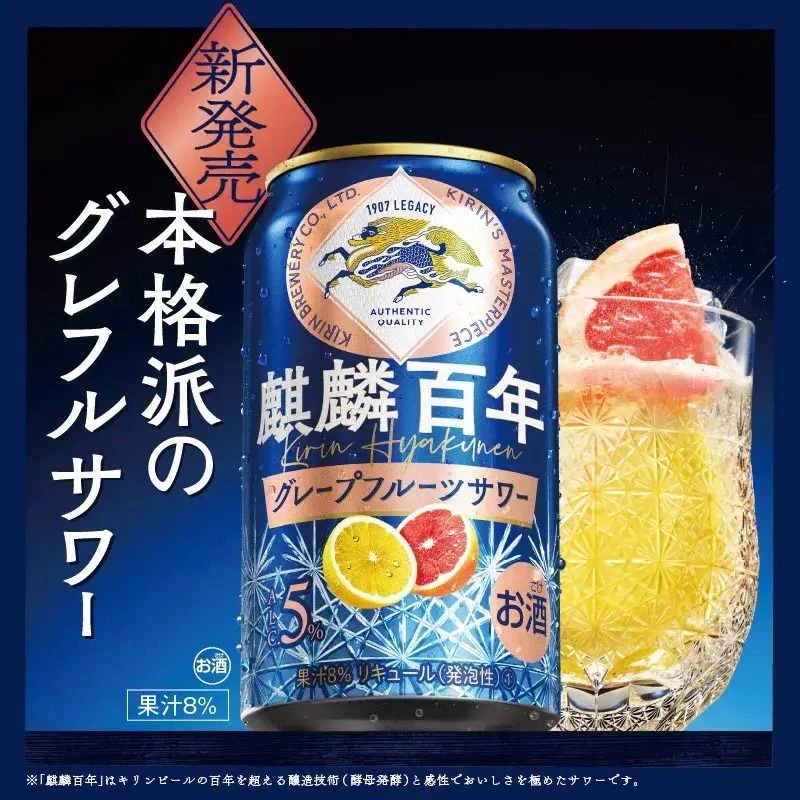
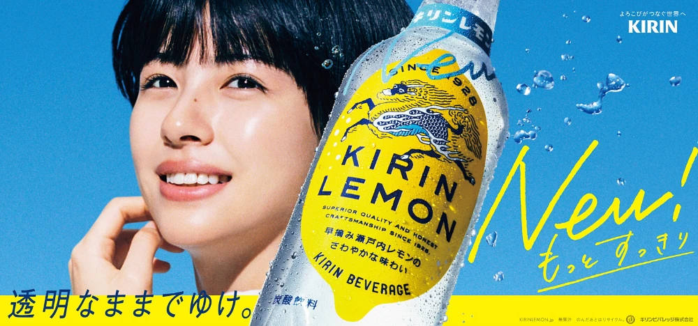
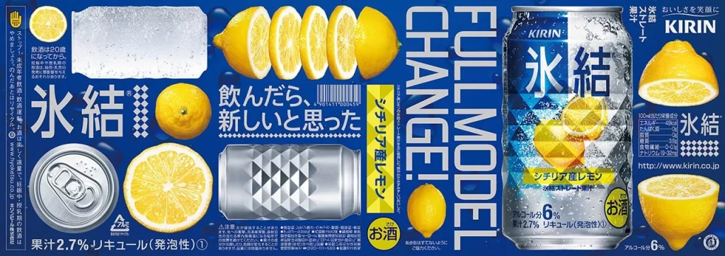
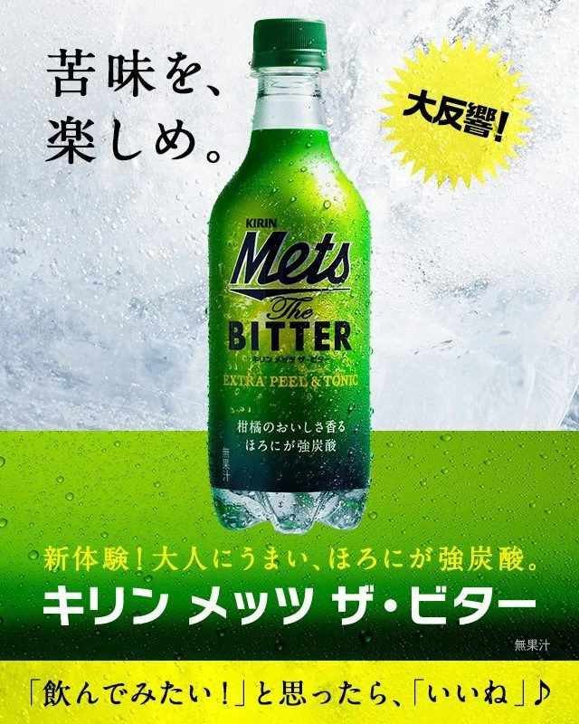
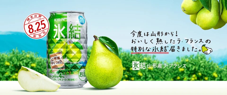
Anchored by a Kirin Hyoketsu pear-flavored canned drink positioned on the left side of the frame, the advertisement is accompanied by a whole green pear and a sliced half in the foreground. A cluster of pears hangs from the upper right corner against a backdrop of blurred green foliage and distant blue mountains, while Japanese text dominates the visual field. This text includes a red circular stamp marking an August 25 release date and promotional copy highlighting Yamagata pears.
Layout composition balances the rigid geometry of the aluminum can with organic fruit shapes, creating visual tension between manufactured and natural elements. Typography employs bold brush-stroke characters for the product name alongside clean sans-serif fonts for descriptive text, establishing clear hierarchy. The color palette draws heavily from fresh greens and sky blues, utilizing high-key lighting to emphasize crispness and seasonal freshness in the photographic style.
Advertising professionals examine such materials to understand how beverage brands communicate flavor profiles through visual cues and regional sourcing narratives. Marketing students analyze the strategic placement of launch dates and origin claims to gauge consumer trust-building tactics. Packaging designers reference the integration of realistic food photography with graphic overlays when developing cohesive brand identities for seasonal product lines.