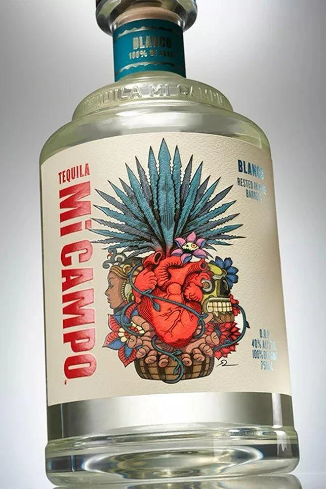
Tequila Mi Campo Bottle
Topics
Details
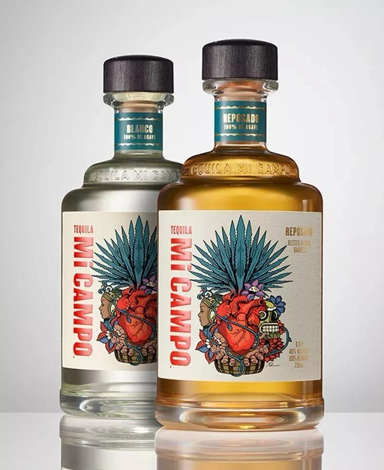
A clear glass bottle of Tequila Mi Campo Blanco stands against a neutral background, featuring a cream-colored main label and a teal neck band. The label displays the brand name 'TEQUILA MI CAMPO' in bold red vertical lettering on the left, while 'BLANCO' appears in blue text on the right. Central to the composition is a detailed illustration of a red anatomical heart surrounded by an agave plant, a female profile, a skull, and various colorful flowers.
The design employs a vibrant yet balanced color palette, contrasting the vivid red typography against a muted off-white background with blue and green illustrative accents. Typography varies between the strong, condensed sans-serif used for the brand name and smaller, cleaner text for product details. The artwork utilizes a detailed, folk-art inspired illustration style that blends anatomical realism with symbolic, decorative elements reminiscent of traditional Mexican art.
Packaging designers frequently examine this bottle as a case study in integrating complex illustration with clear brand hierarchy. Marketing professionals reference the label when developing visual identities for spirits that aim to balance tradition with modern artistic expression. Students of graphic design analyze the layout to understand how to maintain readability while incorporating dense, meaningful imagery.