Kirin Hyoketsu Soda Cans Advertisement
DownloadTopics
Details
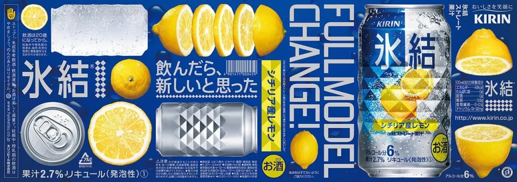
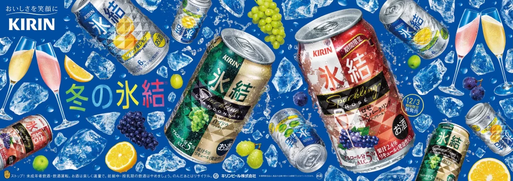
The advertisement showcases Kirin's Hyoketsu sparkling soda cans scattered across a vibrant blue background filled with crystalline ice shards. Various fruit flavors are represented through distinct can designs, including lemon, grape, and apple varieties, alongside two champagne flutes containing pink and yellow beverages. Japanese text dominates the visual field, with the brand name 'KIRIN' displayed prominently in white at the top left and the product name '氷結' (Hyoketsu) featured in large, colorful characters across the center.
Dynamic composition techniques create a sense of refreshing coolness through the strategic placement of ice cubes, fresh fruit slices, and whole grapes that appear to float around the metallic containers. The color palette combines deep blues with bright citrus yellows, rich purples, and crisp greens to evoke a chilled, fruity sensation. Typography varies between bold sans-serif fonts for branding and playful, multicolored lettering for seasonal messaging. A full-resolution file is freely available for detailed examination of the printing textures and finish effects on the aluminum surfaces.
Graphic design professionals frequently reference this layout when studying effective product photography integration within crowded advertising spaces. Marketing students analyze the campaign to understand how seasonal positioning—indicated by the '冬の水結' (Winter's Frozen) text—influences consumer purchasing behavior during colder months. Packaging specialists examine the image for insights into how beverage brands differentiate flavor variants through consistent yet distinct visual coding systems while maintaining overall brand cohesion.