Sparkling Mint Lemonade Can Design
DownloadTopics
Details
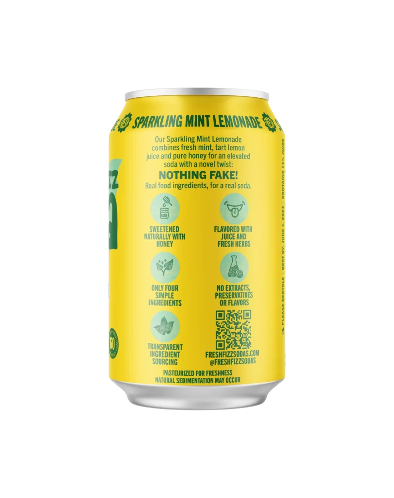
A cylindrical aluminum can with a bright yellow body and silver top and bottom rims stands as the central subject, photographed from a straight-on perspective that reveals the back panel of the packaging. Dark green typography spells out 'SPARKLING MINT LEMONADE' in an arched banner near the rim, followed by a descriptive paragraph about fresh mint, tart lemon juice, and pure honey ingredients. Below the main text block, six circular icons with light green backgrounds illustrate key product claims such as natural honey sweetening, juice and fresh herb flavoring, and transparent ingredient sourcing, while a QR code sits in the lower right corner above the brand's website URL.
What sets this particular design apart is its systematic use of iconography to communicate transparency and authenticity without cluttering the visual field. The consistent color palette of sunny yellow and forest green creates immediate flavor associations, while the grid layout of benefit badges gives the packaging an almost infographic-like clarity. Designers studying this reference will notice how the typographic hierarchy guides the eye from the bold product name down through the ingredient story to the technical details at the base.
Packaging designers working on beverage brands could mine this example for its balanced approach to mandatory nutritional messaging and lifestyle positioning. The straightforward icon system offers a blueprint for communicating complex ingredient philosophies in a scan-friendly format that doesn't overwhelm the consumer. Anyone needing to study the exact spacing, font choices, or color values can grab the full-resolution file from our library to examine every detail up close.