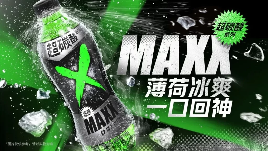
Maxx Mint Soda Advertisement
Topics
Details
The advertisement showcases a bottle of Maxx mint ice soda, labeled with the Chinese text '超碳酸' (super carbonated) and '薄荷冰爽' (mint ice cool). The composition features the product centrally against a dark background with green light streaks, surrounded by splashing water and ice cubes. Large, bold typography displays 'MAXX' in a metallic silver font alongside white Chinese characters promising an invigorating experience.
Visual hierarchy is established through aggressive typography and high-contrast color choices of neon green against deep black. The layout utilizes dynamic diagonal lines to convey motion and energy, while the product photography emphasizes condensation and texture to suggest extreme coldness. Halftone dot patterns add a technical, industrial feel to the overall graphic design.
Marketing professionals analyze such visuals to understand how beverage brands communicate sensory attributes like temperature and fizz through static media. Graphic designers reference the poster's use of scale and negative space when creating impactful packaging or promotional materials. Brand strategists utilize this campaign as a case study for targeting youth demographics with high-energy aesthetics.