Sapporo Classic Beer Advertisement
Topics
Details
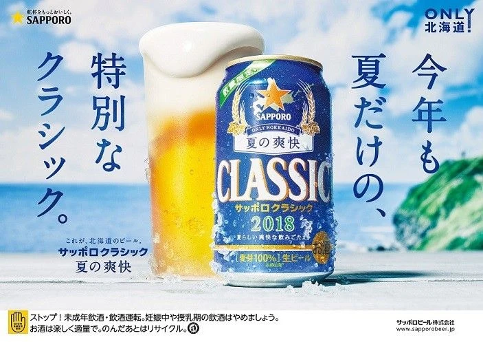
Framed by a bright coastal scene with blue skies, green cliffs, and ocean waves, the advertisement features a blue Sapporo Classic beer can labeled '2018' and 'Summer's Refreshment' positioned next to a glass filled with golden beer and a thick foam head. Japanese text reading 'This year too, summer only, special classic' appears vertically on the left and right sides of the image.
Visual hierarchy is established through bold, vertical Japanese typography that frames the central product photography, drawing the eye inward toward the chilled can. A cool color palette dominated by azure blues and crisp whites evokes freshness, contrasted sharply by the warm amber liquid and the iconic gold star logo. Photorealistic rendering emphasizes condensation droplets on the aluminum surface to enhance the perception of coldness and refreshment.
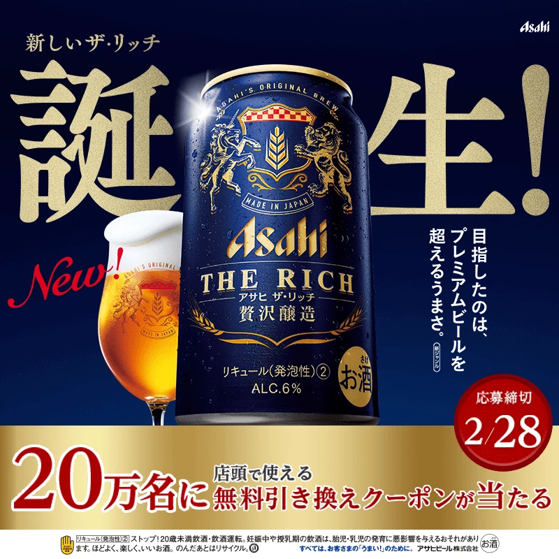
Marketing professionals utilize this composition as a case study for seasonal limited-edition packaging campaigns that create regional exclusivity. Graphic designers reference the balance between large-scale copy and product focal points when creating layouts for premium beverage brands. Brand strategists analyze the integration of heritage elements, such as the ‘Only Hokkaido!’ tagline, to maintain market positioning.