Budweiser Never Surrender
Topics
Details
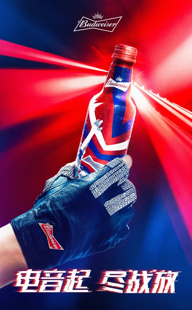
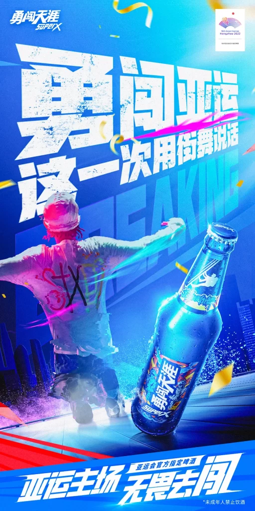
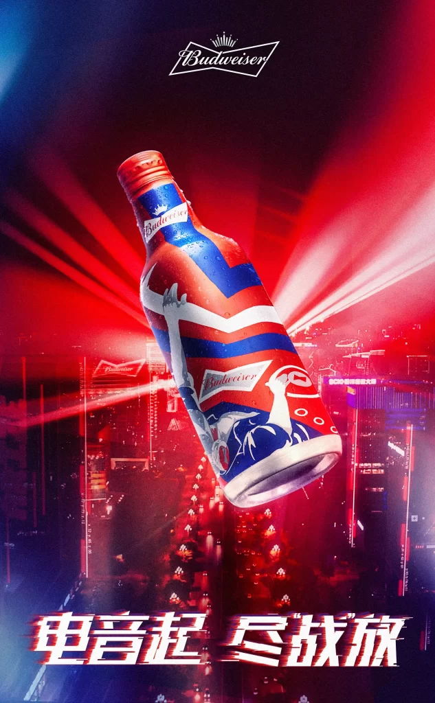
A Budweiser beer bottle floats at a dynamic angle against a neon-lit cityscape background. The bottle features a special edition design with red, white, and blue graphics including stylized figures and the Budweiser logo. Chinese text '电音起 尽战放' appears prominently at the bottom, while the brand's crown logo sits at the top of the composition.
The layout employs dramatic diagonal positioning to create energy and movement, with the bottle as the clear focal point. Typography uses bold, italicized Chinese characters with a slight glow effect that complements the vibrant red and blue color palette. The illustration style blends photorealistic product rendering with stylized graphic elements, creating a festive, concert-like atmosphere through strategic lighting effects.
Marketing professionals reference this campaign when studying how to integrate product packaging with event-based themes. Design students analyze the balance between brand identity elements and seasonal promotional graphics. Packaging specialists examine how limited-edition designs can maintain core brand recognition while introducing fresh visual narratives for specific market segments.