Suntory Beer Can Advertisement
Topics
Details
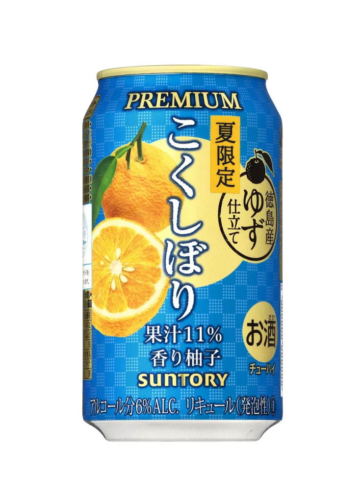
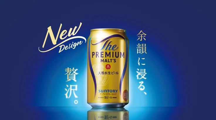
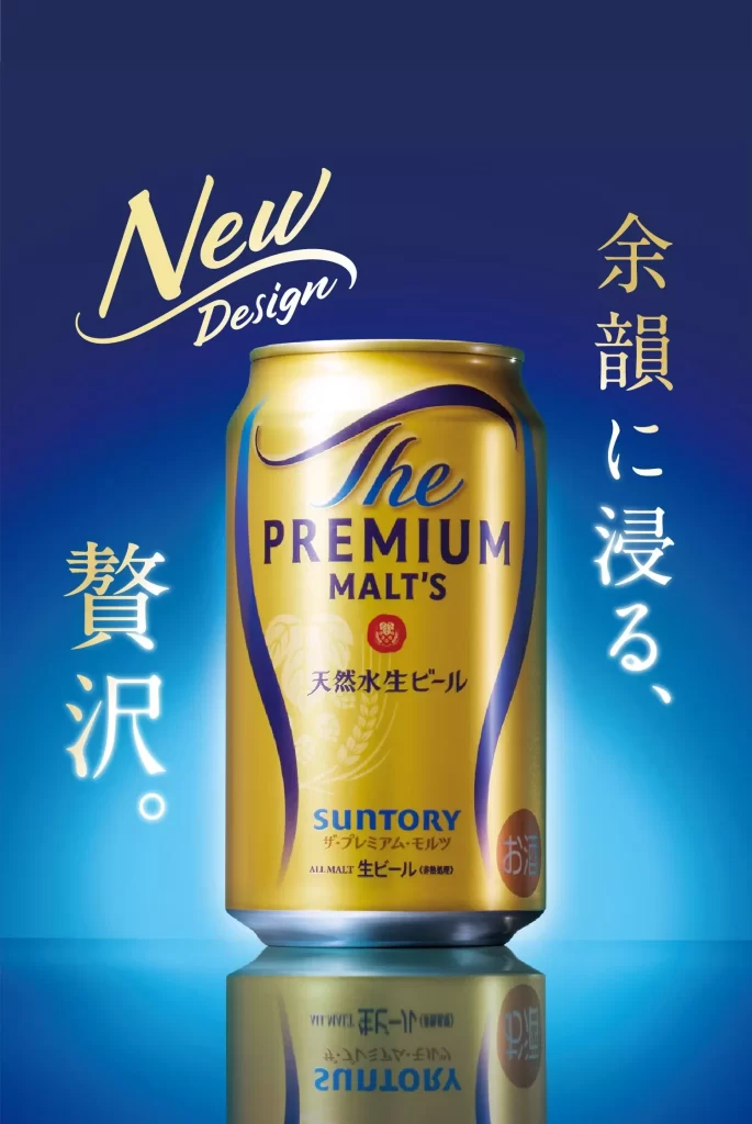
Perched above a glossy surface that reflects its image to create a sense of depth and premium quality, the golden Suntory beer can for ‘The Premium Malt’s’ is centered in the frame against a deep blue gradient background. The composition features English text on the can itself, including the brand name and ‘New Design’ script, alongside vertical Japanese characters reading ‘余韻に浸る、贅沢。’ (Immerse yourself in the luxurious aftertaste).
The layout employs a symmetrical, centered arrangement that draws immediate focus to the product as the hero element. Typography varies between elegant cursive for ‘New Design,’ bold sans-serif for the product name, and traditional vertical Japanese script. The color palette contrasts warm metallic golds of the packaging against cool cyan and navy blues, while lighting highlights the can’s curvature and metallic texture through professional product photography.
Advertising professionals examine such visuals to understand how luxury positioning is communicated through minimalism and color theory. Marketing students analyze the cross-cultural text integration and premium pricing cues embedded in the design language. Packaging designers reference the specific treatment of the gold finish and label hierarchy when developing upscale beverage branding.