Japanese Whisky Bottle Label Design
DownloadTopics
Details
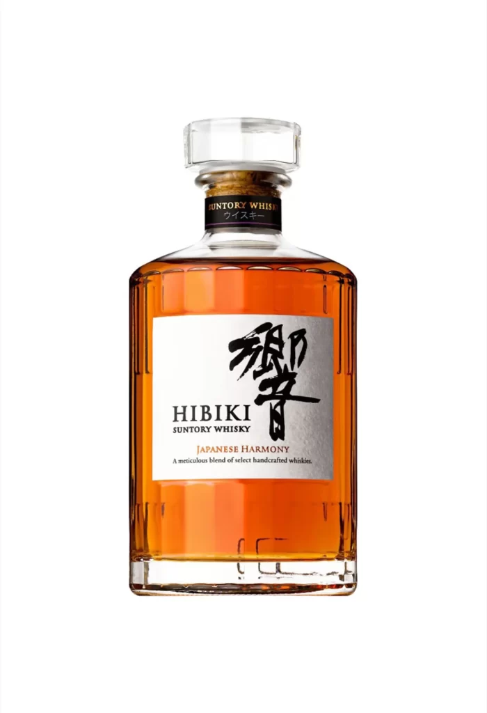
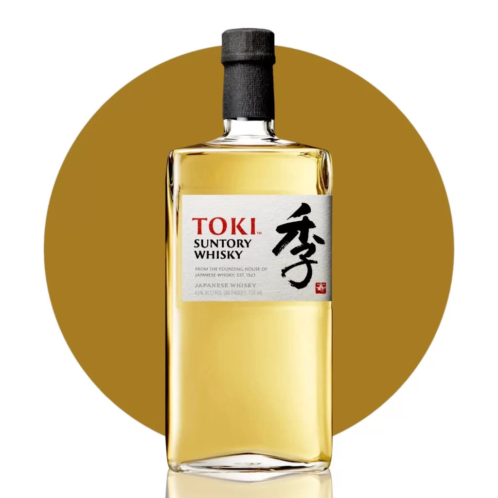
A rectangular glass vessel filled with pale amber liquid stands as the central focus, sealed by a dark, textured cylindrical cap that contrasts with the clear shoulders of the bottle. The white label features bold red typography spelling TOKI above black sans-serif text identifying Suntory Whisky, while a large black calligraphic character dominates the right side alongside a small red seal. Behind the bottle, a solid golden-yellow circle creates a warm halo effect, and the entire composition is captured from a straight-on perspective with soft lighting that highlights the liquid's translucency.
Visual tension arises from the juxtaposition of modern geometric bottle architecture against traditional East Asian calligraphy, creating a bridge between contemporary industrial design and heritage craftsmanship. The restrained color palette—limited to amber, crimson, jet black, and metallic silver—demonstrates how minimal chromatic variation can still convey luxury through typographic hierarchy and negative space management. Designers studying this composition will note how the circular backdrop frames the rectangular form without competing for attention, a technique useful for product photography layouts.
Packaging art directors examining Japanese export branding might analyze the balance between English and kanji typography to understand cross-cultural market positioning strategies. Beverage industry illustrators could reference the specific way light refracts through the glass to accurately render similar spirits in their own conceptual work. Anyone needing to study these specific label proportions or color values can access the full-resolution file at no cost directly from the resource library.