Japanese Tea Bottle Photo
Topics
Details
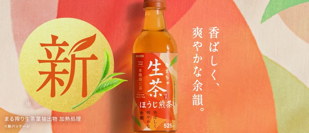
Centered in the frame is a transparent bottle of Kirin Nama-cha Houjicha, filled with a rich amber liquid and labeled with bold white Japanese characters. To the left sits a large, textured golden circle containing the red kanji for 'New' alongside delicate green leaf illustrations. The background features soft, overlapping abstract shapes in warm coral, peach, and pale green tones, with vertical Japanese text on the right describing the tea's aromatic profile.
The layout employs a balanced asymmetry, anchoring the product between graphic elements that guide the eye from left to right. Typography varies significantly, using a traditional serif style for the promotional seal while maintaining clean sans-serif fonts for legibility on the bottle label. A harmonious color palette of earthy golds and sunset oranges evokes warmth and natural freshness, complemented by soft-focus photographic lighting that highlights the liquid's clarity.
Advertising professionals frequently utilize such compositions to study effective product placement within lifestyle contexts. Marketing students analyze the visual hierarchy to understand how cultural symbols like the 'New' seal influence consumer perception. Packaging designers also reference the label integration to see how branding elements coexist with essential nutritional information.