Mizone Zero Sugar Launch
Topics
Details
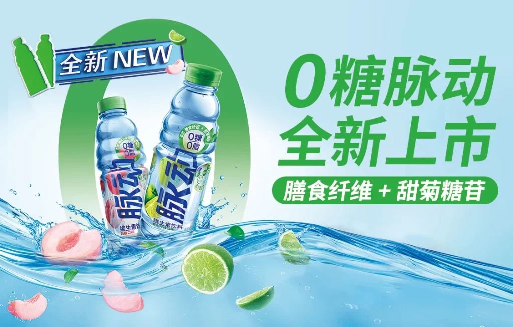
Monochrome palettes are eschewed in favor of a light blue background with dynamic water splashes that frame two bottles of Mizone (脉动) Pulse zero-sugar beverages in peach and lime flavors. Large green Chinese characters announce ‘0糖脉动 全新上市’ (Zero Sugar Pulse, New Launch), accompanied by a green badge highlighting ‘膳食纤维 + 甜菊糖苷’ (Dietary Fiber + Steviol Glycosides). A ‘全新 NEW’ label appears in the upper left corner alongside stylized bottle silhouettes.
The layout employs a diagonal composition with the product bottles positioned centrally within a large circular green graphic element that creates visual focus. Bold sans-serif typography in vibrant green dominates the right side, while high-speed liquid photography captures realistic water movement and floating fruit slices to convey freshness and hydration. The color palette combines cool aqua blues with energetic lime greens and natural fruit tones to reinforce the health-conscious, refreshing product positioning.
Advertising professionals utilize this campaign asset to analyze effective beverage packaging presentation and splash photography techniques for liquid products. Marketing students reference the clear hierarchy of health claims and flavor differentiation strategies used in Asian market FMCG launches. Brand designers study the integration of nutritional benefit badges with primary brand messaging to create compelling retail point-of-sale materials.