Japanese Ice Cream Dessert Advertisement
Topics
Details
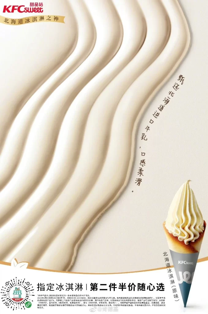
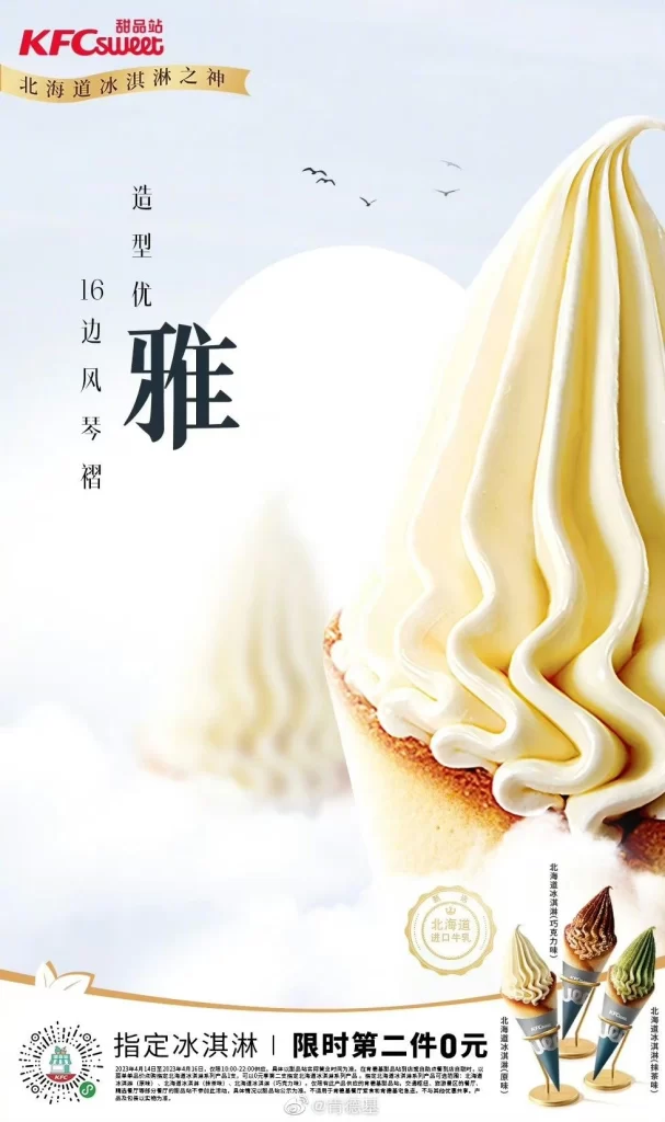
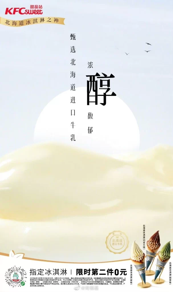
Stretched across a soft, pale yellow background depicting stylized rolling hills beneath a pale sky with a large white sun and three small birds, the advertisement features the KFC Sweet brand logo in red at the top left, accompanied by a gold banner reading ‘God of Hokkaido Ice Cream’. The central composition displays large, vertical Chinese characters for ‘Rich Mellow’ and ‘Luxury’, flanked by smaller text stating ‘Selected Hokkaido Imported Milk’, while three ice cream cones appear in the bottom right corner.
The layout employs a minimalist, airy aesthetic with significant negative space that draws focus to the central typography. Traditional Chinese calligraphy is used for the main headline to convey premium quality and cultural authenticity. The color palette consists of creamy whites, soft yellows, and subtle beige tones, creating a gentle, appetizing atmosphere that suggests smooth texture and purity.
Advertising professionals utilize this poster as a case study in balancing traditional Eastern typography with modern Western brand identity. Marketing students analyze its visual hierarchy to understand how luxury positioning is achieved through restrained design elements. Packaging designers reference the color harmonies and spatial arrangements when developing premium dairy product lines or seasonal dessert campaigns.