Sandro Desii Gelato Box
DownloadTopics
Details
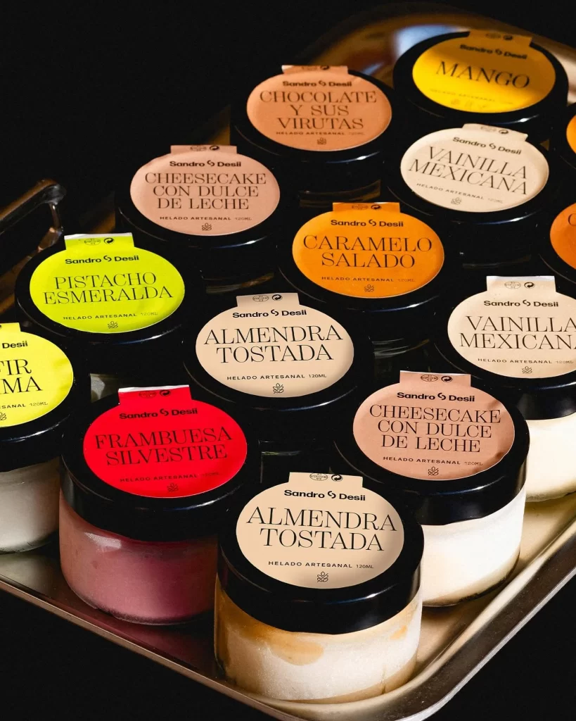
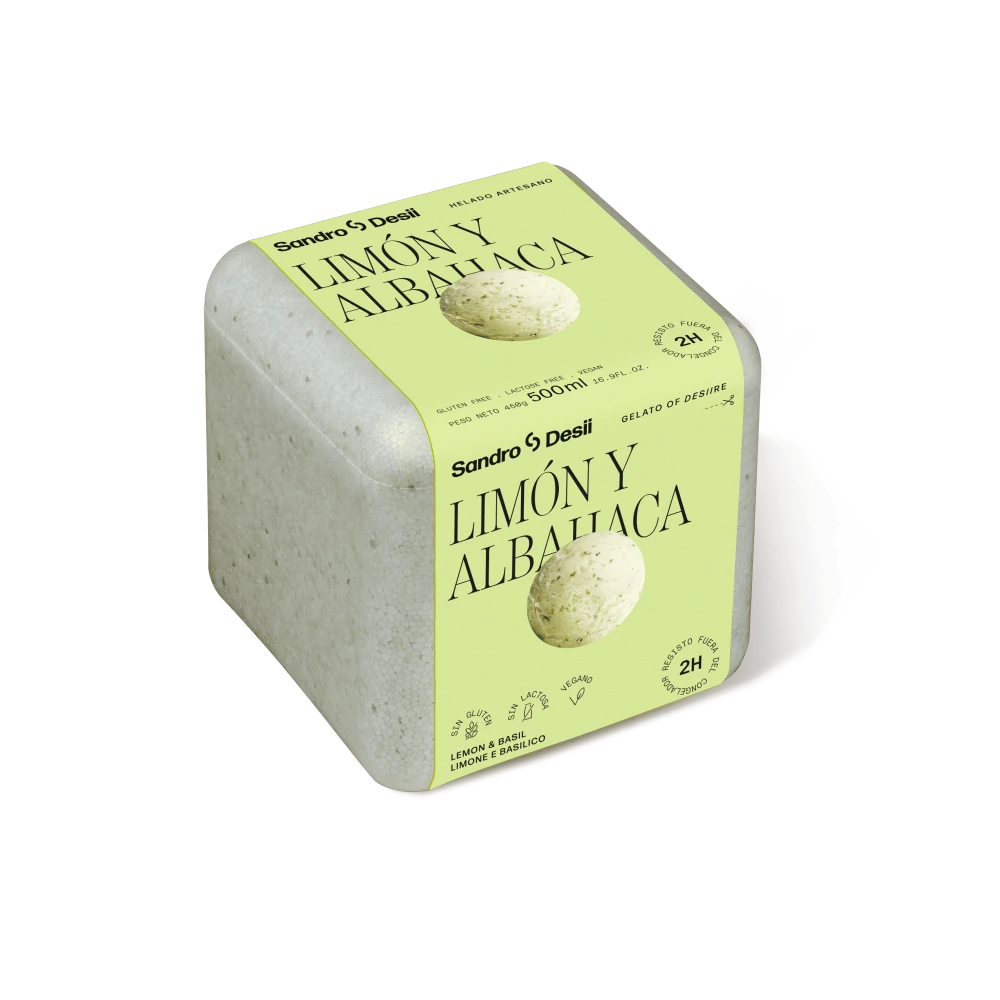
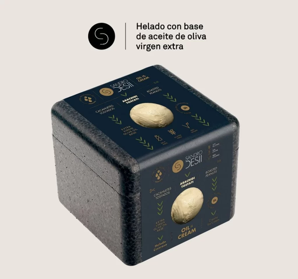
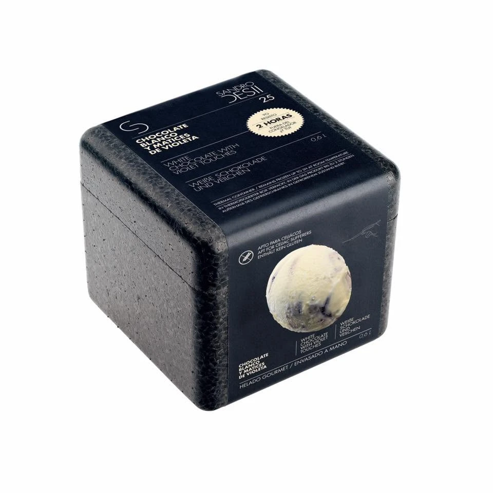
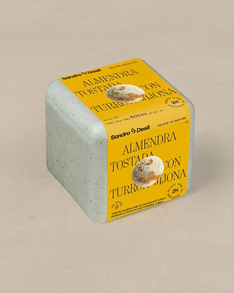
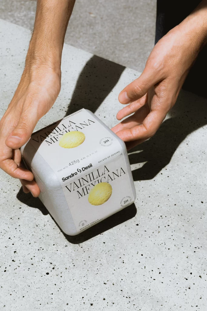
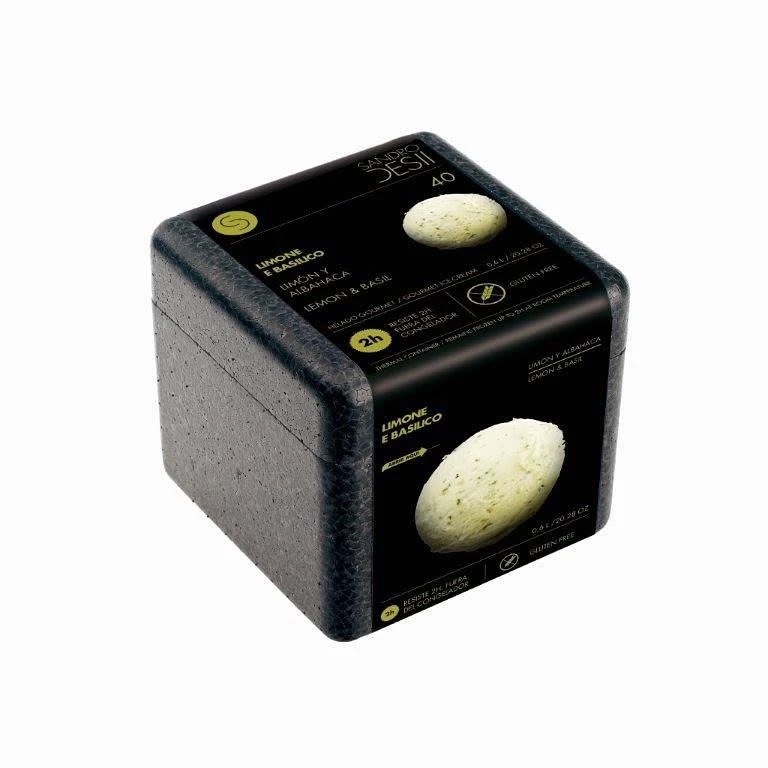
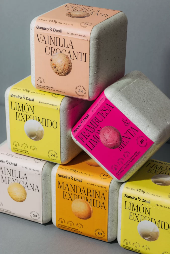
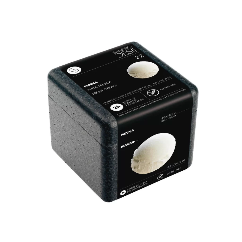
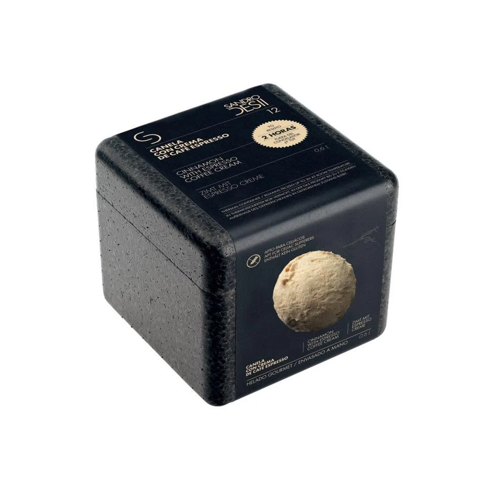
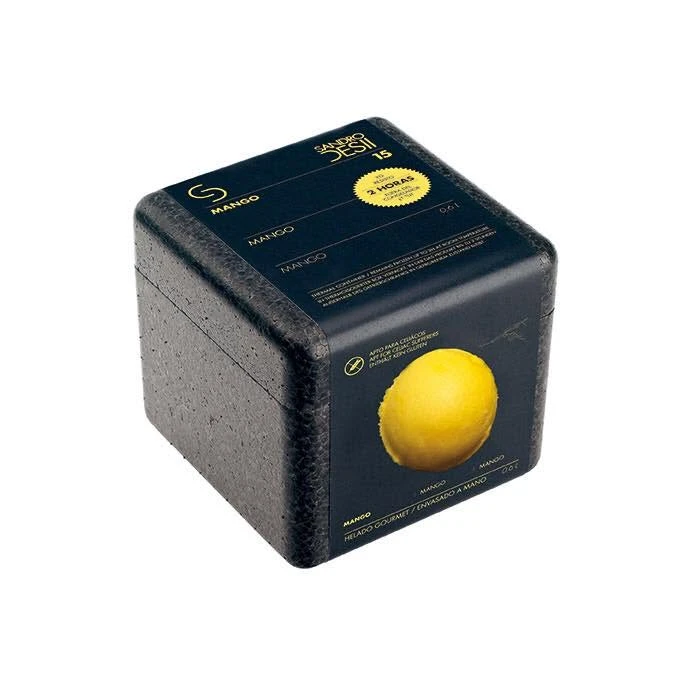
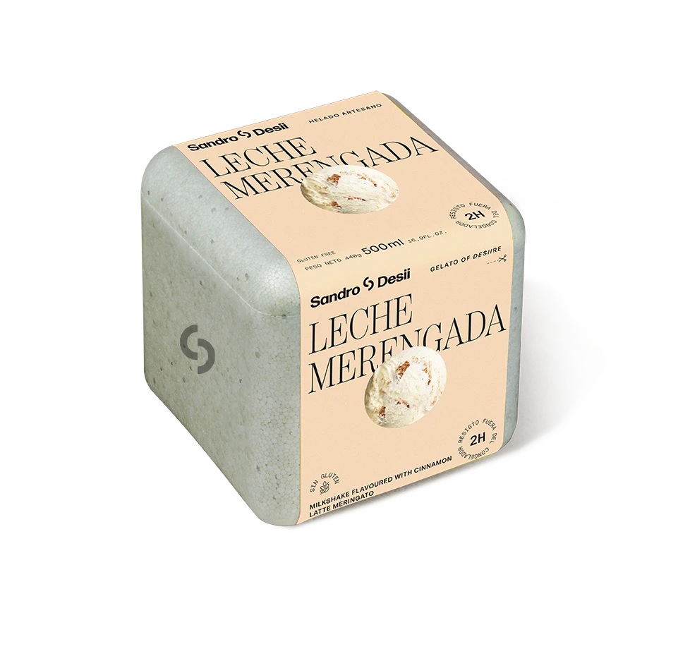
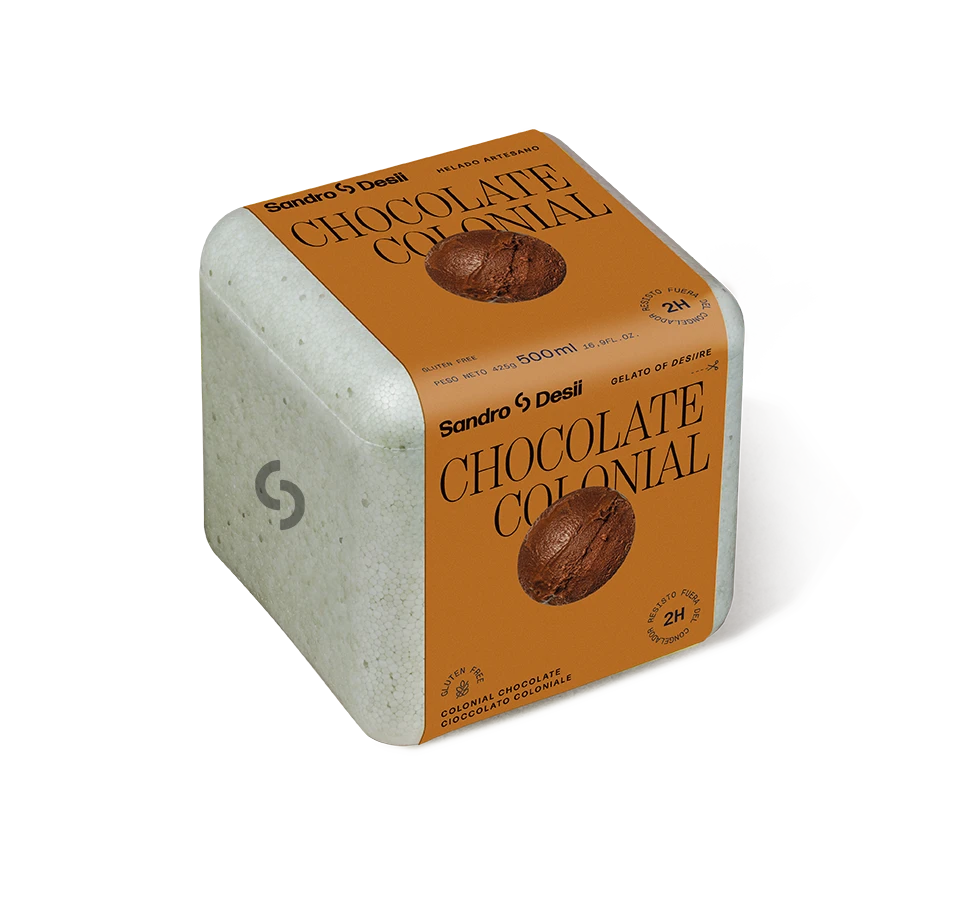
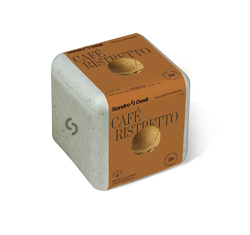
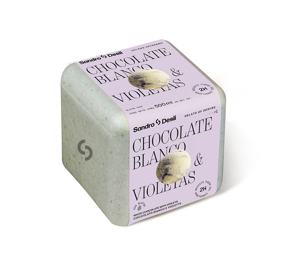
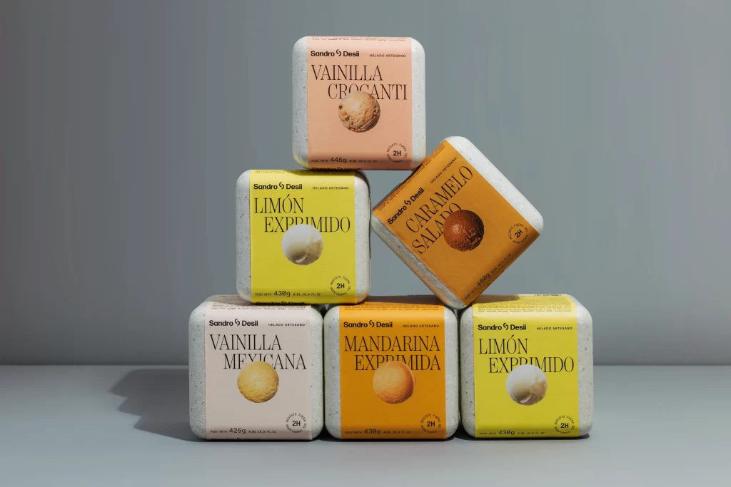
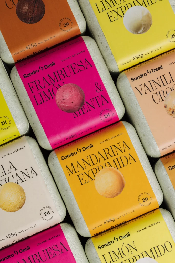
From a slightly elevated perspective, the frame captures a dense grid of rectangular gelato containers, each wrapped in a vibrant paper sleeve that contrasts sharply against the matte gray insulation of the underlying boxes. The color palette is aggressively saturated, featuring a hot magenta for the raspberry and mint flavor, a deep burnt orange for chocolate, and a bright citrus yellow for the lemon variant. Centered on each label is a realistic photographic scoop of the corresponding ice cream, while clean sans-serif typography displays the brand name 'Sandro Desii' alongside specific weights like 425g or 430g and artisanal production claims.
Visual hierarchy is established through the bold interplay between the vivid background hues and the stark black lettering, ensuring legibility while maintaining an energetic, modern aesthetic. The inclusion of a tangible, textured sphere of product on every package bridges the gap between graphic design and sensory expectation, making the abstract flavors feel immediate and edible. Designers seeking to study effective packaging layouts can access the full-resolution file at no cost to examine the precise typographic spacing and color balancing techniques used here.
Brand strategists and packaging engineers would utilize this composition to analyze how repetitive grid patterns can create a strong shelf presence through collective visual impact. Color theorists might reference the specific hex values of these sleeves to understand how high-chroma backgrounds influence consumer perception of food products. Art directors working on confectionery branding could deconstruct the placement of the 'Helado Artesano' seal to see how small textual elements integrate into a larger, busy design system without cluttering the primary message.