Sandro Desii Meringue Milkshake Carton
Topics
Details
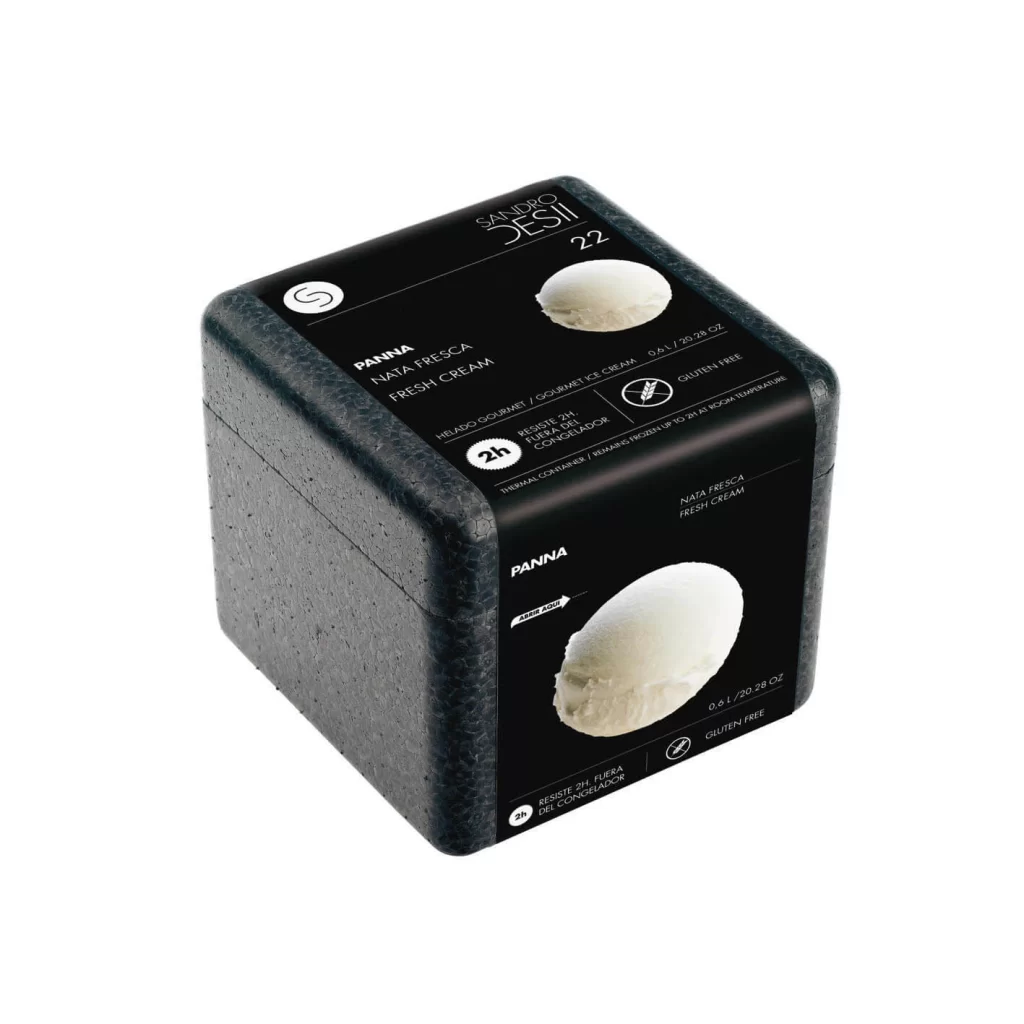
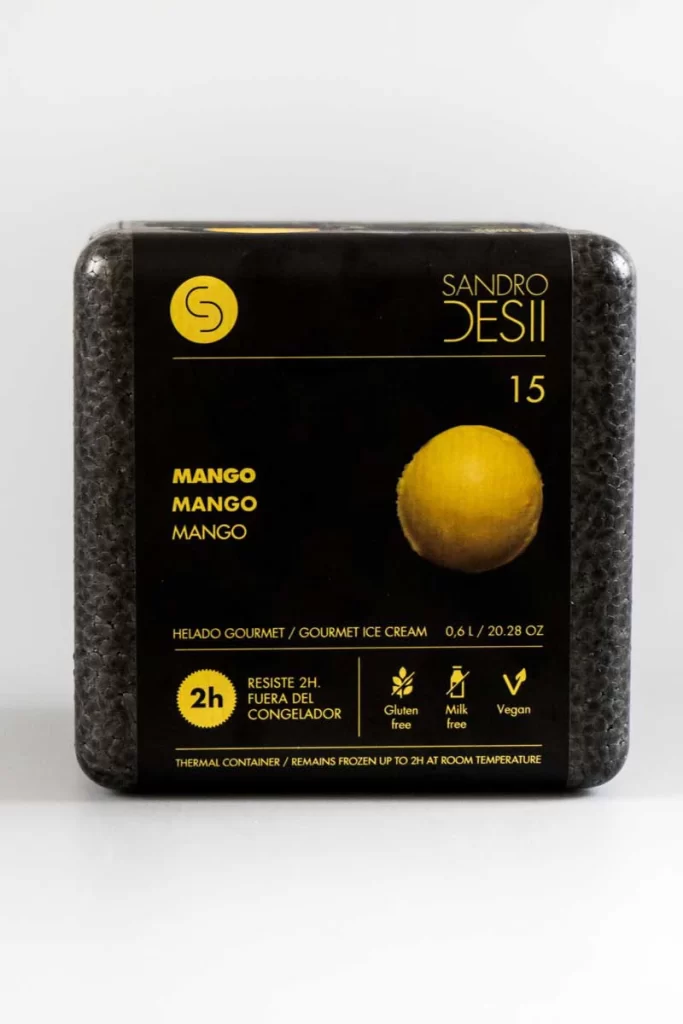
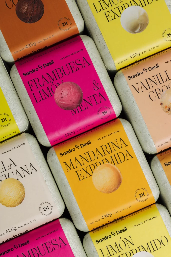
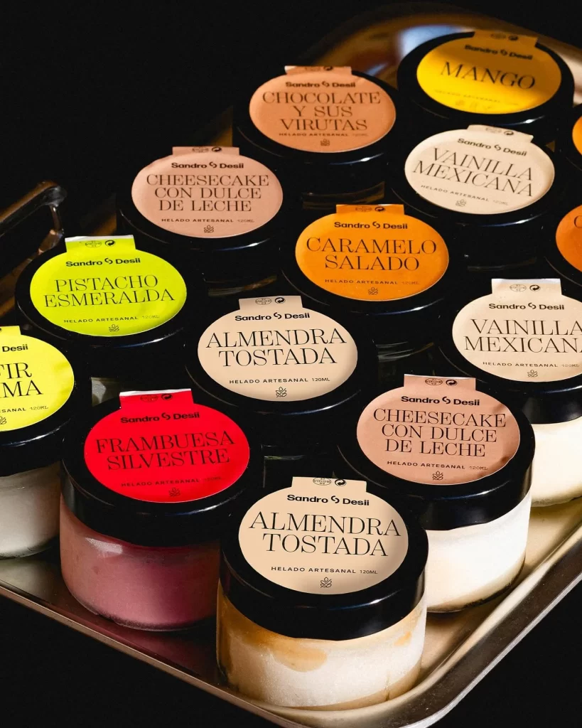
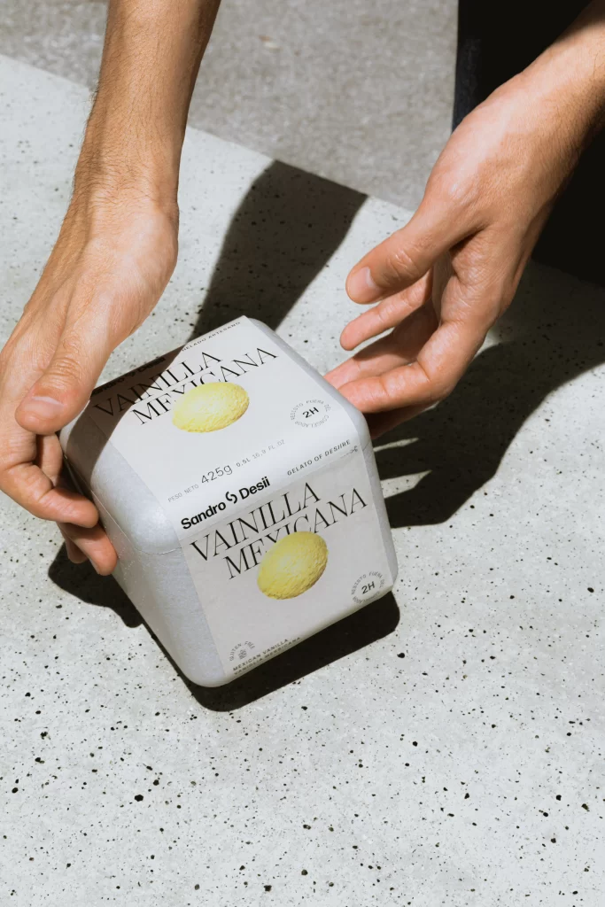
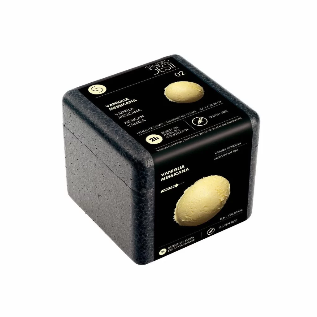
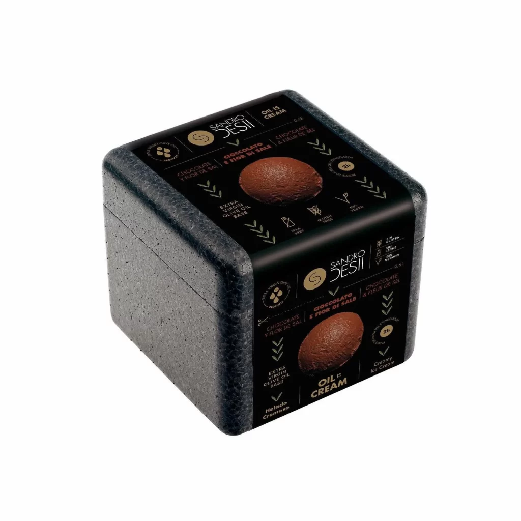
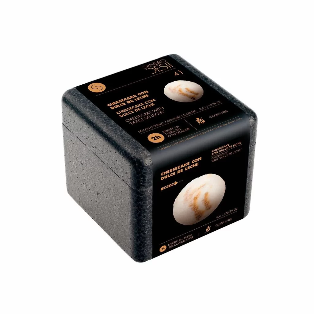
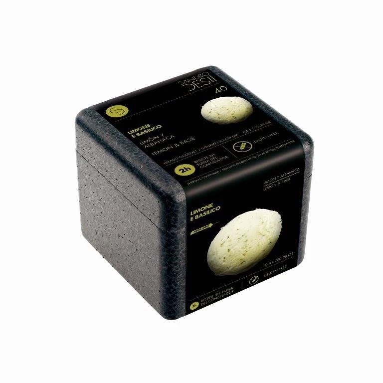
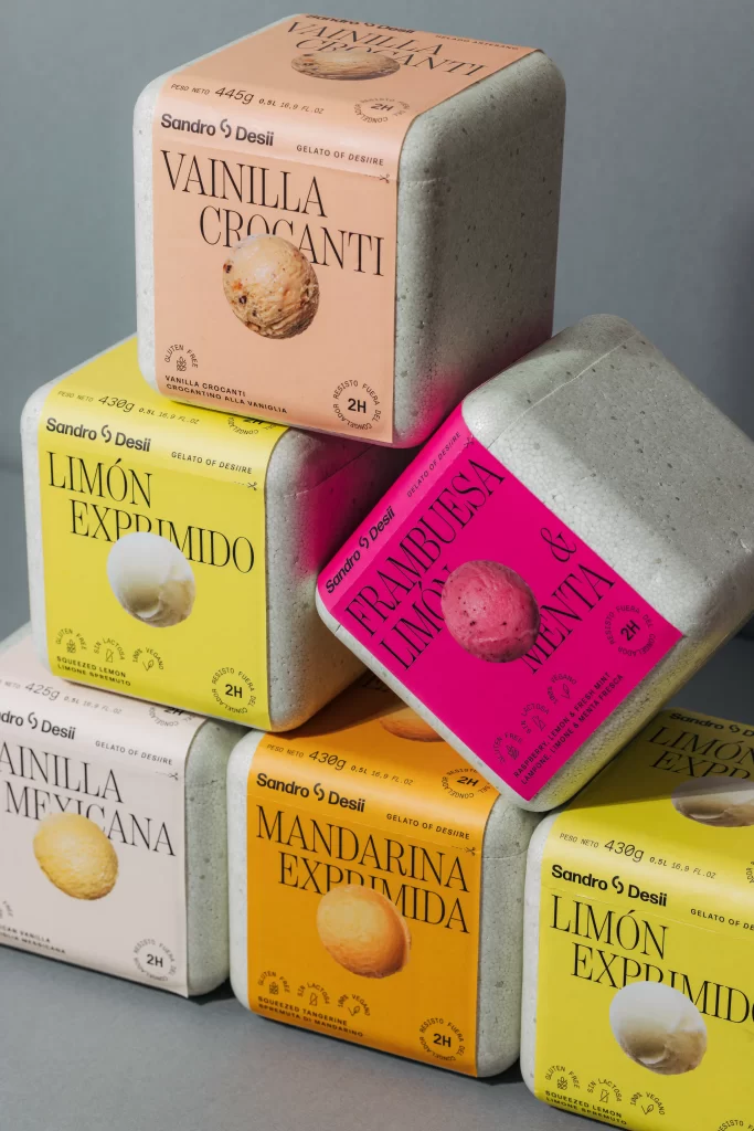
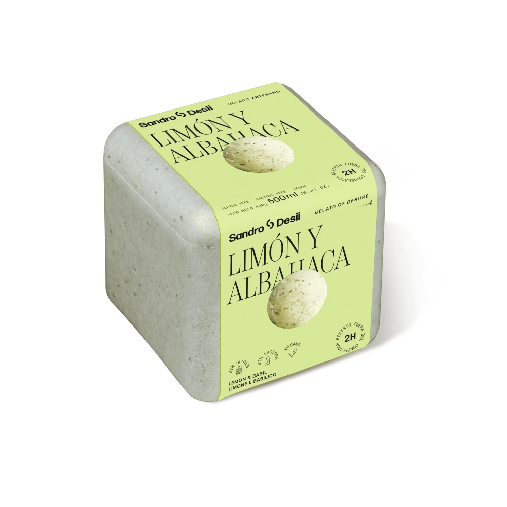
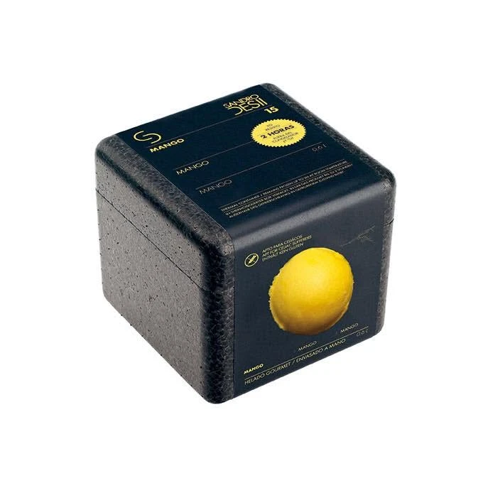
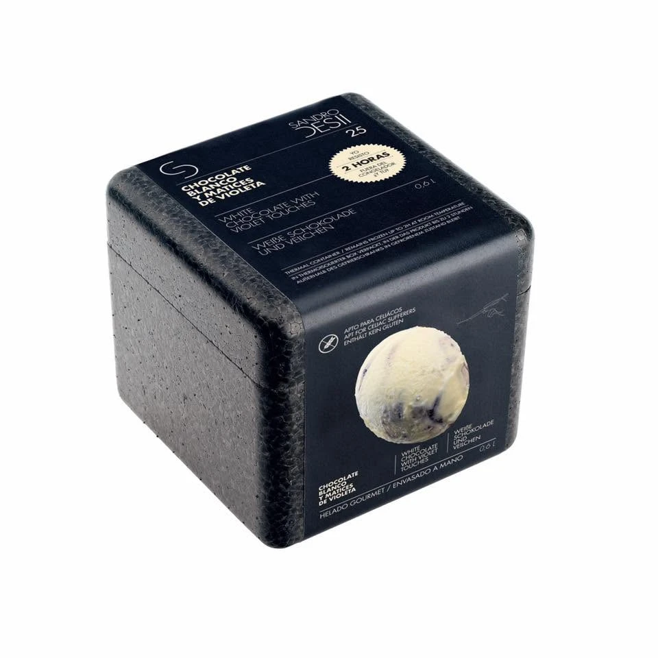
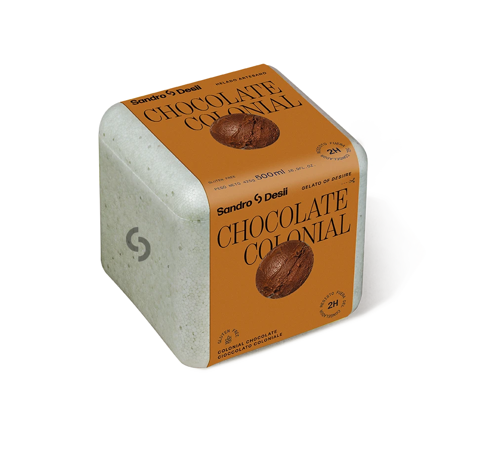
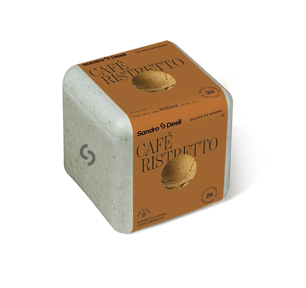
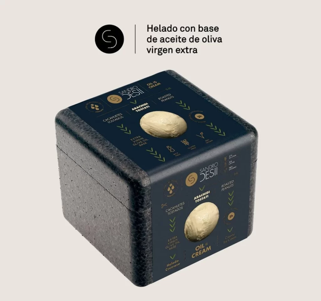
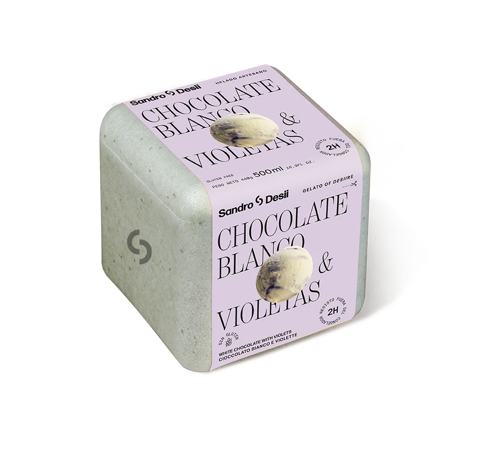
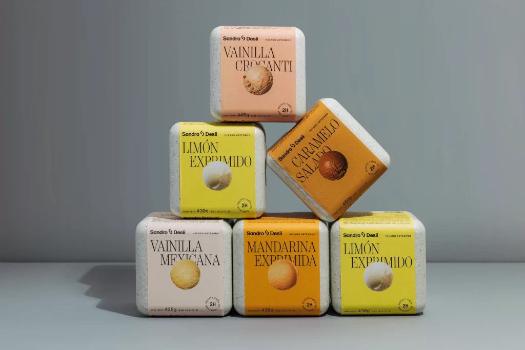
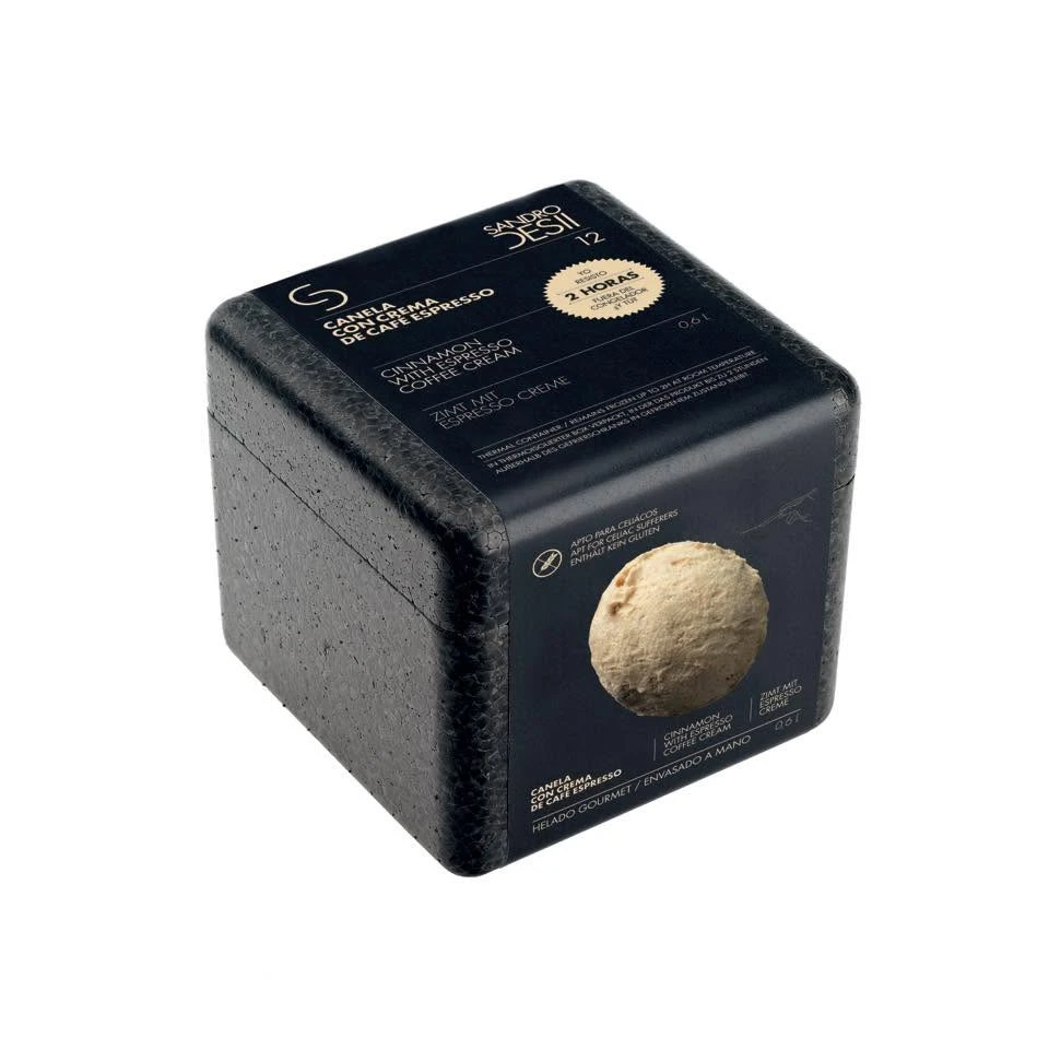
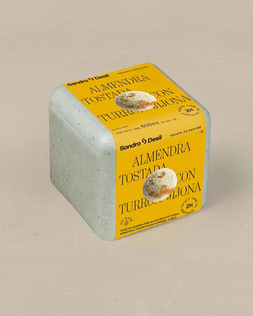
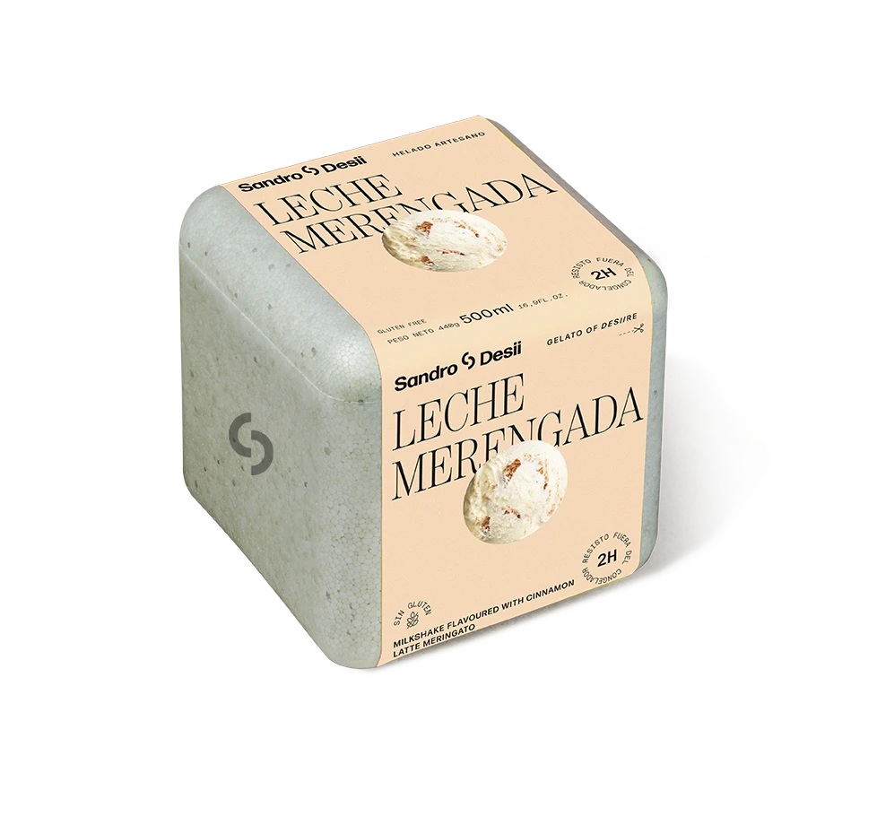
Positioned at a three-quarter angle against a seamless white void, the container presents a stark material dichotomy between its matte, speckled grey concrete-textured body and the warm peach label wrapping two visible faces. The typography employs a sophisticated hierarchy, with 'Sandro Desii' rendered in a bold sans-serif while 'LECHE MERENGADA' dominates in an elegant, high-contrast serif. Circular photographic insets of cinnamon-flecked ice cream punctuate the layout alongside technical specifications including 500ml volume, 469g net weight, and a 2H refrigeration indicator stamp.
Visual tension arises from the juxtaposition of industrial brutalist aesthetics with delicate artisanal gelato branding, creating a luxury positioning that feels simultaneously raw and refined. The concrete simulation features subtle tonal variations and pitting that suggest tactile weight, while the minimalist colour palette of peach, charcoal, and black ensures typographic legibility without visual clutter. Such material honesty in packaging design signals premium craftsmanship, distinguishing this product from conventional glossy ice cream containers through its architectural presence.
Brand strategists analyzing premium frozen dessert market positioning would examine this artifact to understand how texture communicates value propositions beyond flavour profiles. Packaging engineers might reference the structural geometry and sleeve-application technique when developing containers for temperature-sensitive artisanal goods. Retail merchandisers could study the dimensional proportions and label real estate allocation to optimize shelf presence for similar high-end dairy products.