Sandro Desii Fideu de Tinta de Calamar Box
Topics
Details
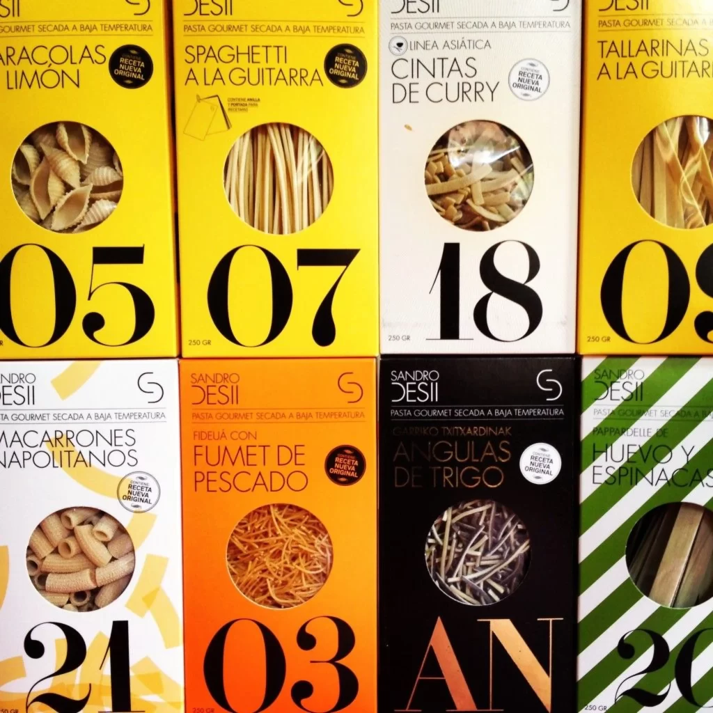
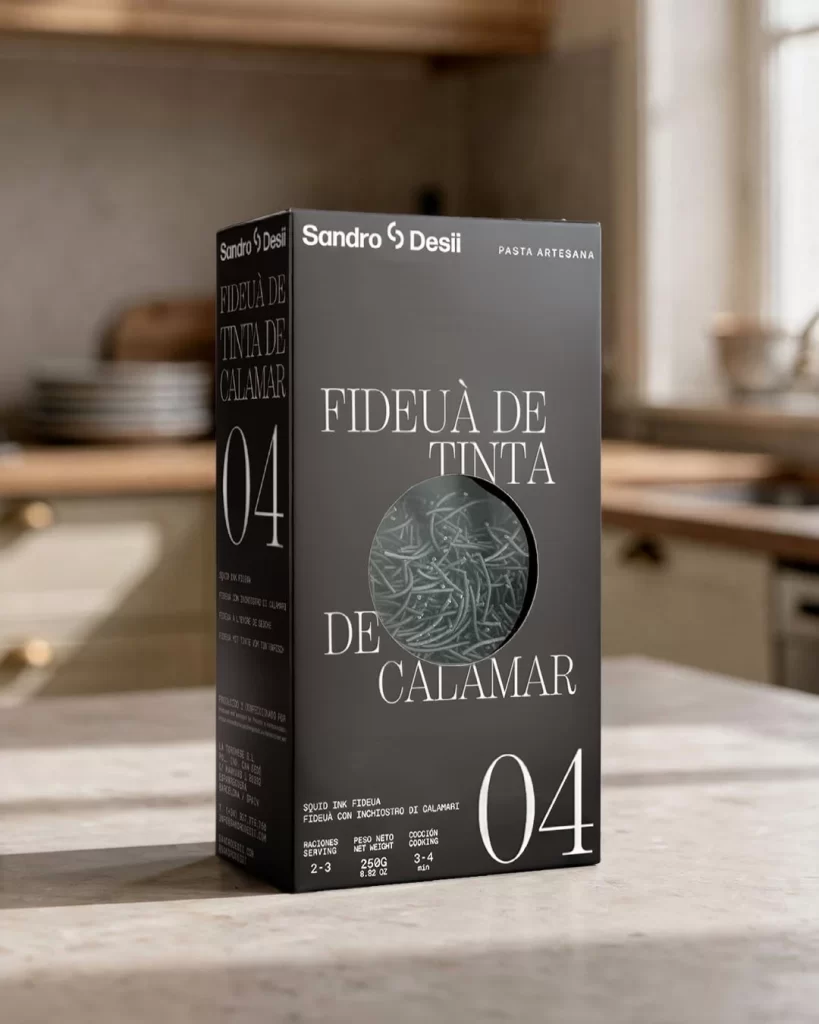
A matte black rectangular box stands upright on a light gray stone surface, displaying crisp white typography that reads 'Fideuà de Tinta de Calamar' alongside the number '04' in a bold serif font. A circular transparent window near the center reveals dark, ink-colored pasta strands inside, while the brand name 'Sandro Desil' appears at the top with 'Pasta Artesana' printed smaller to its right. Soft natural daylight streams from the right side of the frame, casting gentle shadows across the box and highlighting its clean geometric edges against a softly blurred kitchen background.
Visual distinction emerges from the sophisticated interplay between the deep charcoal substrate and the high-contrast white lettering, creating an almost architectural presence on shelf. The transparent porthole serves as both a functional verification tool and a textural focal point, allowing the irregular, squid-ink-coated strands to provide organic visual relief against the rigid geometric container. This particular iteration balances minimalism with artisanal cues through its restrained color palette and strategic use of negative space around the central product reveal.
Packaging designers studying premium food branding would examine this composition to understand how monochromatic schemes convey luxury without excessive ornamentation. Art directors planning photoshoots for gourmet pantry items might reference the lighting setup and shallow depth-of-field technique to achieve similar atmospheric product presentations. Typography enthusiasts could analyze the hierarchy established between the brand mark, descriptive nomenclature, and numerical coding system to inform their own label layout decisions.