Kita No Tegami Cracker Box Design
Topics
Details
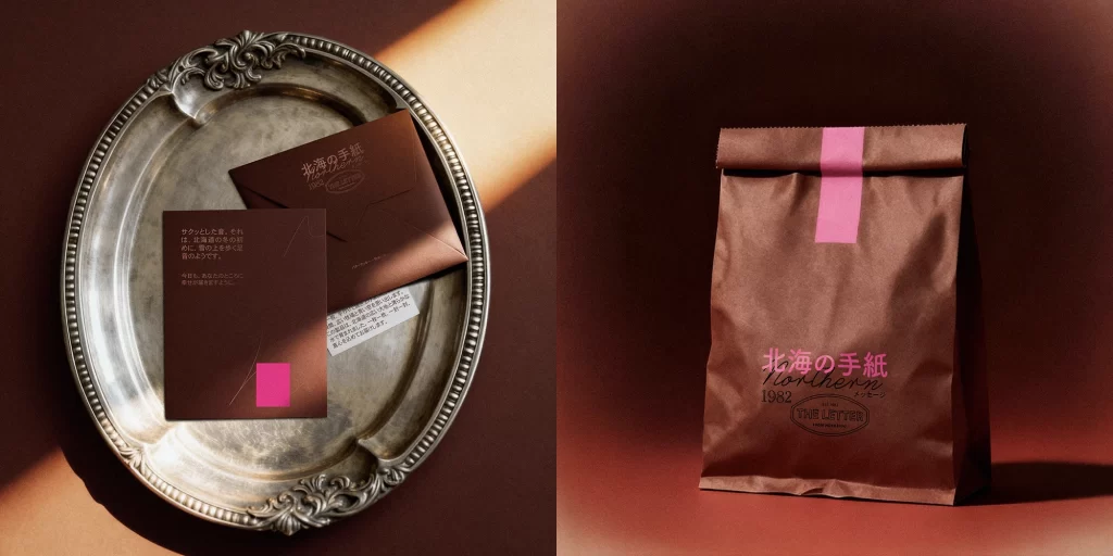
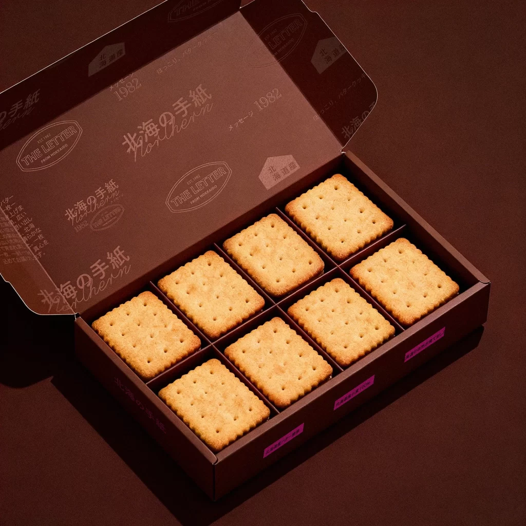
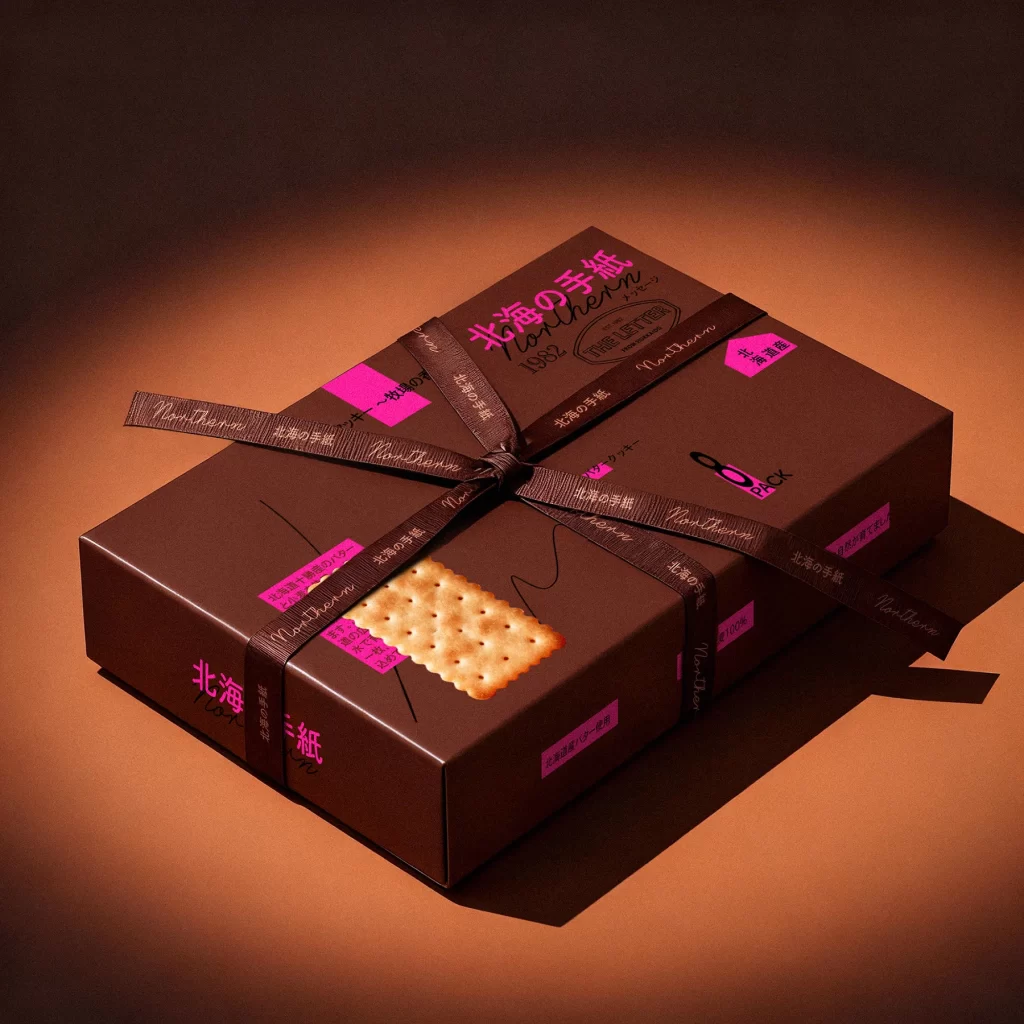
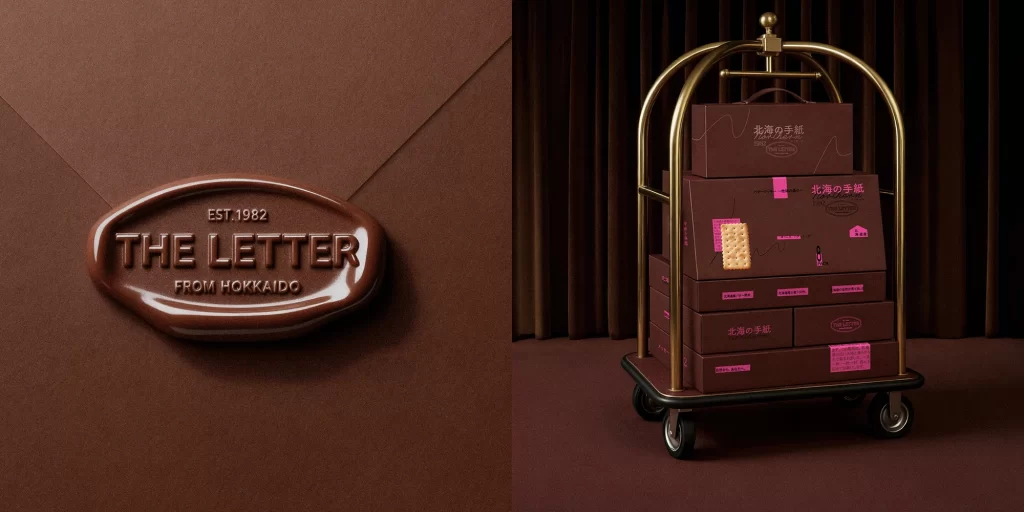
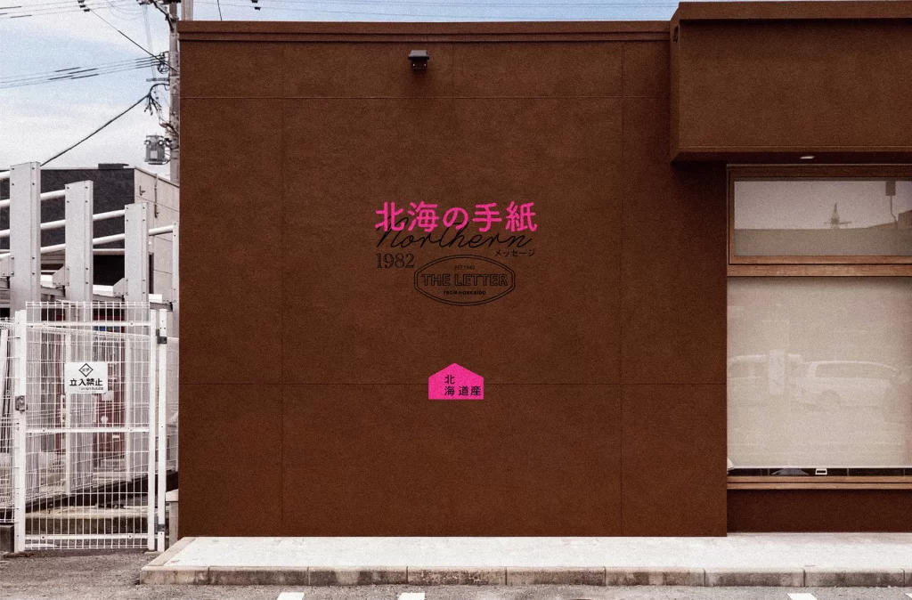
Three identical rectangular boxes sit in a horizontal row, each rendered in a deep matte chocolate brown that absorbs the ambient light. A single rectangular cracker with scalloped edges and a grid of small holes is centered on the lower half of every package, its pale golden hue creating a stark contrast against the dark substrate. Vibrant magenta typography dominates the upper portion with the Japanese characters '北海の手紙' (Northern Letter), while smaller pink labels contain additional product details and a house-shaped badge reading '北海道産' (Hokkaido Product). The composition employs a straight-on camera angle that emphasizes the flat, graphic quality of the packaging, with subtle drop shadows grounding the objects on a seamless background of matching brown tones.
Visual tension emerges from the unexpected juxtaposition of utilitarian snack packaging with the refined aesthetic of artisanal stationery or luxury correspondence. The choice of neon pink against the somber earthy base creates a contemporary pop-art sensibility that defies traditional food industry color palettes, suggesting instead a boutique editorial approach to commodity design. Hand-drawn squiggly lines beneath the cracker imagery introduce an organic, humanist element that softens the geometric rigidity of the box format, while the vertical Japanese text running along the left edge adds a sophisticated typographic rhythm reminiscent of traditional book spines.
Brand strategists developing premium regional products will find this composition particularly useful when exploring how heritage cues can be modernized through bold chromatic choices. Packaging engineers studying material finishes might analyze how the matte texture interacts with high-saturation accent colors to create perceived value without expensive printing techniques. Art directors working on culinary publications could reference this layout for feature spreads that treat everyday food items as collectible design objects, while retail environment designers might adapt the triptych arrangement for window displays requiring visual cohesion across multiple SKUs.