Kita No Tegami Cracker Box Detail
Topics
Details
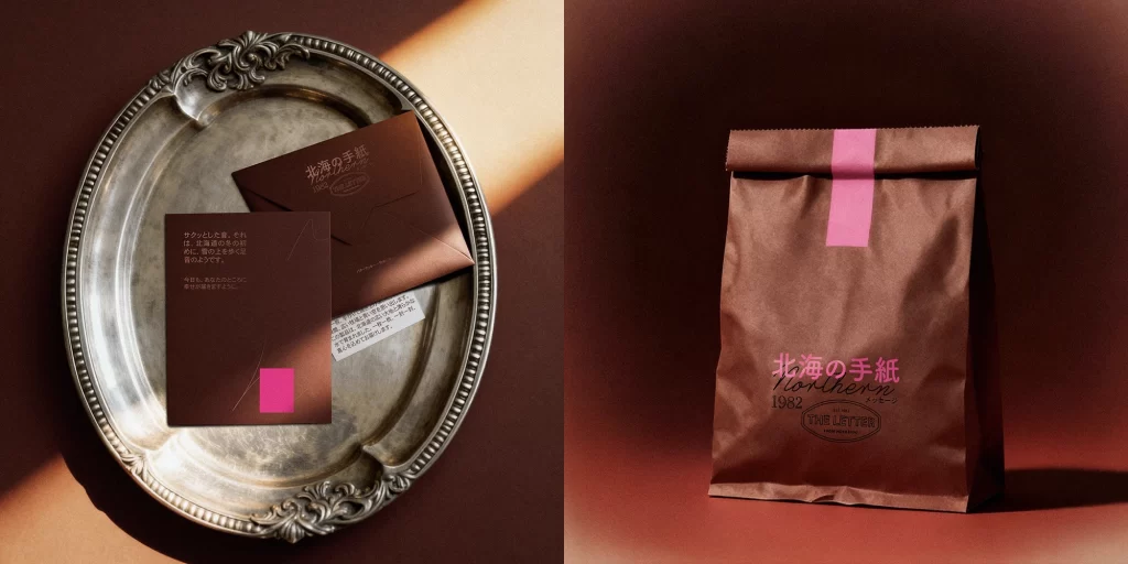
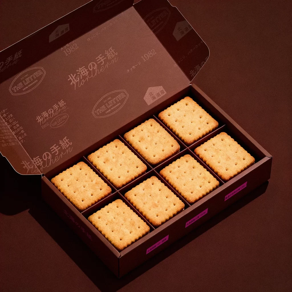
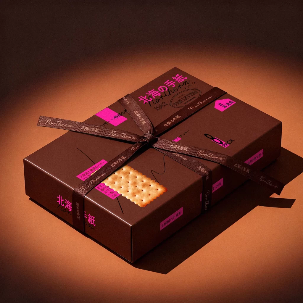
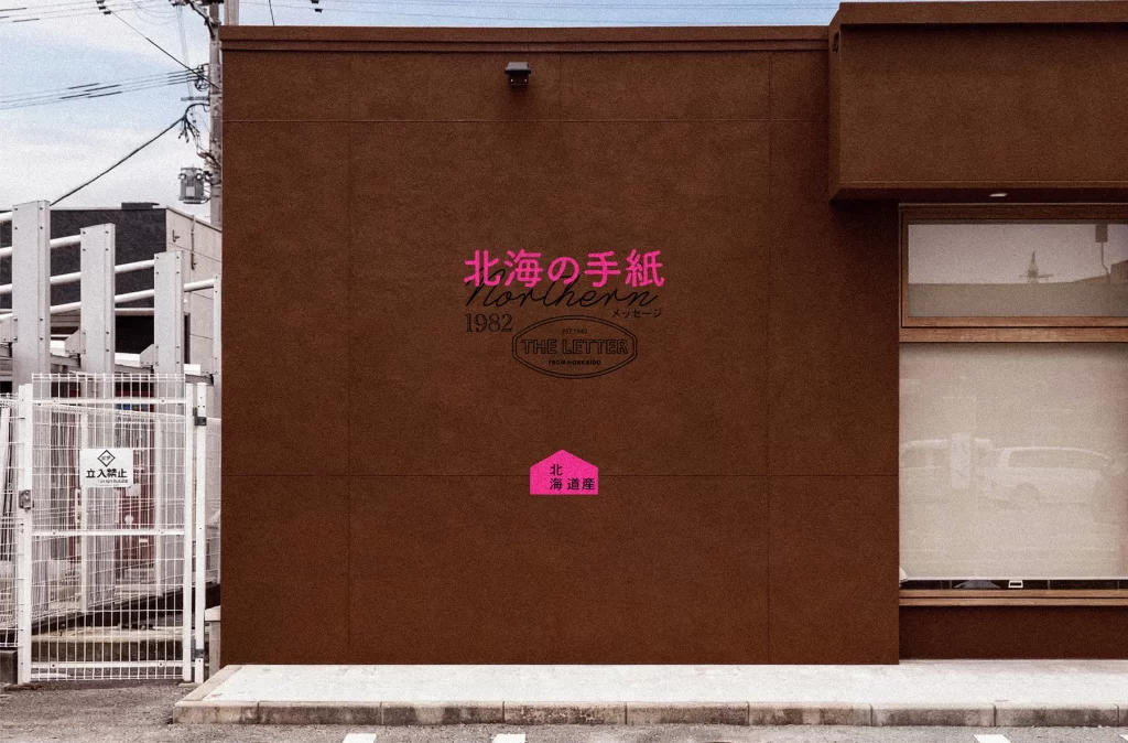
Set against a moody gradient of deep espresso and warm taupe, two rectangular cracker boxes in matte chocolate brown command the foreground. The packaging features a striking juxtaposition of elegant black cursive script and bold, neon magenta typography that spells out 'Northern' and '1982' alongside Japanese characters. A realistic image of a perforated rectangular biscuit is printed on the front of each box, while loose crackers rest on the dark surface below, illuminated by soft, directional light that casts gentle shadows to the right.
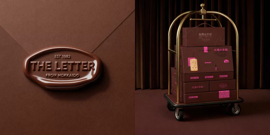
Visual tension arises from the unexpected collision of rustic, earthy tones with the synthetic vibrancy of the pink accents and tape elements. The layout mimics a collage aesthetic, layering fine line drawings, stamp-like seals, and varying font weights to create a sense of curated nostalgia. This specific iteration stands out due to its sophisticated balance between minimalist structure and maximalist color pops, offering a masterclass in modern Japanese package design that feels both artisanal and contemporary.
Art directors seeking to understand how to effectively pair neutral backgrounds with high-contrast accent colors will find this composition particularly instructive. Branding teams working on premium snack or beverage lines can study the typographic hierarchy here to see how multiple languages coexist without clutter. Furthermore, photographers looking to replicate this atmospheric mood for product shoots should note the interplay between the tangible texture of the cardboard and the smooth glass held by the hand entering from the right edge.