Kita No Tegami Chocolate Box
Topics
Details
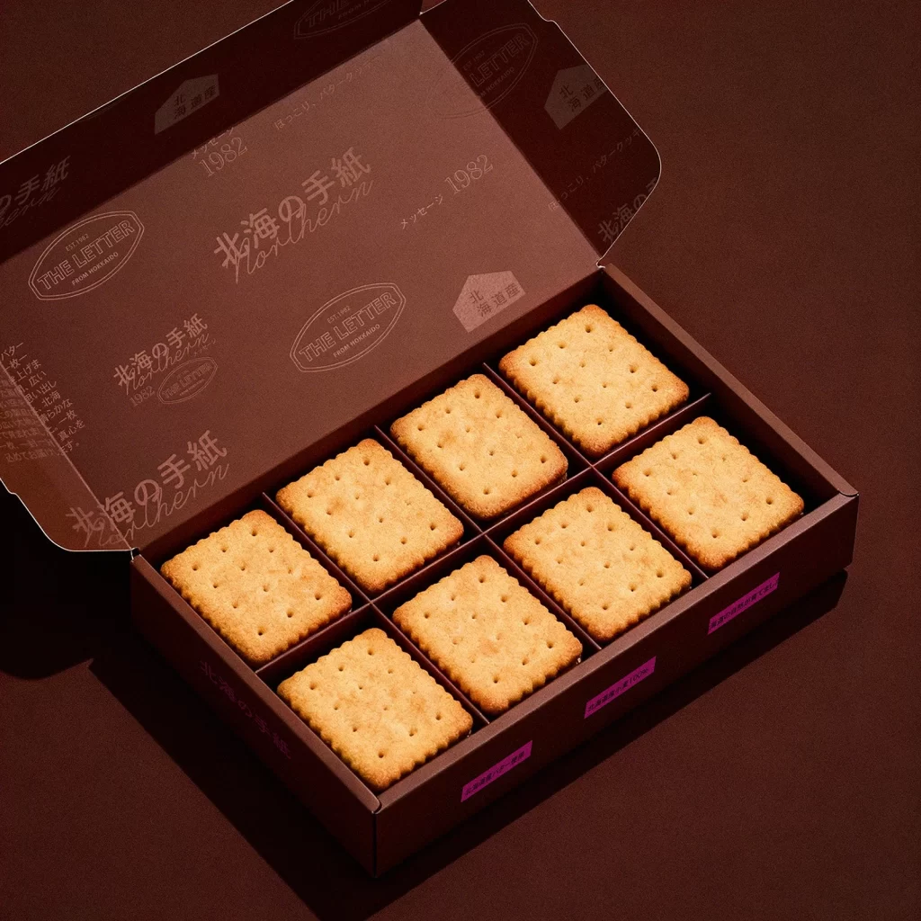
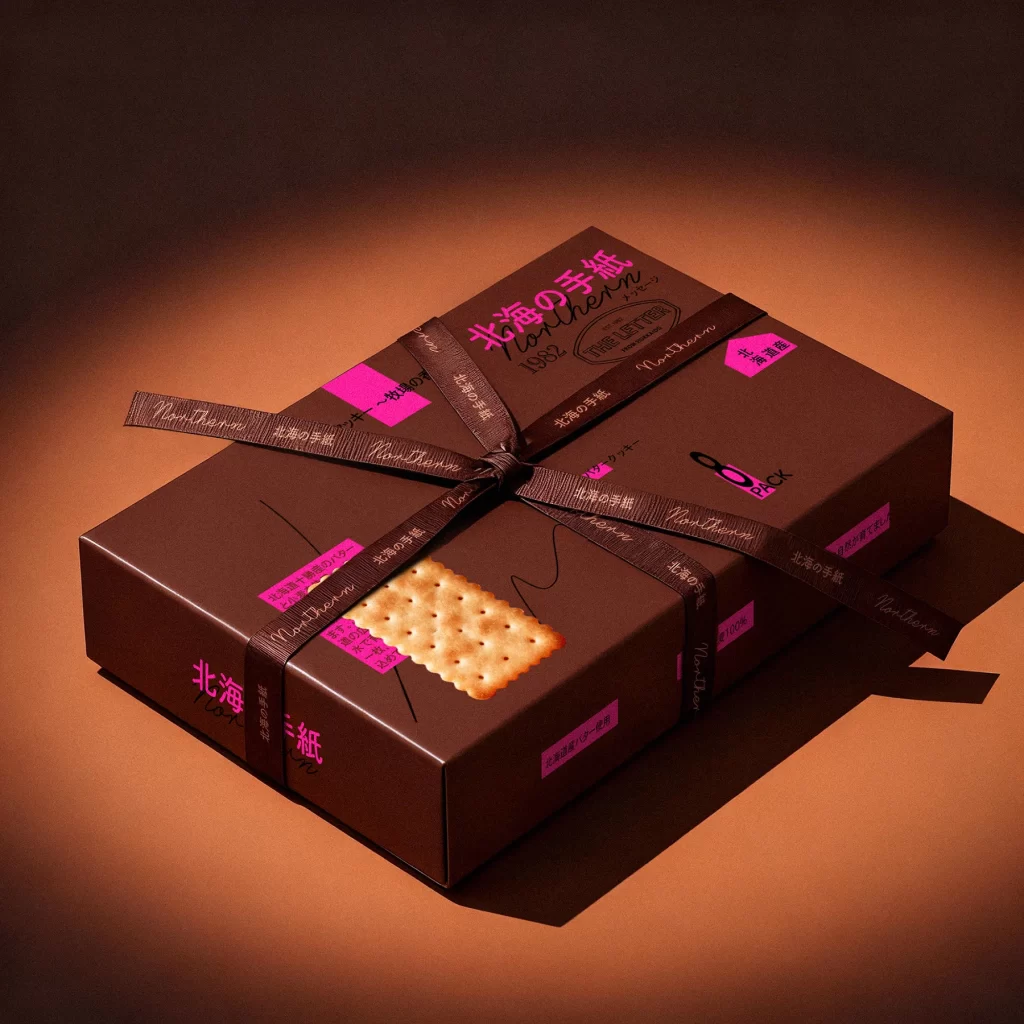
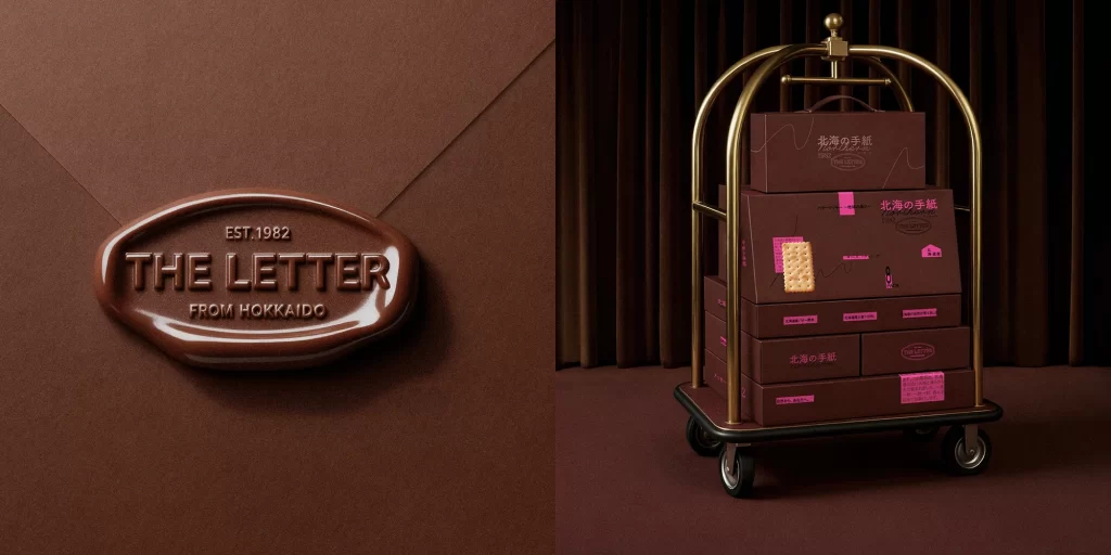
Deep chocolate browns dominate the composition, creating a monochromatic environment where a brass luggage cart stands against heavy velvet curtains and geometric wall panels. On the left, an oversized, glossy wax seal floats in three-dimensional space, embossed with 'EST. 1982 THE LETTER FROM HOKKAIDO' in raised serif typography. To the right, the cart carries a stack of rectangular gift boxes in matching dark cocoa tones, each decorated with vibrant magenta labels featuring Japanese characters and a realistic cracker illustration.
Visual tension arises from the juxtaposition of industrial hotel hardware against delicate confectionery packaging, while the unexpected neon pink accents disrupt the otherwise somber palette. The wax seal motif cleverly bridges traditional correspondence aesthetics with modern luxury food branding, suggesting authenticity through its tactile, liquid-like surface finish. Lighting emphasizes the reflective qualities of both the metallic cart frame and the seal's glossy curvature, establishing a clear hierarchy between the brand mark and the product display.
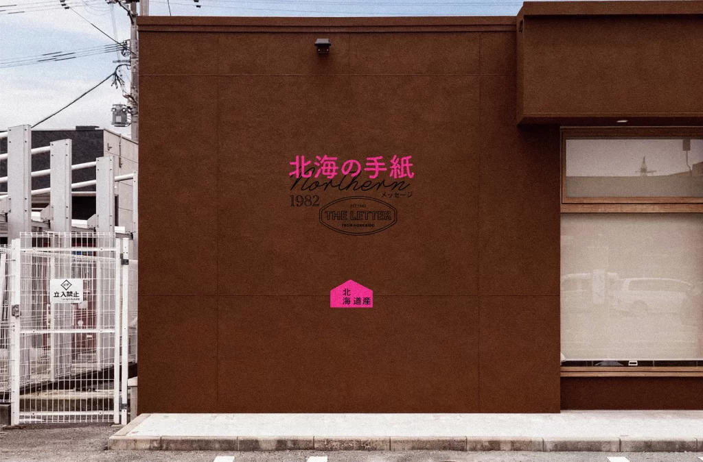
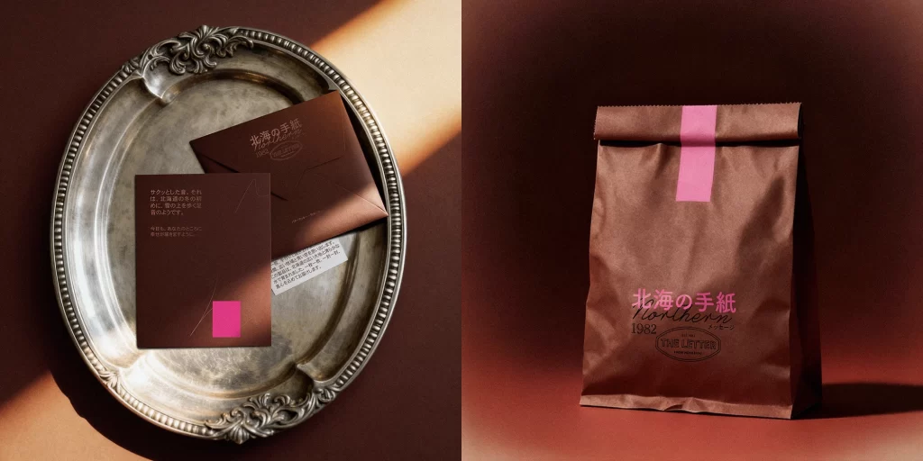
Brand identity designers studying premium food packaging will find value in analyzing how limited accent colors can elevate minimalist box designs without overwhelming the primary palette. Art directors planning luxury product photography sessions could reference this setup for balancing props with negative space in editorial compositions. Packaging engineers might examine the structural layout of stacked boxes to understand how varying label placements maintain visual rhythm across multiple SKUs.