Kita No Tegami Cracker Box Lineup
Topics
Details
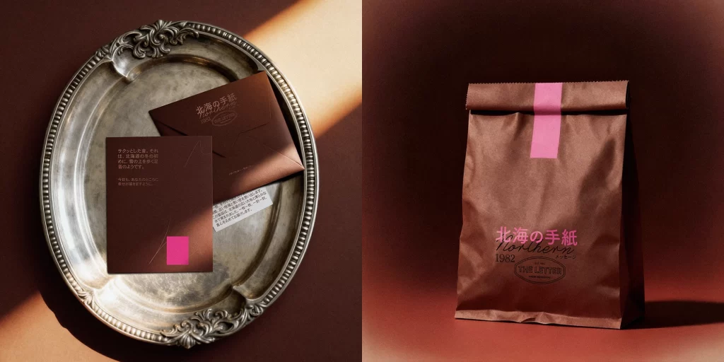
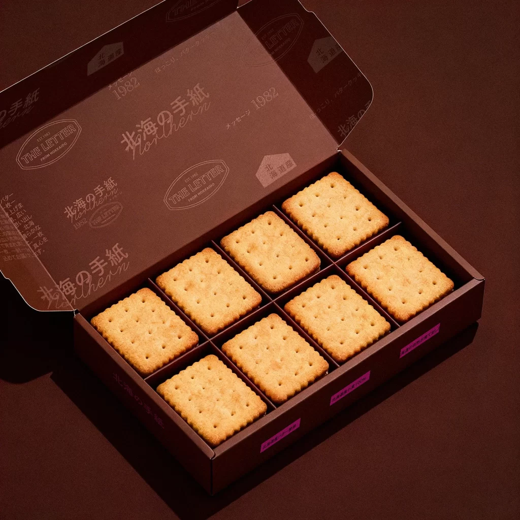
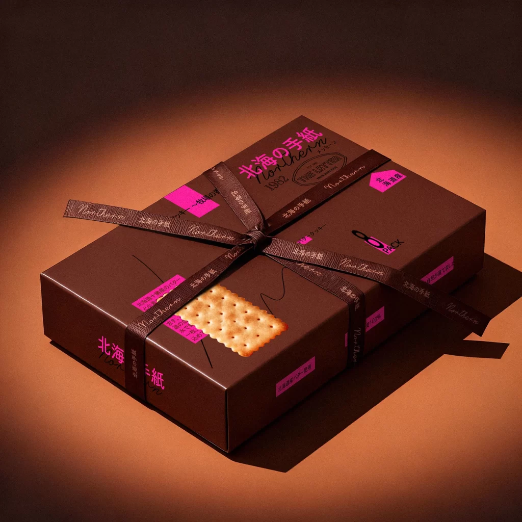
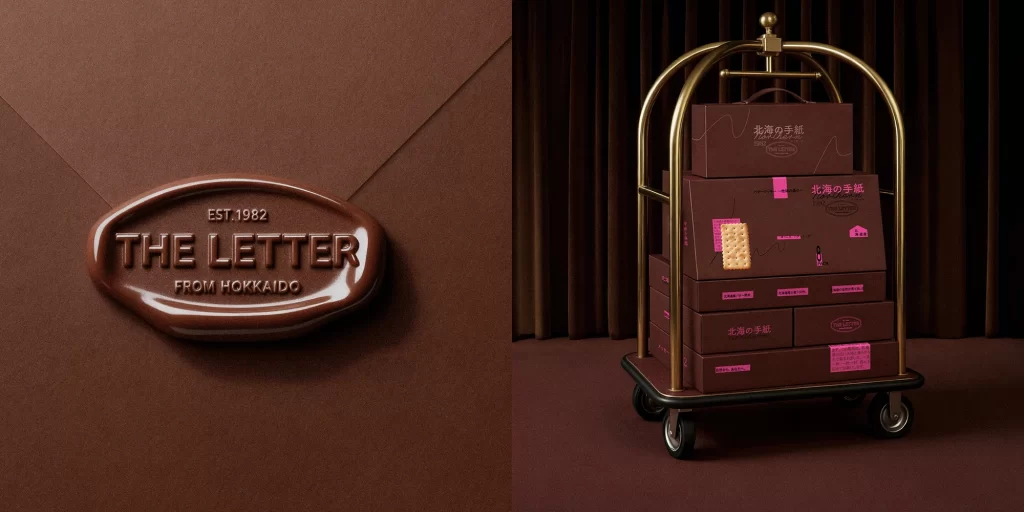
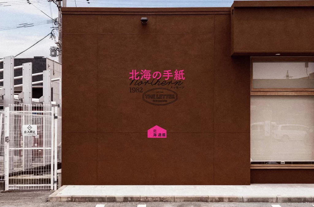
Against a gradient background shifting from warm terracotta to deep burgundy, a matte chocolate-brown rectangular box sits centered on a dark crimson surface. Three rectangular crackers with scalloped edges and uniform perforations float above and rest upon the packaging, their golden-tan surfaces catching soft directional light from the upper left. The box features vibrant magenta typography displaying '北海の手紙' (Northern Letter) alongside '1982' and 'THE LETTER FROM HOKKAIDO', with additional pink labels indicating '8 PACK' and '北海道産' (Hokkaido Product) scattered across the front panel.
Visual tension emerges from the juxtaposition of organic, irregular cracker placement against the rigid geometric precision of the box's grid-based layout. The high-contrast neon pink accents against the muted earth-tone substrate create immediate focal points while maintaining sophisticated restraint through limited color application. Subtle line-art illustrations and varied typographic weights—ranging from bold sans-serif to elegant script—establish hierarchical clarity without overwhelming the product photography.
Packaging designers studying Japanese confectionery branding will find value in analyzing the balance between traditional craftsmanship cues and contemporary graphic elements. Art directors planning food photography campaigns can reference the lighting setup that emphasizes texture gradients on baked goods while preserving legible surface graphics. Brand strategists developing regional origin narratives might examine how geographic indicators integrate seamlessly with premium positioning signals.