Cyrillic Gin Bottle Pair Design
Topics
Details
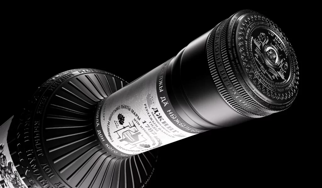
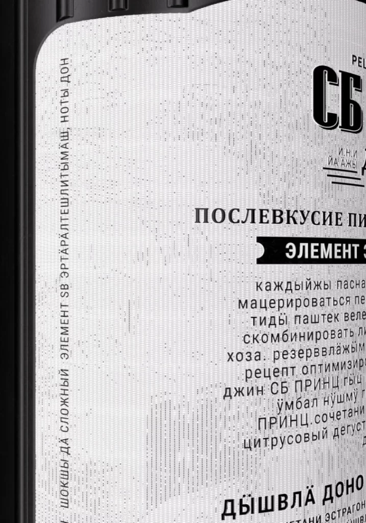
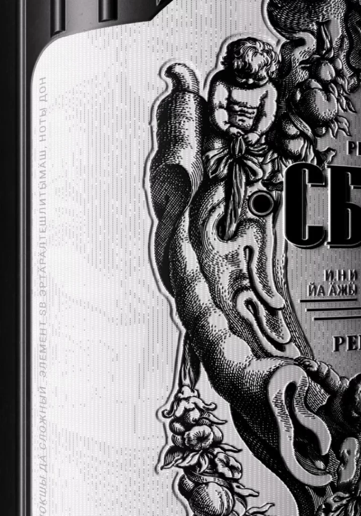
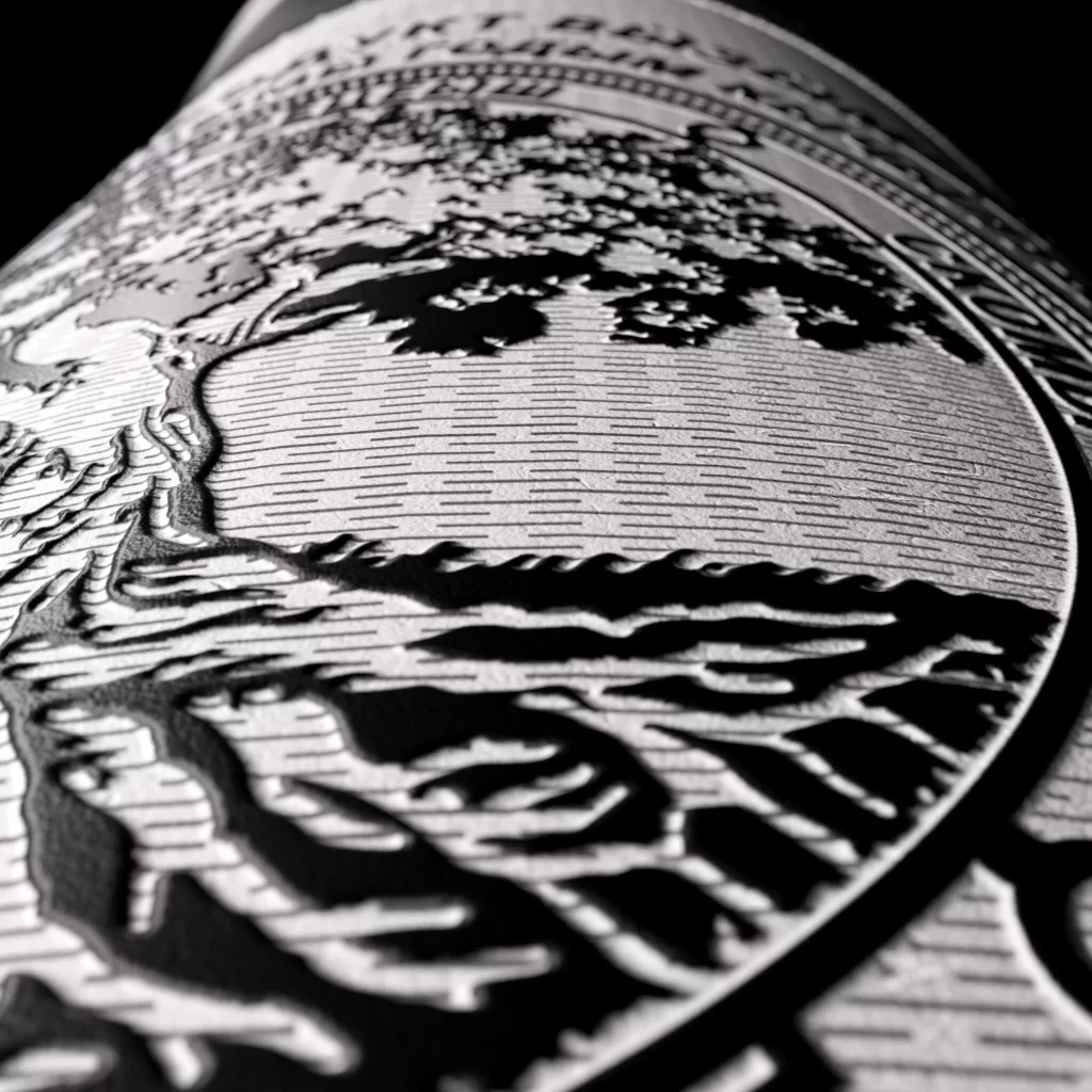
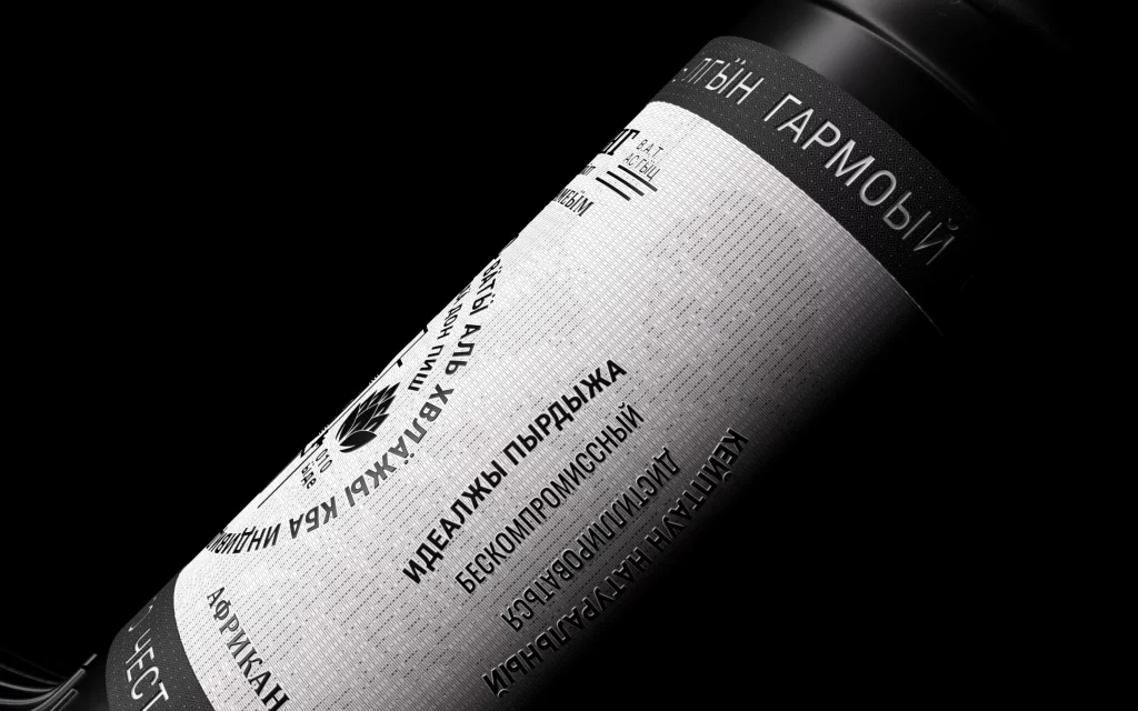
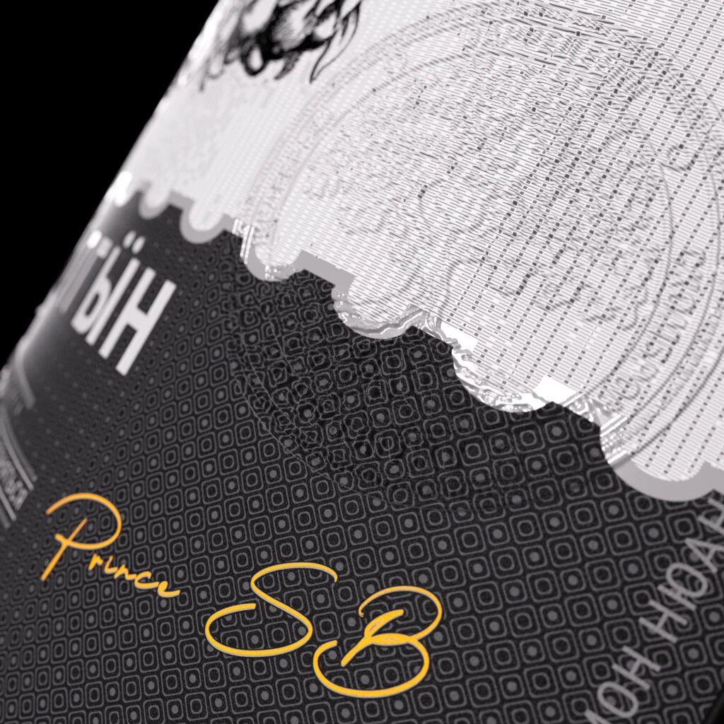
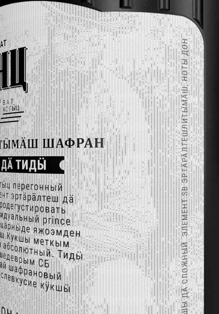
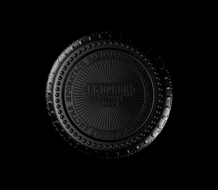
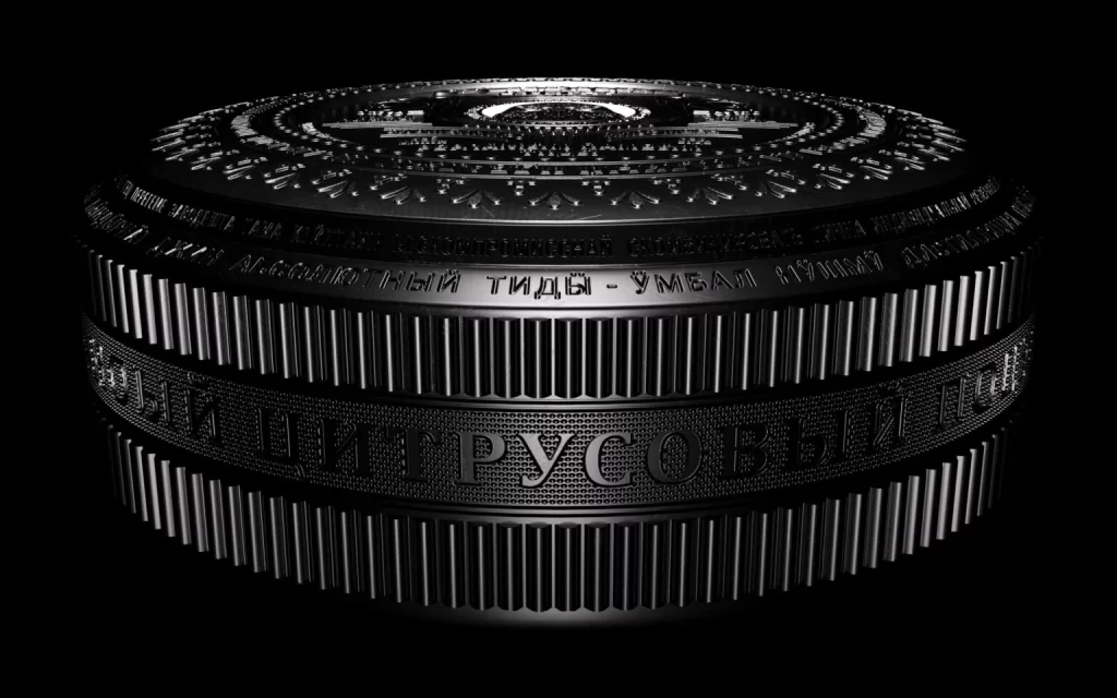
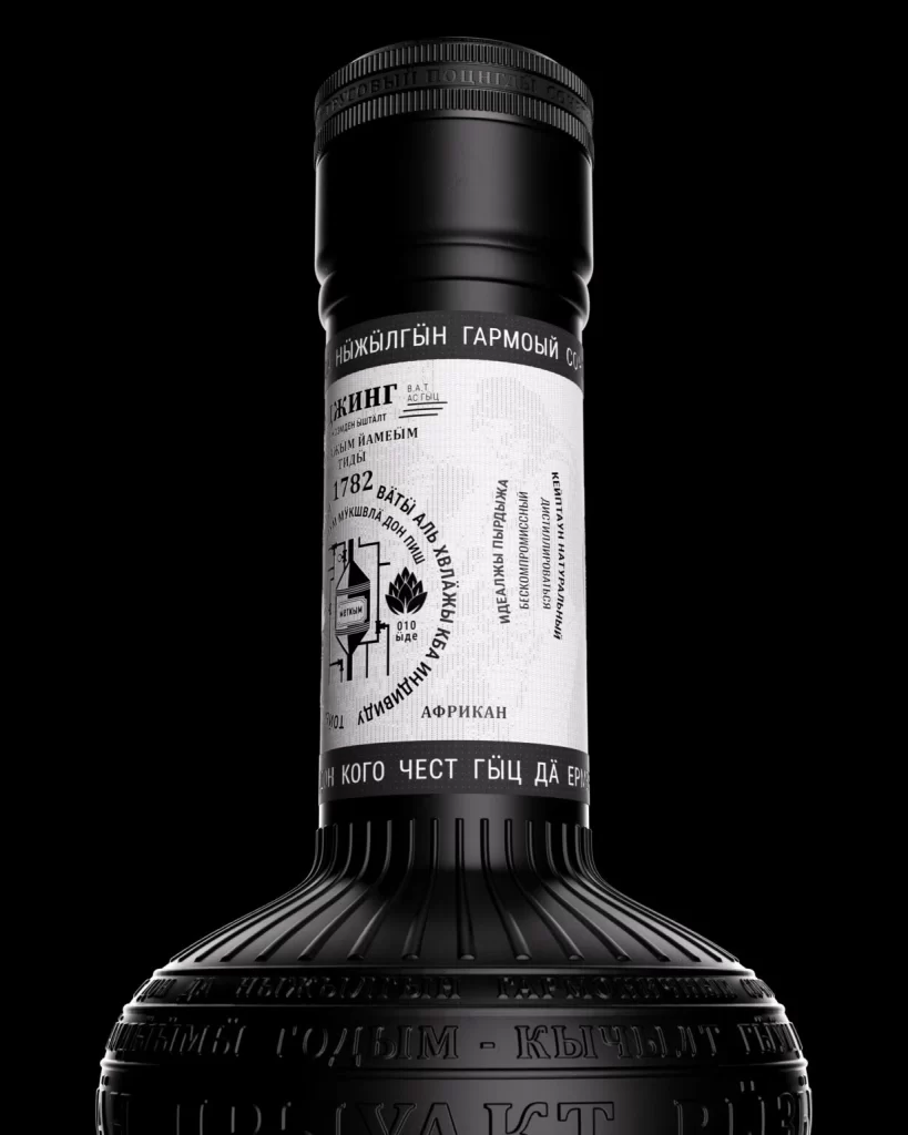
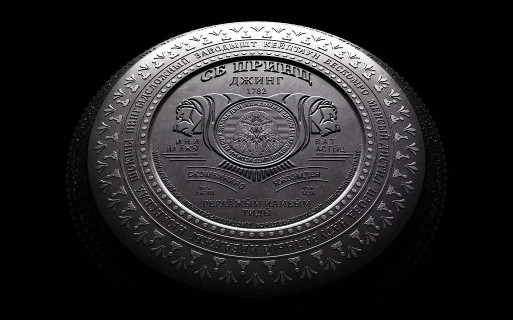
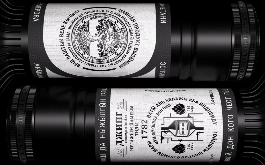
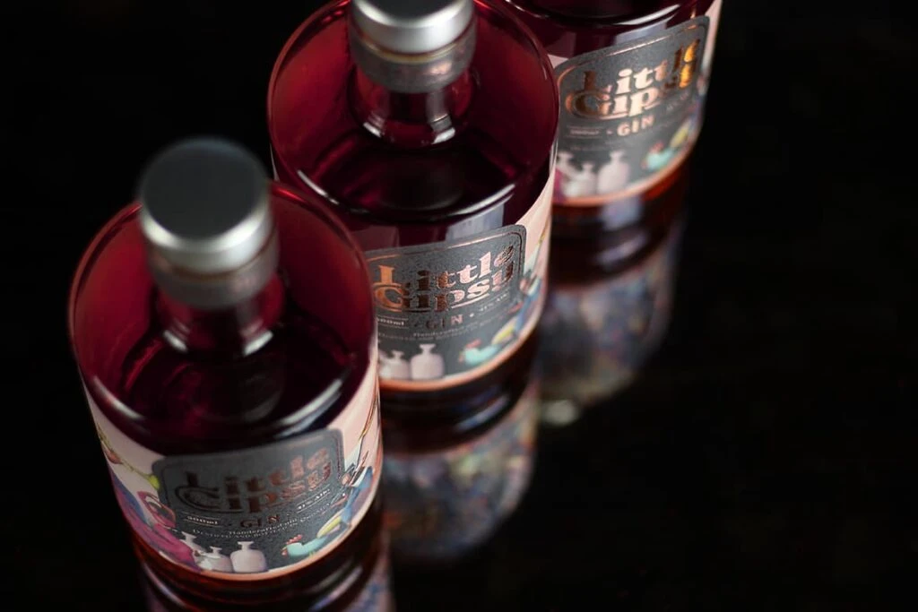
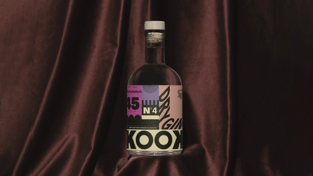
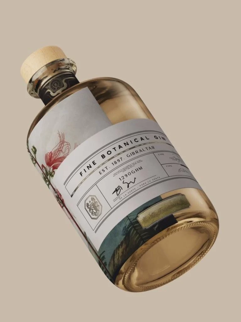
Monochromatic tones dominate the frame, presenting two cylindrical containers arranged in a tight diagonal composition that emphasizes the foreground vessel. The labels feature bold, embossed Cyrillic typography—specifically the prominent 'СЪ ПРИНЦ' and 'ДЖИНГ' lettering—set against a subtly textured paper surface with fine horizontal striations. Soft directional lighting from the upper left casts gentle shadows across the curved forms, creating a tactile, three-dimensional quality that highlights the raised ink and metallic sheen of the text elements.
Visual hierarchy emerges through dramatic scale contrasts between the oversized display type and smaller supporting copy, establishing a clear reading order despite the foreign language barrier. The interplay of matte label finishes against glossy bottle surfaces creates sophisticated material juxtapositions, while the shallow depth of field isolates the primary subject with professional precision. Such typographic density and dimensional lettering effects demonstrate advanced packaging techniques that balance ornamental flair with functional legibility.
Packaging designers studying vintage European aesthetics will find valuable lessons in the typographic weight distribution and spatial organization demonstrated here. Art directors developing beverage branding concepts can analyze how embossed elements interact with flat printing to create premium perceived value. Students of industrial design might examine the cylindrical labeling constraints and how text wraps around curved surfaces without losing impact or readability.