Prince Gold Vintage Vodka Label
Topics
Details
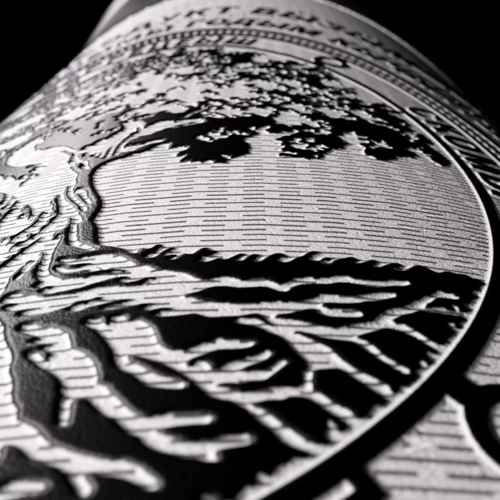
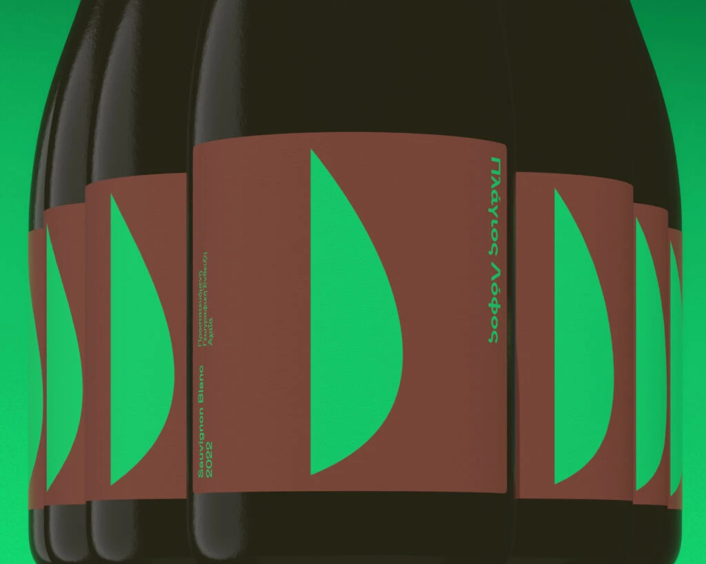
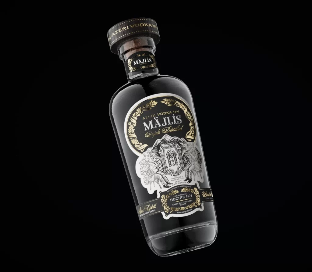
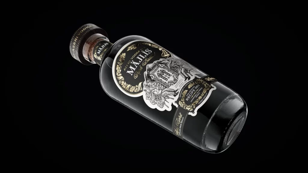
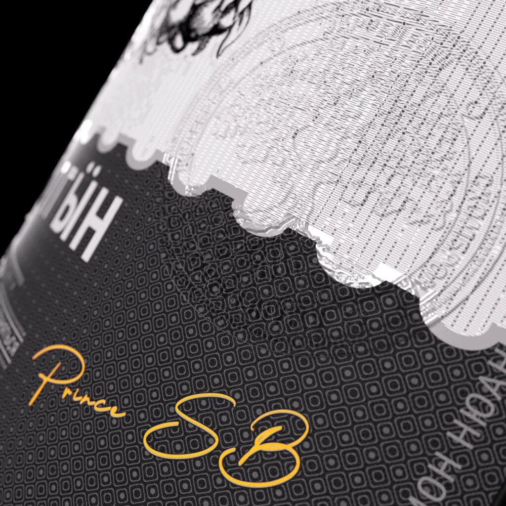
A close-up, angled shot reveals a sophisticated wine label where deep black and crisp white sections meet along a jagged, torn-paper edge. The dark lower portion features a subtle geometric dot pattern and displays the name 'Prince SB' in an elegant, flowing golden script. Above this textured divide, the upper silver-white area is covered in fine concentric circular lines resembling a vinyl record or security watermark, with partial white lettering visible on both sides against a pure black background.
What truly sets this design apart is the clever interplay between the rough, organic tear separating the two color fields and the precise, technical patterns within each zone. The warm metallic signature provides a luxurious focal point that contrasts beautifully with the cool monochrome palette and industrial textures. This combination of handwritten elegance with structured, almost architectural graphic elements creates a memorable visual tension that feels both modern and classic.
Packaging designers studying premium beverage branding would find this particularly useful for understanding how to balance typography with complex background textures. Art directors working on luxury goods could reference the way metallic accents pop against dark, patterned surfaces without overwhelming the composition. Anyone developing identity systems for high-end products might study how the torn edge effect adds tactile interest and breaks up rigid geometric layouts.