NANAR Vodka Packaging G
Topics
Details
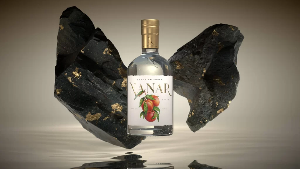
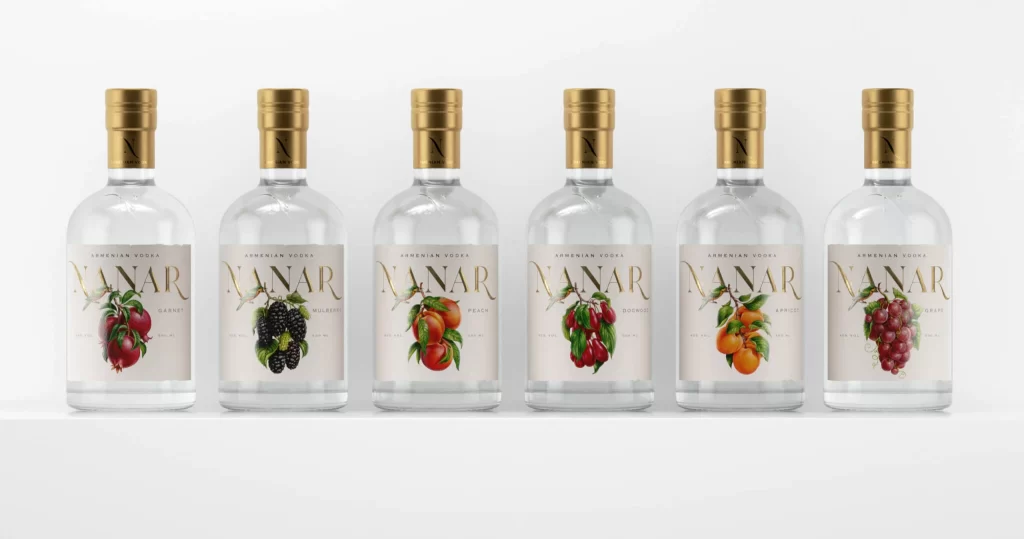
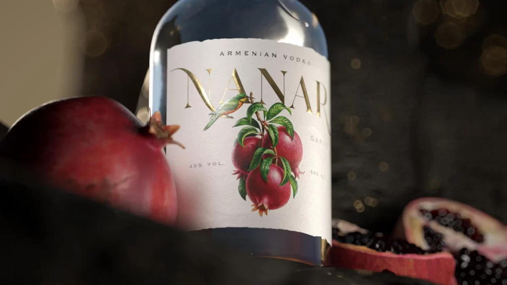
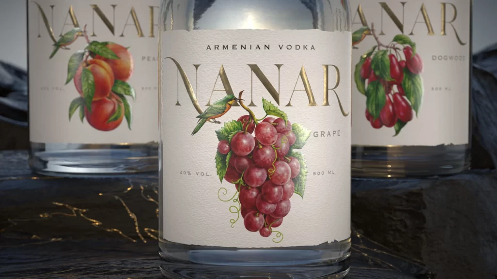
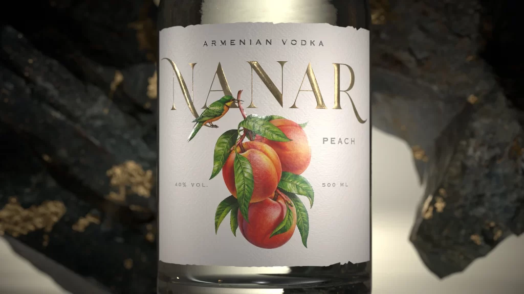
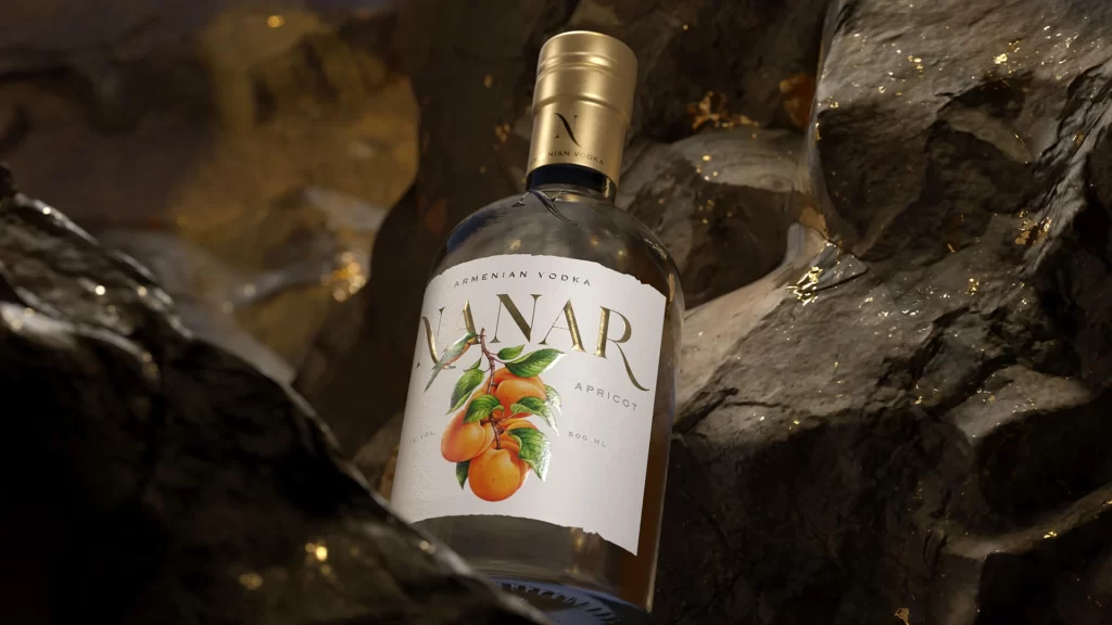
Nestled within a craggy, dark grey rock formation, a clear glass bottle of NANAR Armenian Vodka commands the viewer's attention with its elegant white label and gleaming gold cap. The label features the brand name 'NANAR' in large, sophisticated gold serif lettering, positioned above a vibrant botanical illustration of ripe orange apricots hanging from green branches. Warm, directional lighting catches the metallic flecks embedded in the rough stone background, creating subtle golden highlights that complement the bottle's premium aesthetic while casting soft shadows across the textured surface.
What sets this packaging apart is the striking contrast between organic, natural elements and refined luxury details, creating a visual narrative that feels both artisanal and high-end. The choice to feature realistic fruit illustration rather than abstract graphics immediately communicates the apricot flavor profile while maintaining an upscale, almost gallery-worthy presentation. This particular composition demonstrates how product photography can transform simple packaging into a lifestyle statement by integrating the bottle into a dramatic, elemental environment that suggests depth and authenticity.
Brand strategists crafting premium spirit identities would find this reference invaluable for studying how color palettes—specifically the interplay between warm golds, crisp whites, and earthy oranges—evoke specific market positioning. Art directors planning editorial shoots for beverage clients could analyze the lighting techniques used here to make glass surfaces pop against complex textural backgrounds without losing legibility. Packaging designers working on fruit-infused liquors might study the balance between typographic hierarchy and illustrative elements to ensure flavor communication remains clear while preserving an air of sophistication.