Esophy Vodka Packaging
Topics
Details
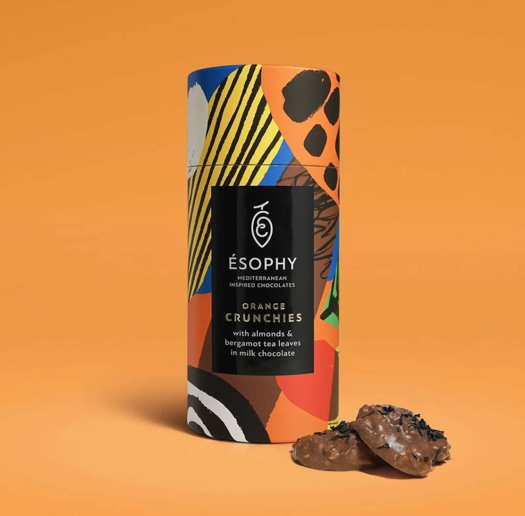
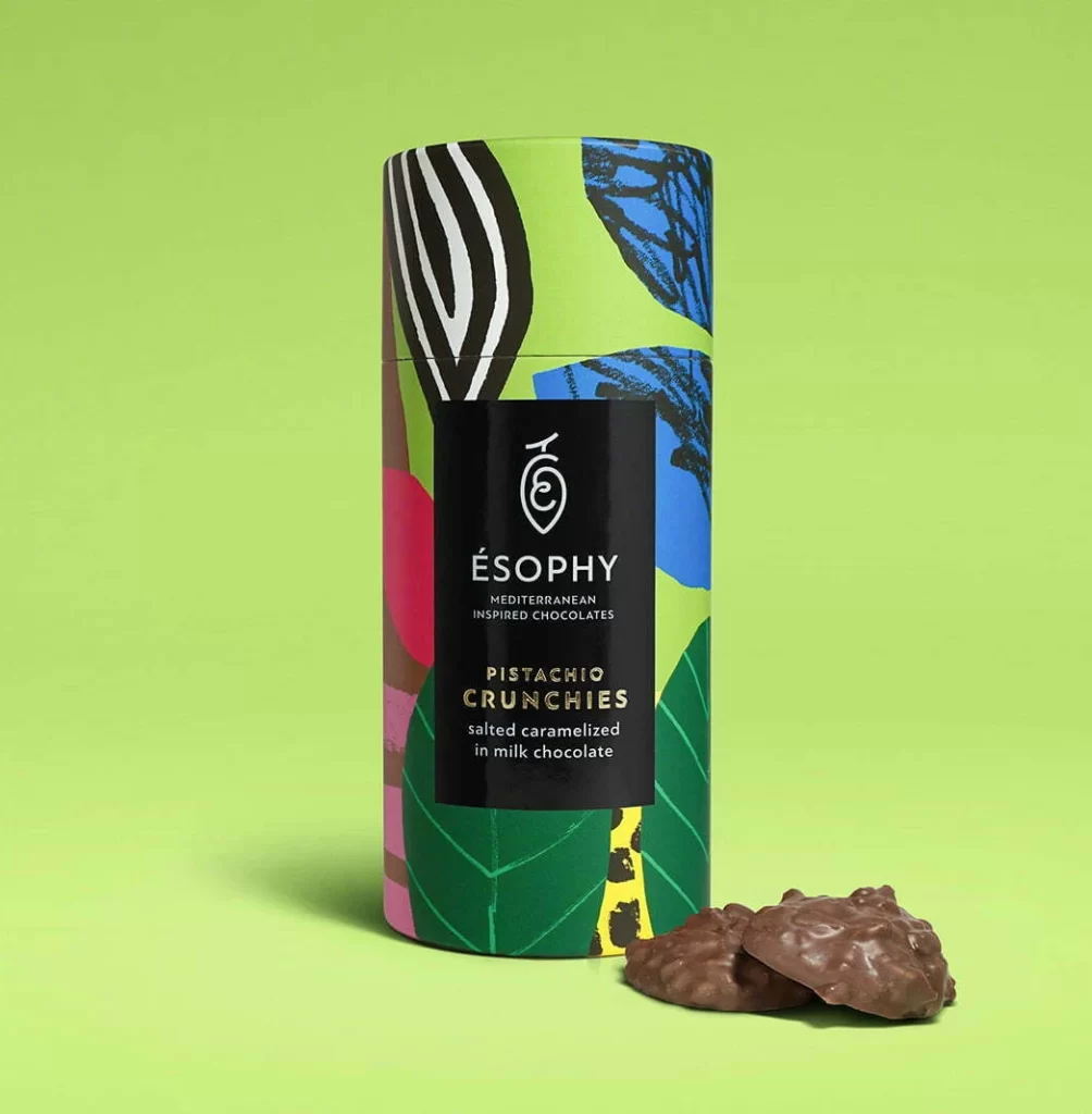
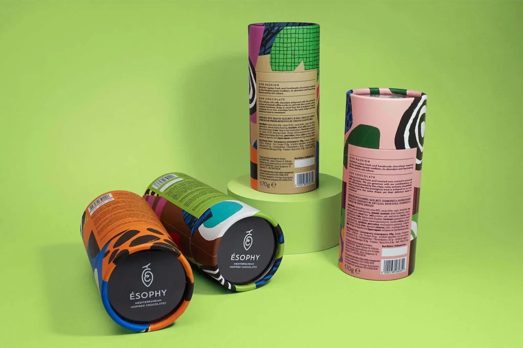
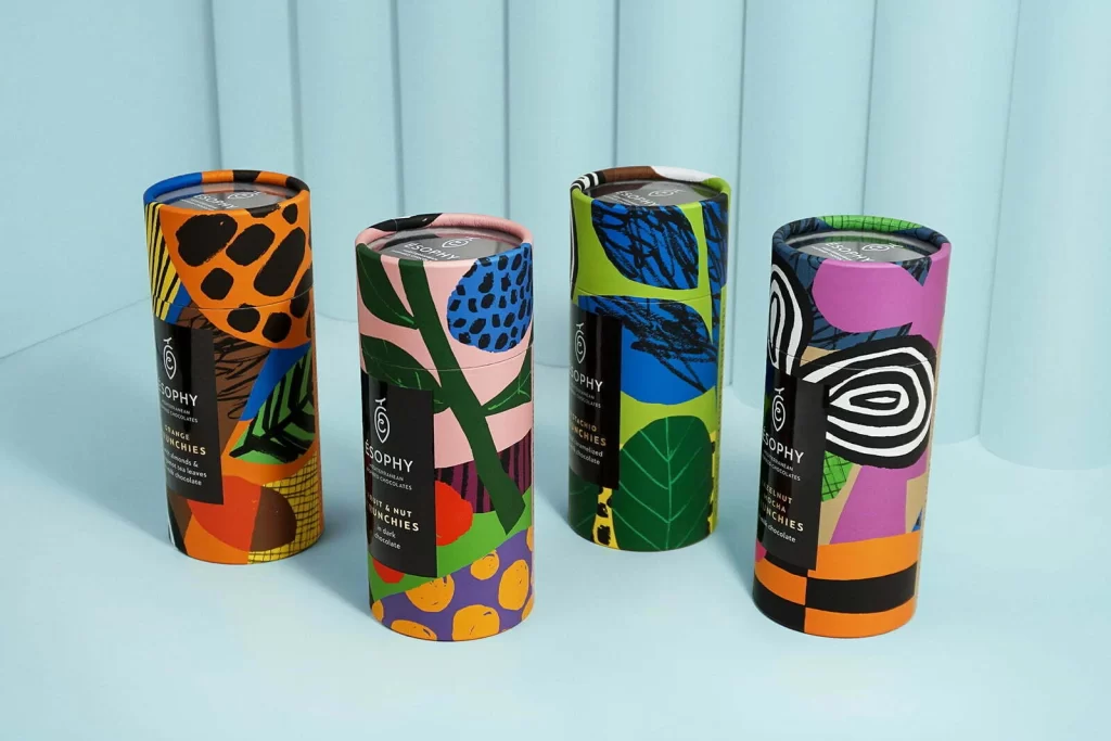
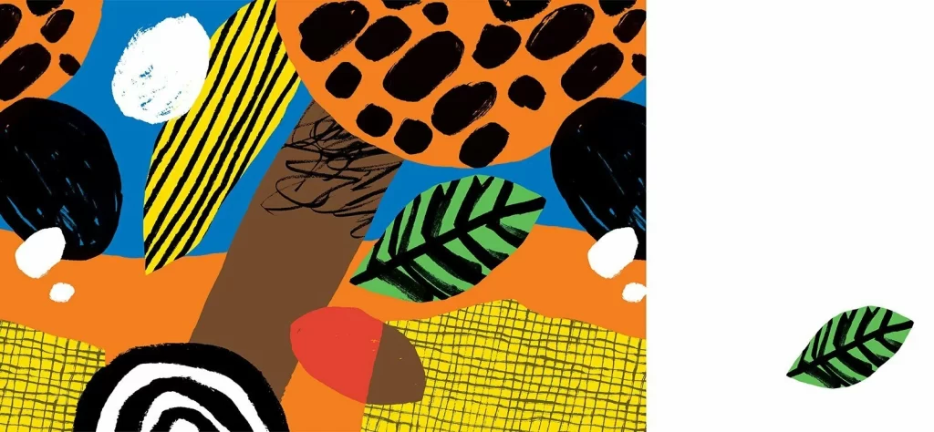
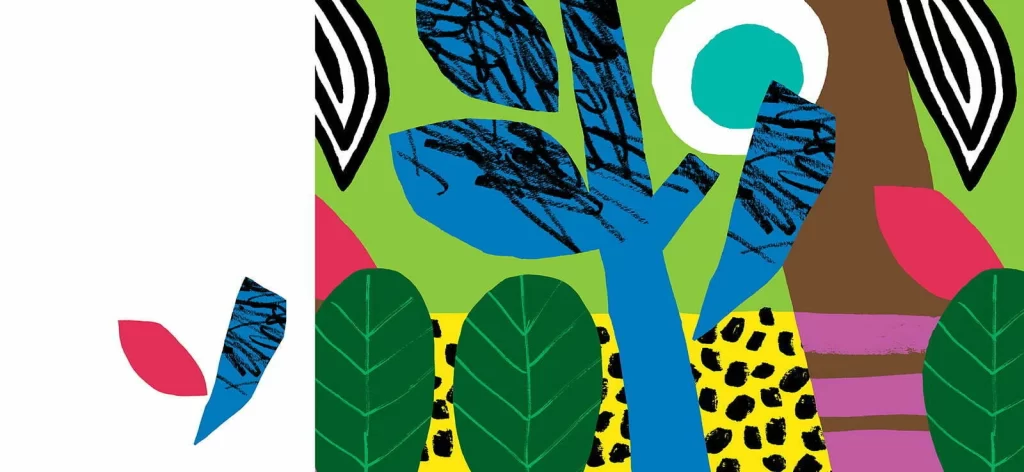
Split vertically down the center, the composition presents a stark white void on the left against a dense, layered collage on the right. A vibrant lime green background anchors the scene, populated by a central cerulean blue tree trunk with scribbled black texture on its leaves. Surrounding this focal point are oversized emerald green leaves with white veins, magenta petal shapes, and a brown vertical form decorated with lavender horizontal stripes, all resting above a yellow field speckled with irregular black spots.
Visual interest arises from the deliberate clash of organic forms and graphic patterns, particularly the contrast between the smooth color fields and the frantic, hand-drawn black hatching. The inclusion of a large white circle containing a teal dot introduces an abstract, almost facial element that disrupts the botanical theme. Such a juxtaposition of naive illustration techniques with bold, flat color blocking creates a playful yet sophisticated aesthetic that defies traditional realism.
Brand strategists developing youth-oriented beverage lines might study the balance between chaotic texture and solid shapes to inform label layouts. Illustrators working on children's literature could utilize the specific combination of leaf patterns and animal-print textures as a starting point for character environments. Art directors tasked with creating vibrant retail window displays would find the high-contrast palette and cut-out style useful for planning physical installations that demand immediate visual attention.