Esophy Packaging A
Topics
Details
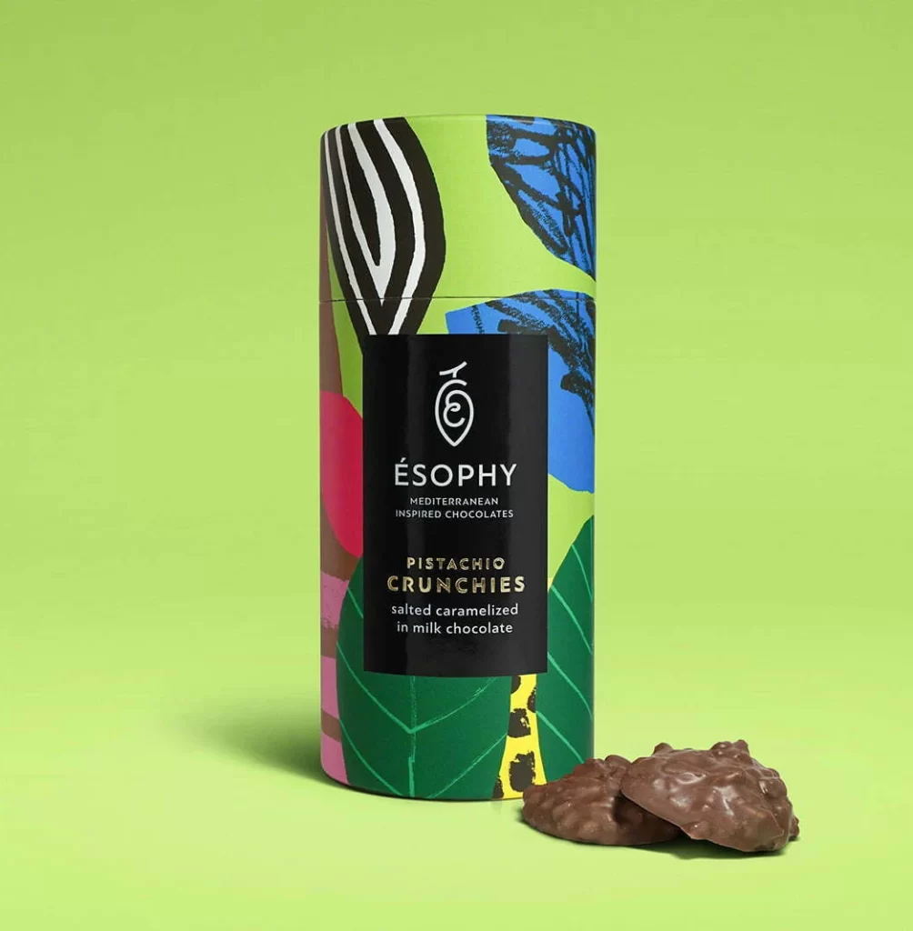
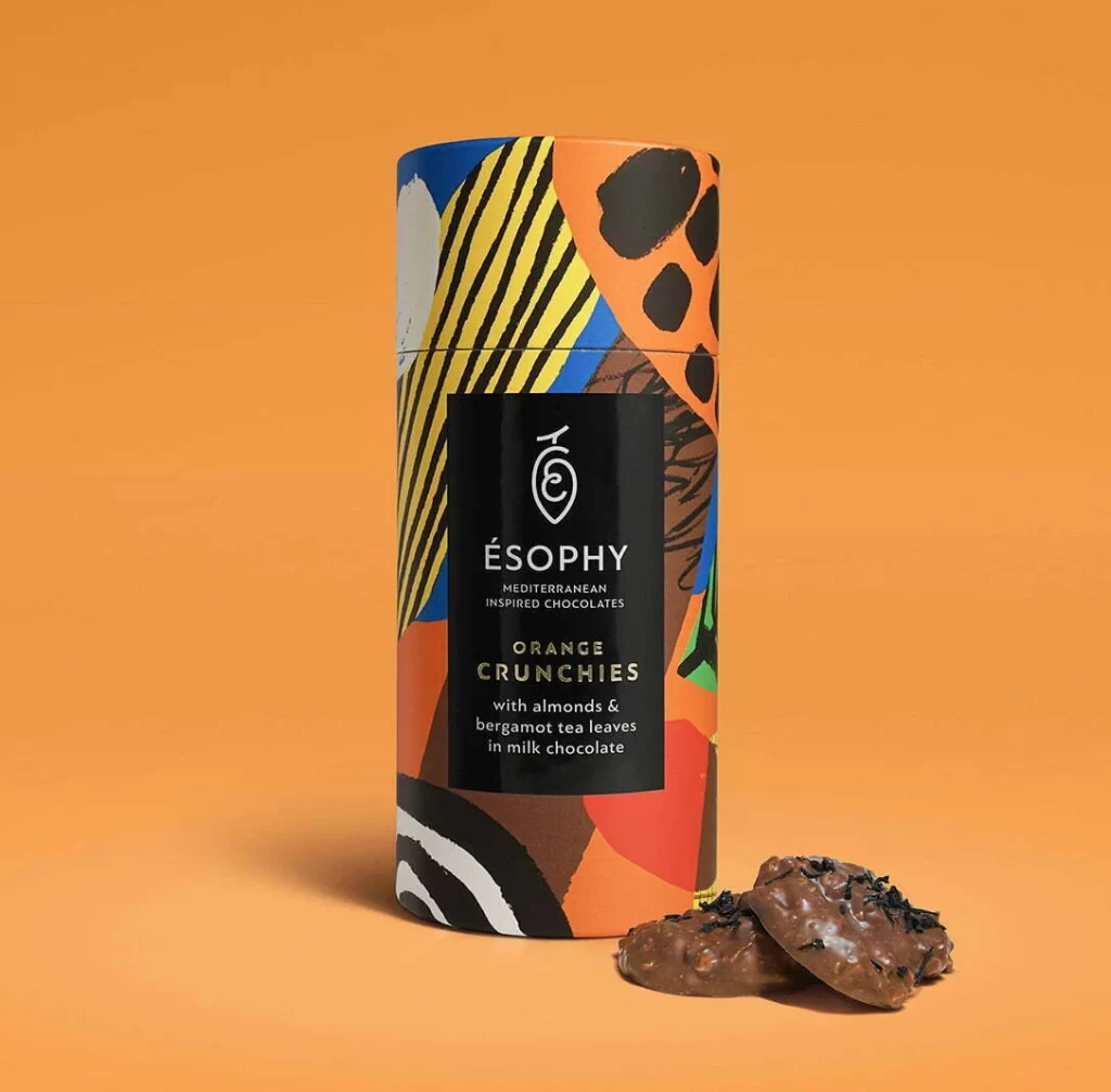
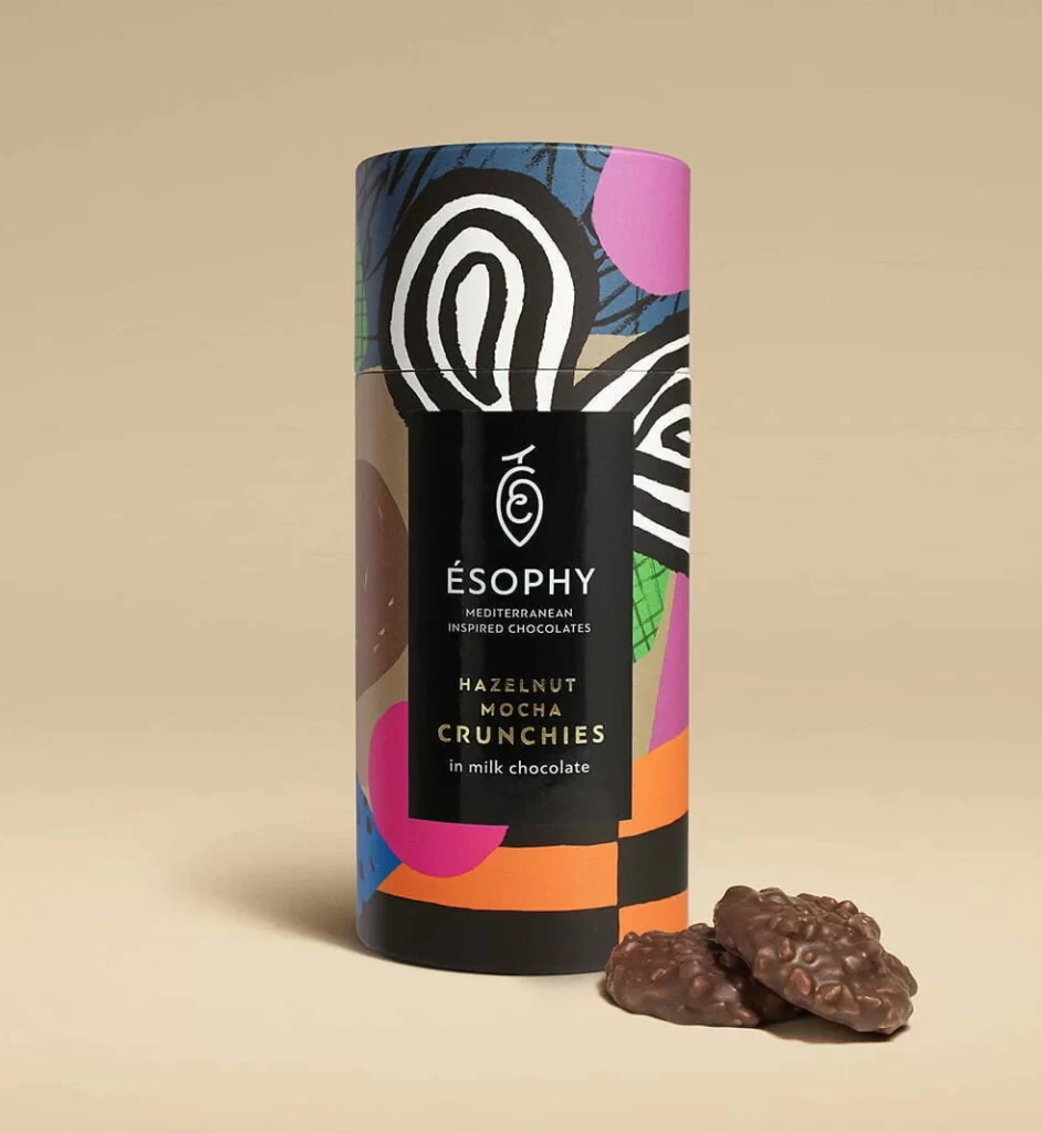
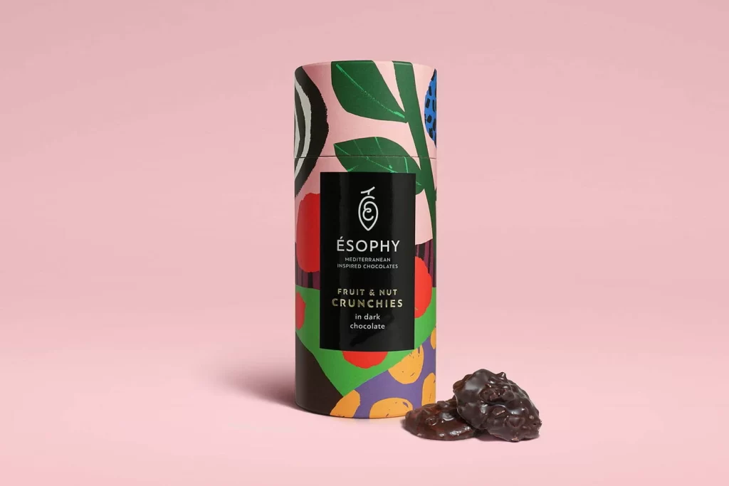
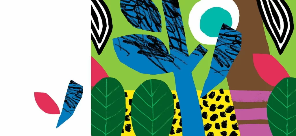
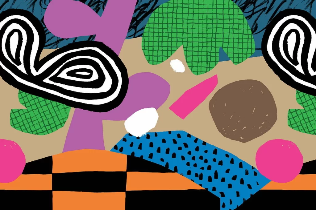
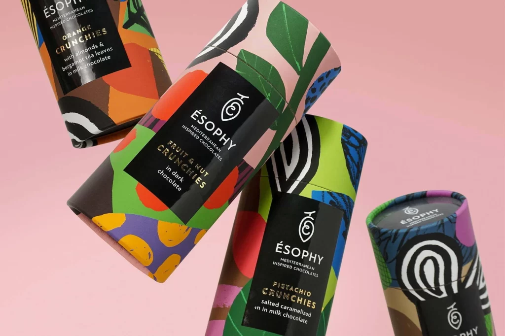
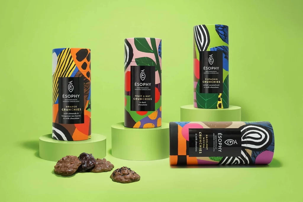
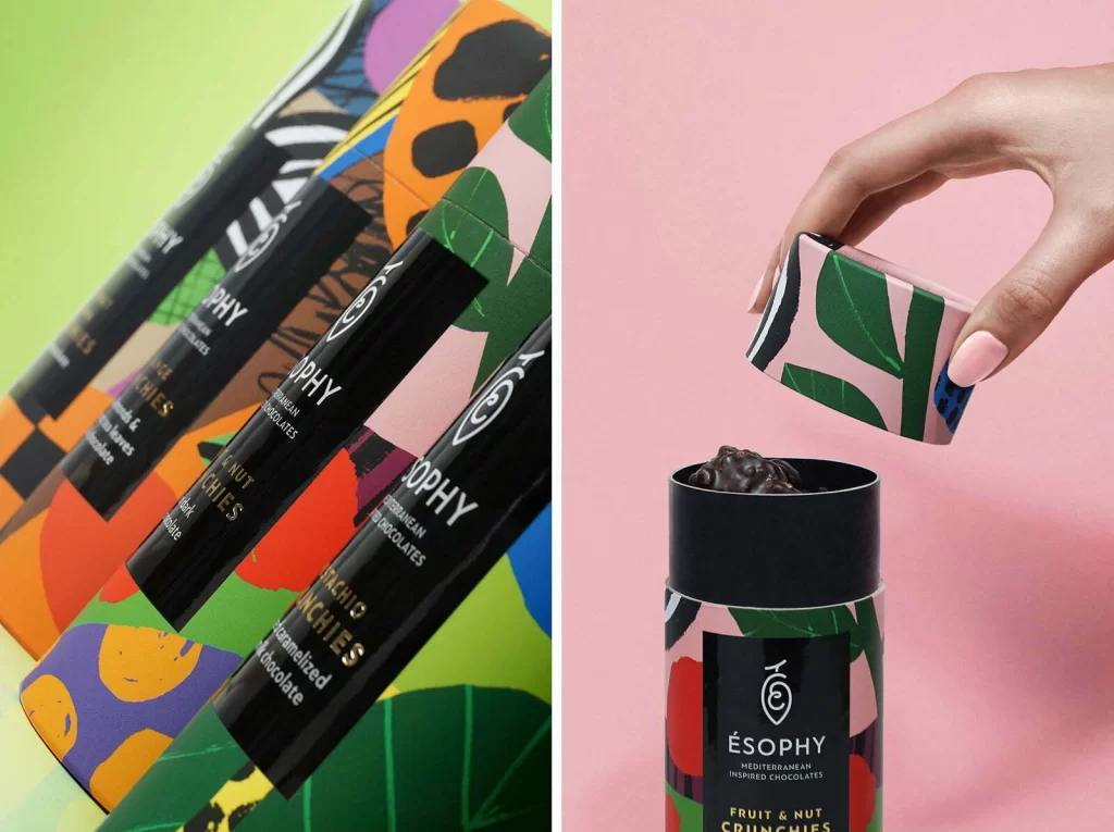
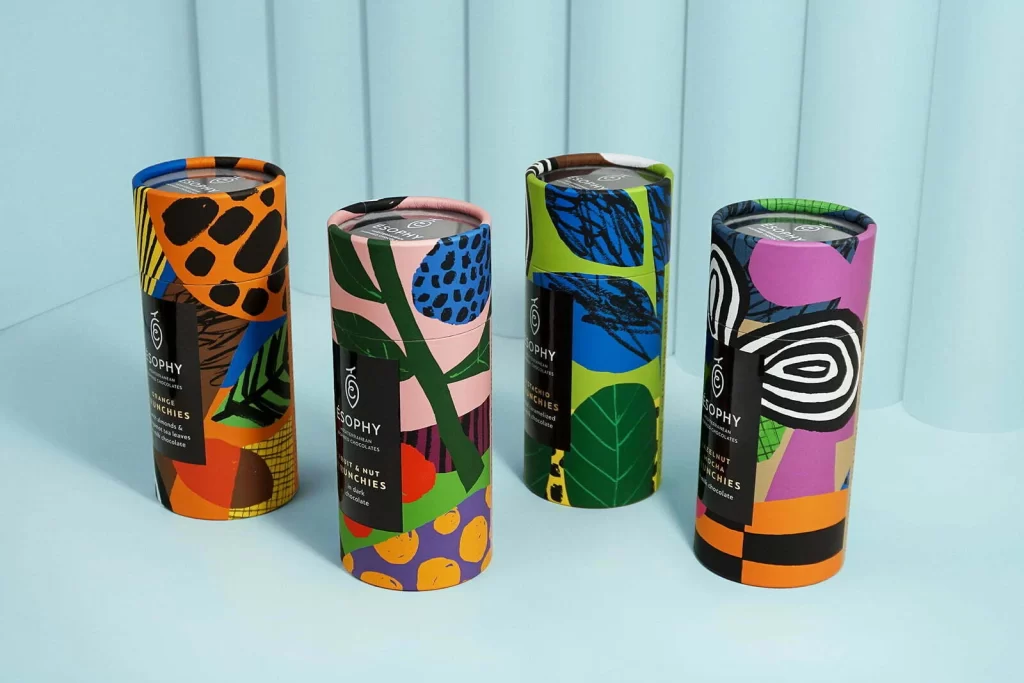
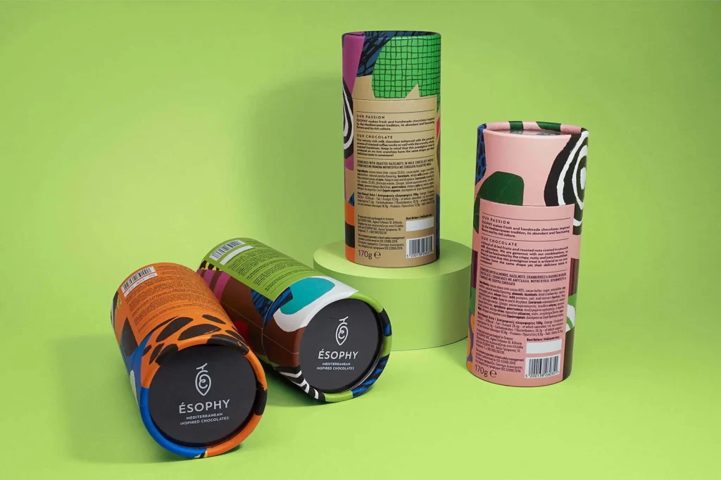
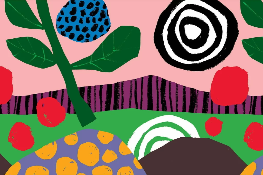
Bold organic forms collide in a layered composition across a flat salmon-pink backdrop. A deep green stem with pointed leaves anchors the left side, while a cobalt-blue orb speckled with black dots floats near the top. Dominating the upper right, a thick black-and-white spiral sits above a band of vertical purple and black stripes, and the lower register features a bright green field containing a white spiral, a dark brown mound, and a purple shape with yellow polka dots.
Visual tension arises from the juxtaposition of rigid geometric patterns against hand-drawn, irregular shapes. The limited yet vibrant palette—salmon pink, forest green, royal blue, and primary red—creates immediate graphic impact through high-contrast layering. Textural variation between the stippled blue surface, the striped purple barrier, and the solid color fields adds depth without traditional perspective techniques.
Brand strategists developing playful consumer goods packaging might employ this aesthetic for snack foods or children’s products requiring shelf presence. Illustrators working on editorial spreads about botanical themes or abstract nature could adapt these compositional strategies. Art directors seeking to modernize retro 1960s graphic sensibilities will find the balance between organic curves and hard-edged patterns particularly instructive.