NANAR Vodka Packaging E
Topics
Details
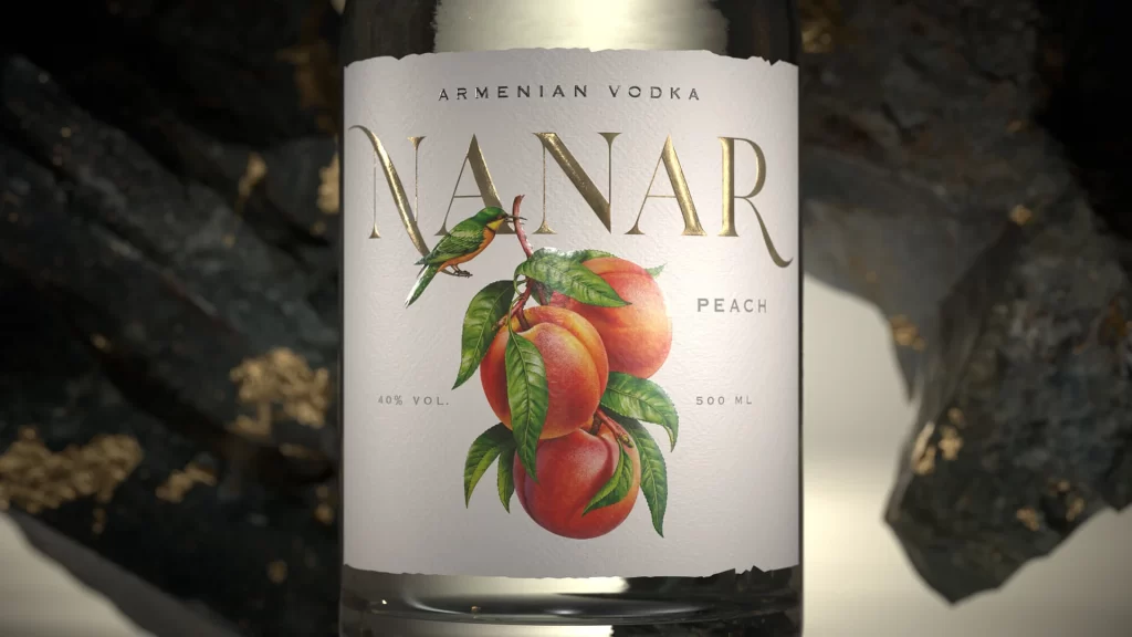
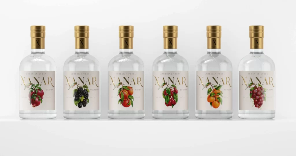
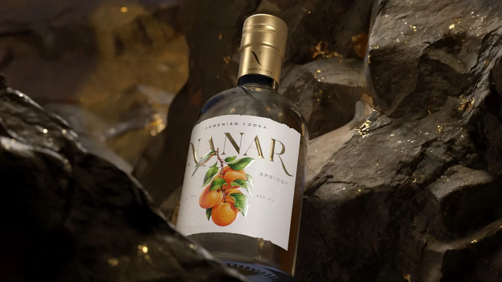
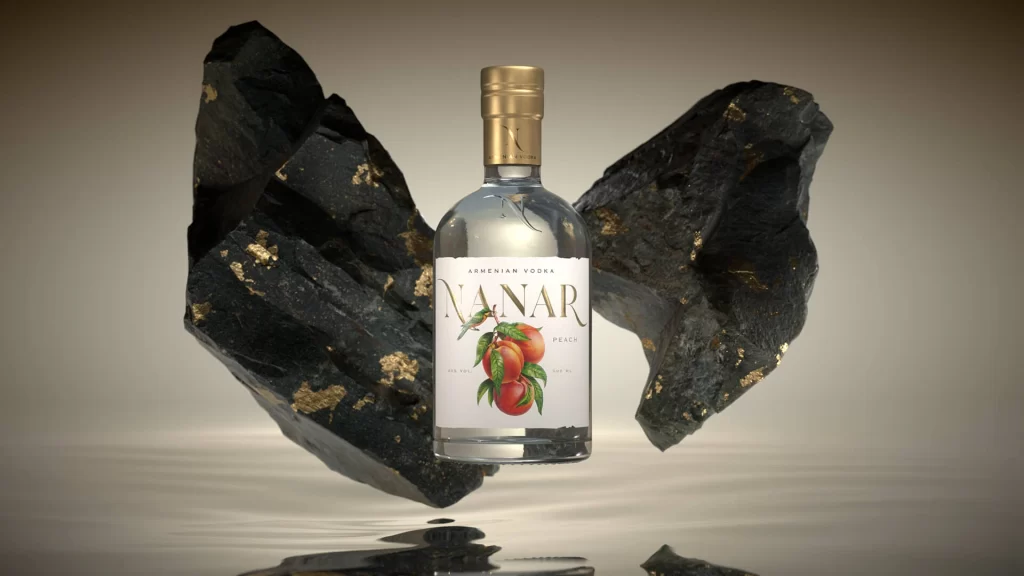
Centered within a softly lit studio environment, a clear glass bottle of NANAR Armenian Vodka commands attention with its crisp white label and gleaming gold screw cap. The typography on the label features the brand name in an elegant serif font, positioned above a vibrant botanical illustration of ripe peaches and green leaves. Flanking the vessel are two massive, jagged shards of dark obsidian or coal-like rock that appear to levitate, their rough surfaces sporadically flecked with metallic gold leaf. A subtle reflection of the entire arrangement shimmers on the polished floor below, while the background fades into a warm, neutral gradient that emphasizes the product's clarity.
Visual tension arises from the stark juxtaposition between the refined, transparent spirit container and the raw, ancient weight of the surrounding geological formations. The inclusion of gold accents on both the cap and the dark rocks creates a cohesive luxury palette that bridges the gap between natural ruggedness and sophisticated branding. By incorporating the fruit illustration directly onto the minimalist label, the design clearly communicates the peach flavor profile without cluttering the composition, allowing the dramatic staging to carry the premium aesthetic.
Art directors developing campaigns for premium spirits will find the spatial arrangement particularly useful for understanding how to frame glass products against heavy textural elements. 3D artists studying material properties can examine how light interacts with both transparent liquid and matte, irregular stone surfaces in a single scene. Photographers planning complex still-life shoots might reference this setup to balance negative space with high-contrast props, ensuring the focal point remains legible despite the dramatic surroundings.