72 Conditions Vodka Bottle View
Topics
Details
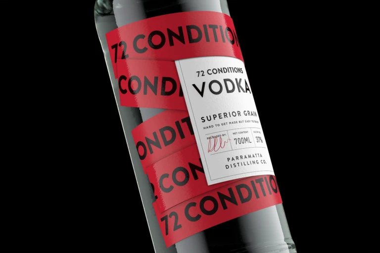
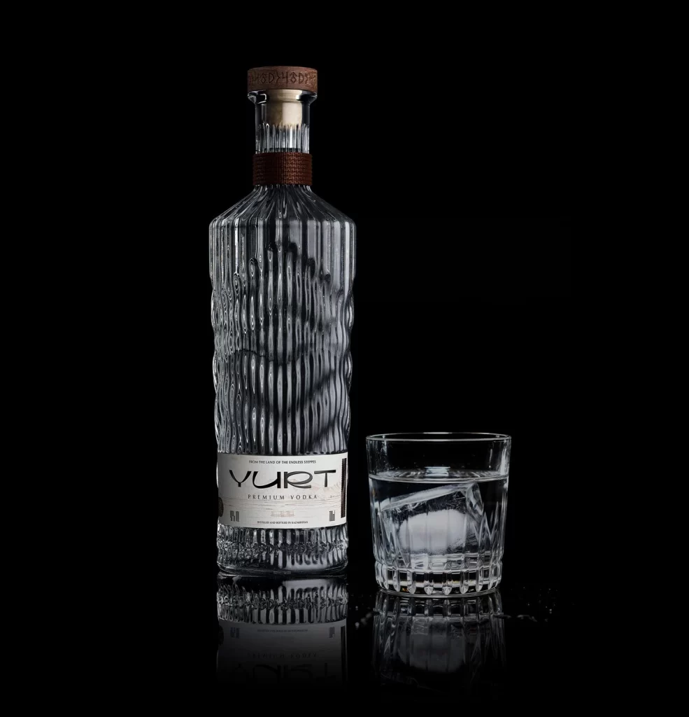
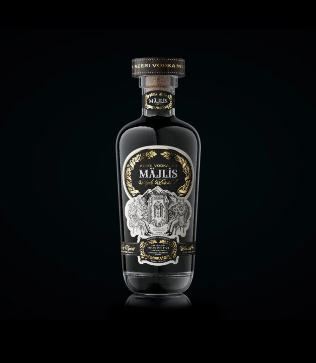
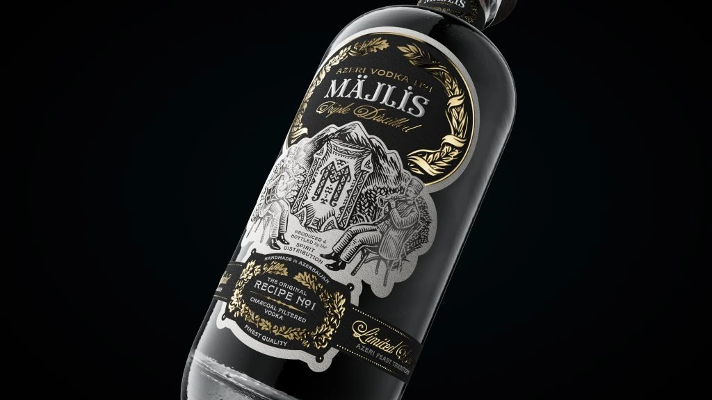
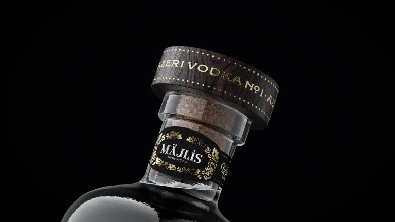
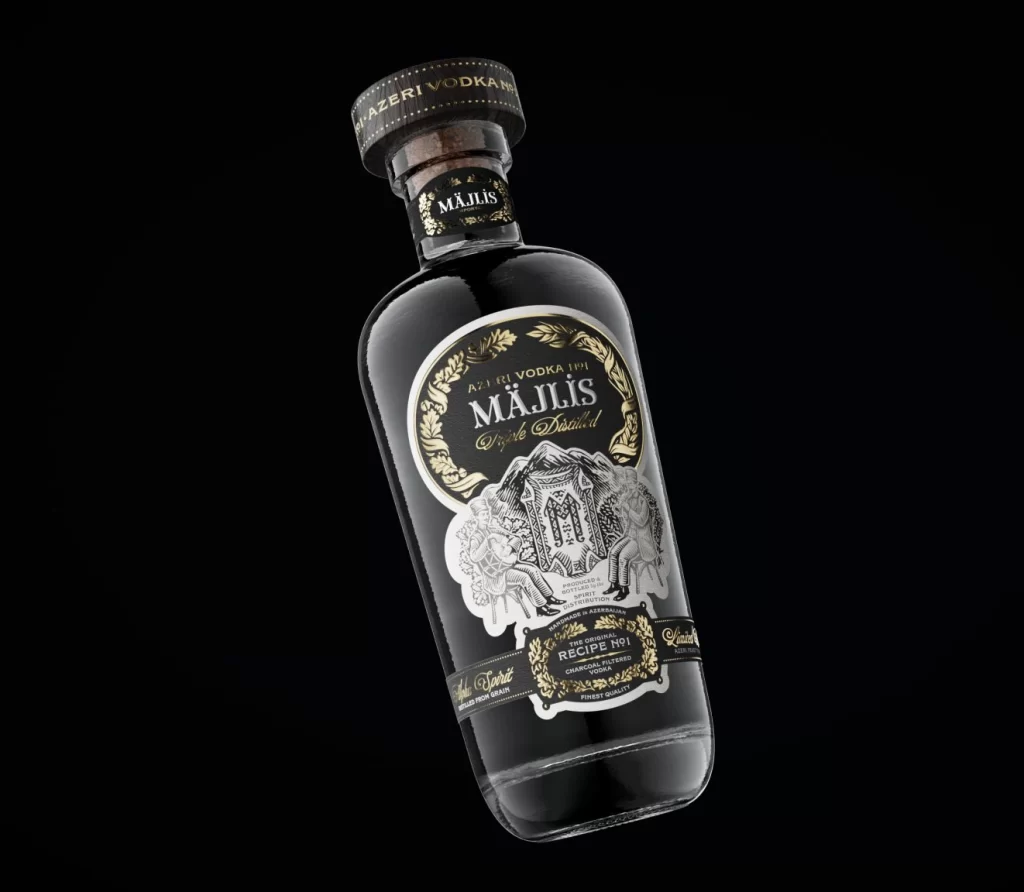
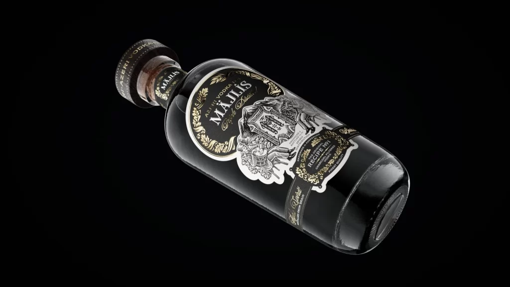
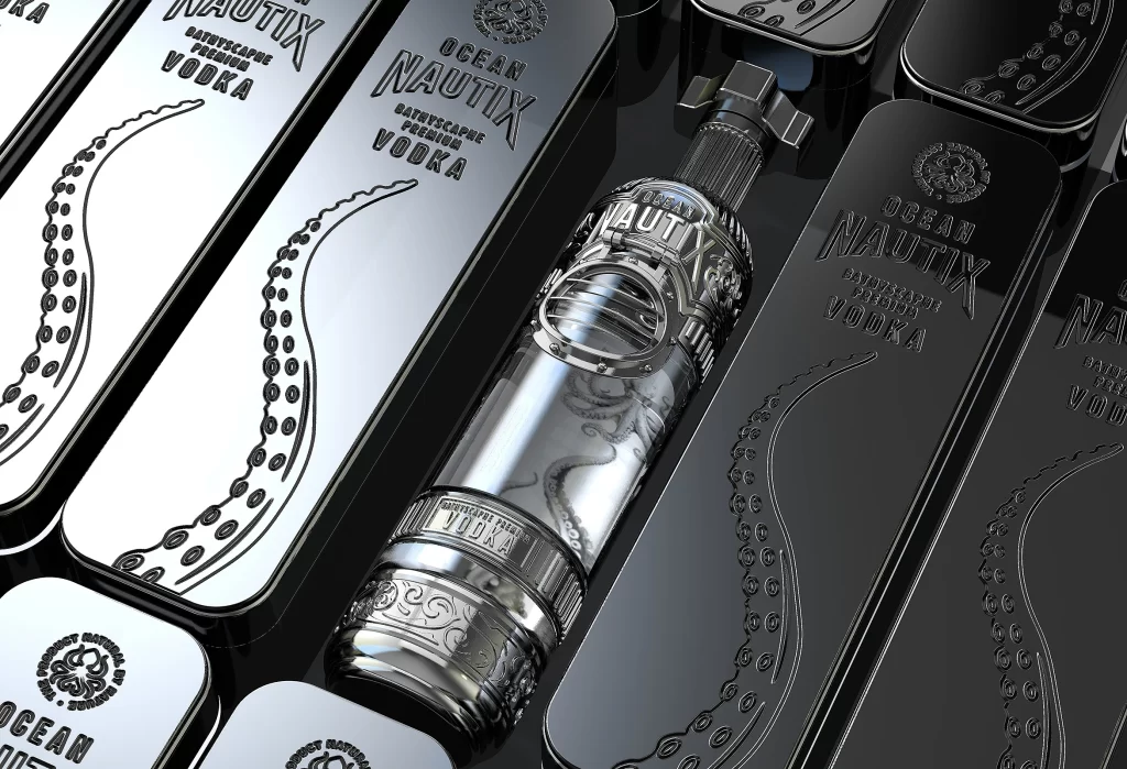
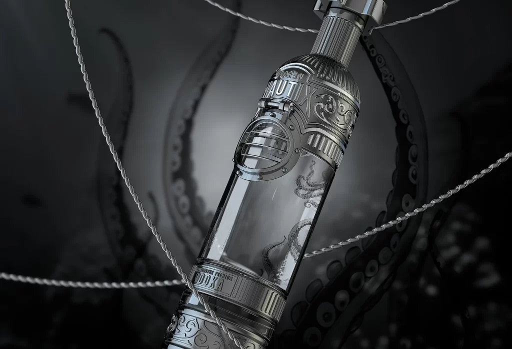
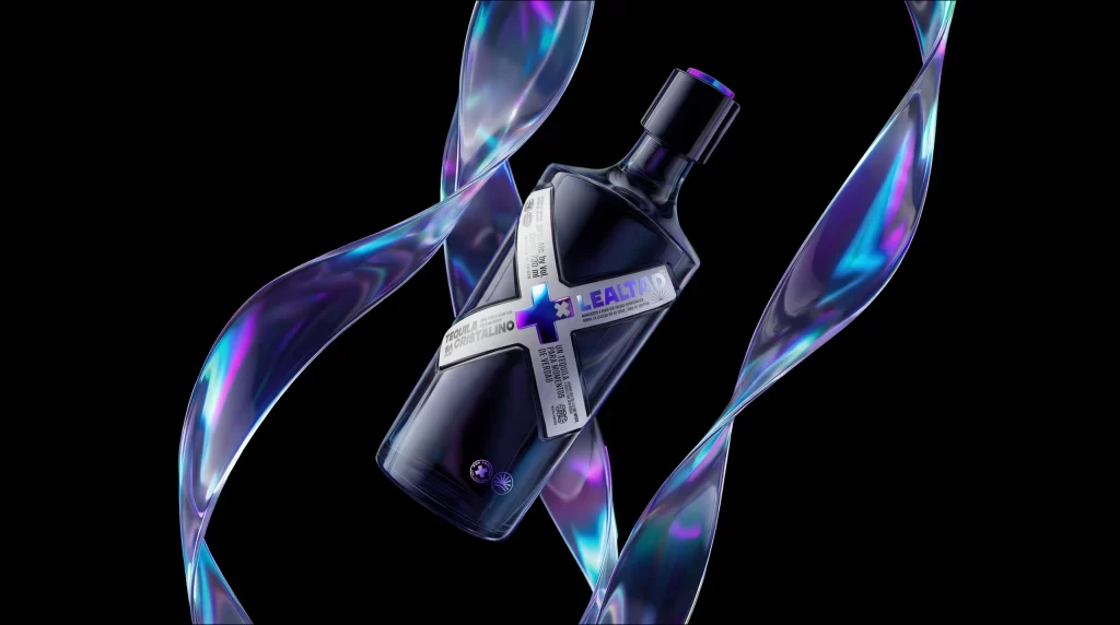
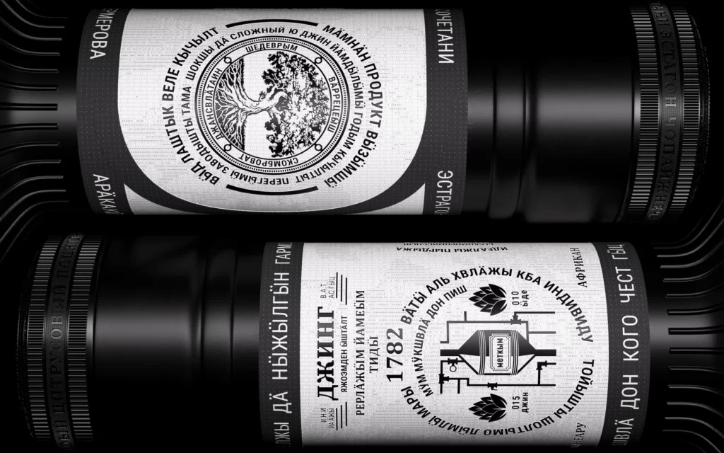
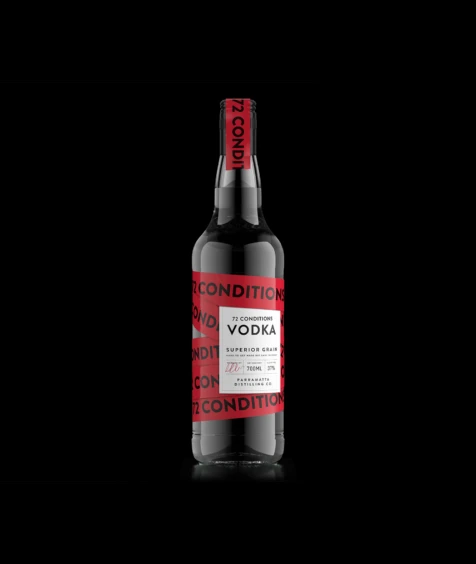
72 Conditions Vodka appears in a dark charcoal glass bottle, wrapped with a bold red band that repeats the brand name in black text. A white rectangular label centered on the front displays '72 CONDITIONS VODKA' in clean typography above 'SUPERIOR GRAIN' and '77% VOL'. The bottle stands against a pure black background with subtle reflections highlighting its glossy surface and the red neck seal.
Visual interest is generated primarily through the tension between the chaotic, overlapping red bands and the orderly information hierarchy of the central white label. This specific iteration of packaging design utilizes repetition to create brand recognition while maintaining legibility for essential product details like alcohol volume. The high-contrast color scheme ensures maximum visibility, making the object pop dramatically from the dark surroundings.
Packaging designers might study this composition to understand how to balance busy graphic elements with necessary regulatory text. 3D artists could utilize the clear glass material and distinct label geometry as a base for rendering realistic liquid containers. Marketing teams analyzing premium spirit branding would find value in how the repetitive typography reinforces the identity without obscuring the product category.