NANAR Vodka Packaging D
Topics
Details
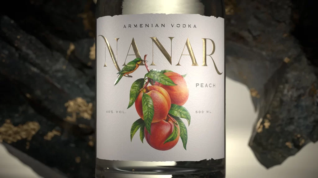
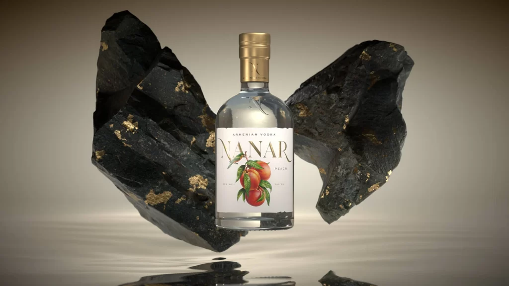
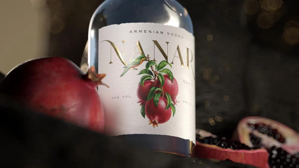
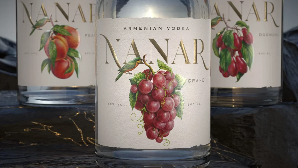
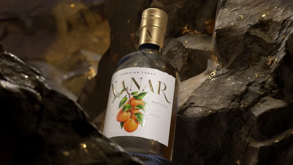
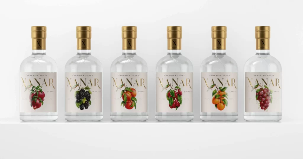
Six clear glass bottles of Armenian vodka stand in a precise horizontal row against a seamless white background, each sealed with a brushed gold cap bearing a subtle black 'N' logo. The labels feature the brand name NANAR in elegant gold serif typography above delicate botanical illustrations of pomegranate, blackberry, peach, cherry, apricot, and grape clusters rendered in naturalistic watercolor tones against cream-colored backgrounds. Soft studio lighting creates gentle highlights along the cylindrical glass shoulders while maintaining consistent shadow depth beneath each vessel, photographed from a straight-on eye-level perspective that emphasizes the uniform spacing and symmetrical alignment of the collection.
Visual distinction emerges from the sophisticated interplay between metallic gold accents and organic fruit imagery, where each label's unique botanical illustration serves as both flavor identifier and decorative focal point without disrupting overall brand cohesion. The restrained color palette—limited to transparent glass, warm gold foil, muted cream, and vivid fruit pigments—creates a premium aesthetic that balances traditional luxury cues with contemporary minimalist sensibilities through careful typographic hierarchy and ample negative space surrounding the central illustrations.
Packaging designers developing premium spirit brands would examine this composition to study how consistent bottle architecture supports varied flavor-line differentiation through label artwork alone. Marketing teams could reference the lighting setup and product arrangement when planning e-commerce photography or print catalog layouts requiring multiple SKU display. Brand strategists might analyze the gold-to-cream ratio and serif font choices to inform visual identity systems for luxury food and beverage categories seeking an artisanal yet refined market positioning.