NANAR Vodka Packaging A
Topics
Details
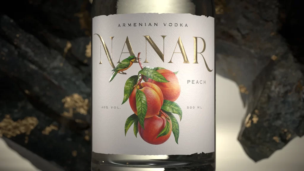
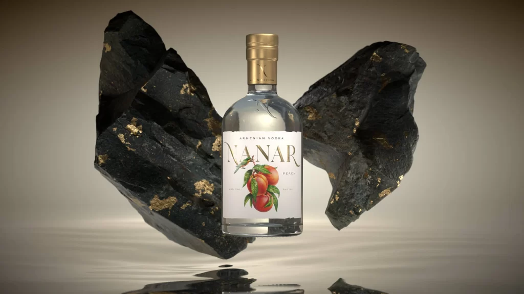
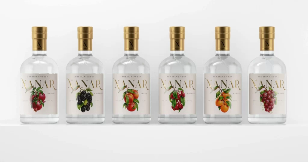
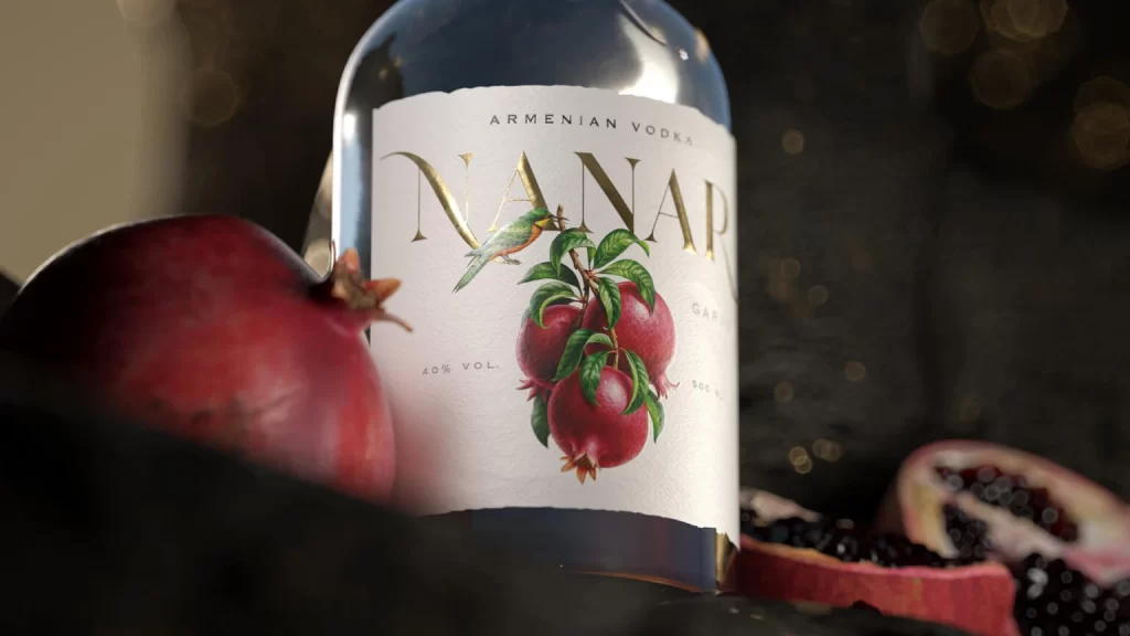
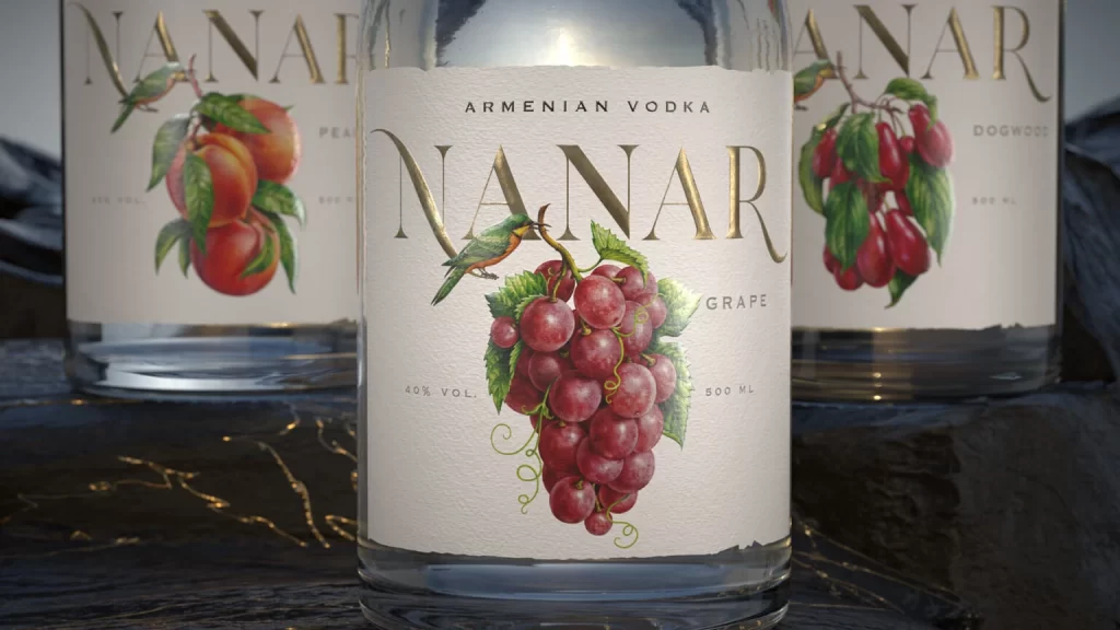
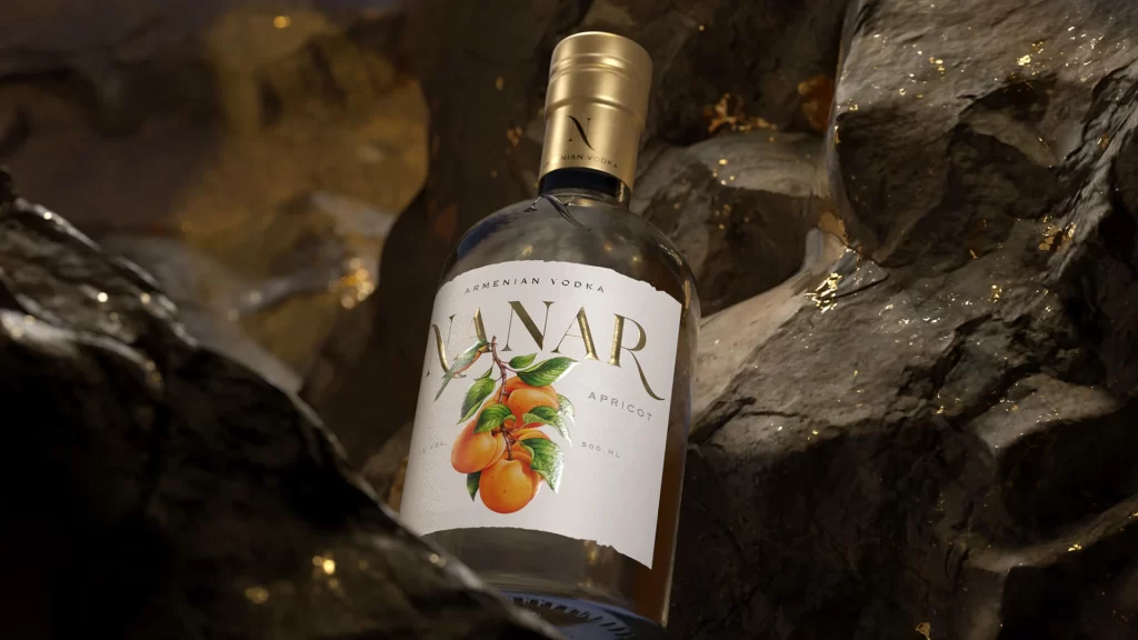
Three clear glass bottles of NANAR Armenian Vodka form a shallow triangular arrangement, each featuring a cylindrical body topped with a brushed gold screw cap embossed with a stylized 'N'. Off-white labels display the brand name in elegant gold serif typography alongside botanical illustrations of grapes, peaches, and pomegranates. Soft, diffused light illuminates the scene from above as jagged, dark slate formations rise in the background.
Visual interest is generated through the sophisticated interplay between the industrial metallic caps and the organic, painterly fruit motifs rendered on the labels. The choice of a monochromatic, rocky environment creates a stark contrast with the transparent liquid and the warm metallic accents, emphasizing a sense of rugged luxury. Furthermore, the consistent use of gold foil for both the text and the bottle tops unifies the three flavors into a cohesive premium collection.
Brand strategists might analyze this composition to understand how texture and lighting influence the perception of high-end spirits. Art directors could utilize this layout as a study in balancing multiple product variations within a single frame without visual clutter. Additionally, packaging designers may reference the specific typographic hierarchy and color palette when developing concepts for boutique beverage lines.