NANAR Vodka Packaging B
Topics
Details
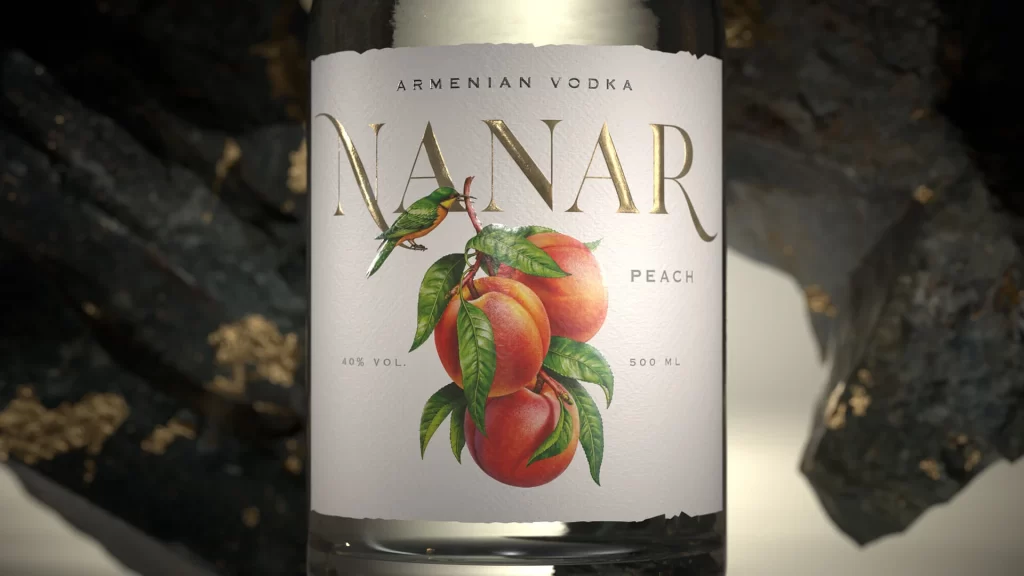
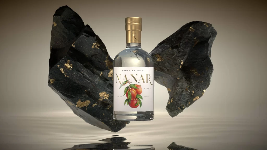
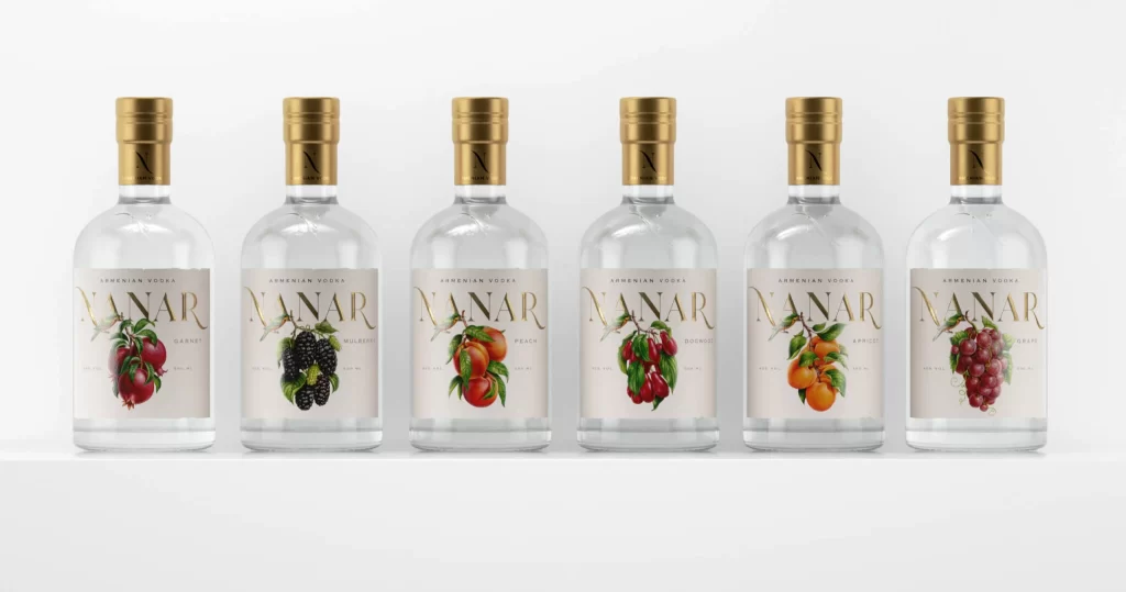
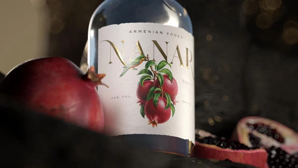
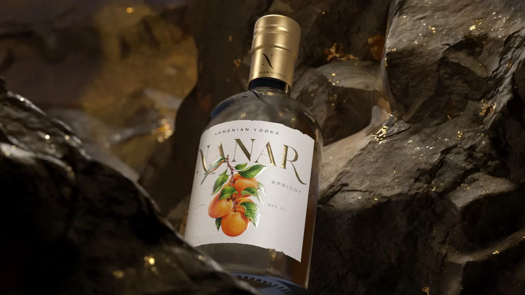
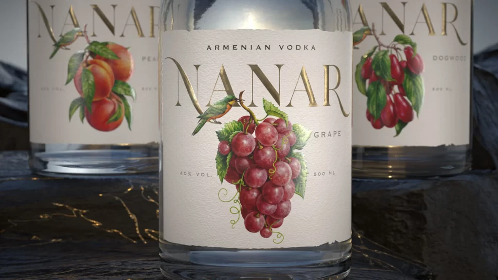
Three clear glass bottles of NANAR Armenian Vodka stand on a dark, textured surface that catches subtle golden highlights. The central bottle dominates the frame with its cream-colored label featuring the word NANAR in large, elegant gold serif lettering above a lush illustration of red grapes and a small green bird. Flanking it are two partially visible variants—one displaying peaches and the other dogwood berries—each sharing the same sophisticated typographic hierarchy and 40% vol., 500 ml specifications printed in understated black text.
Botanical realism meets luxury branding through the meticulous rendering of fruit clusters and avian details that feel almost tactile against the matte paper background. Gold foil typography creates a refined contrast against the organic watercolor-style illustrations, while the consistent layout across different flavor variations demonstrates strong visual system thinking. Soft directional lighting emphasizes the bottle's transparency and the label's textured finish, giving the entire composition an artisanal yet premium presence.
Packaging designers studying premium spirit labeling will find valuable lessons in the balance between illustration density and negative space here. Brand identity teams developing fruit-infused product lines could analyze how color palettes shift between variants while maintaining cohesive brand recognition. Illustrators specializing in food and beverage artwork might reference the specific technique of combining metallic text effects with naturalistic botanical elements for upscale market positioning.