TAT Spaghetti Bag
Topics
Details
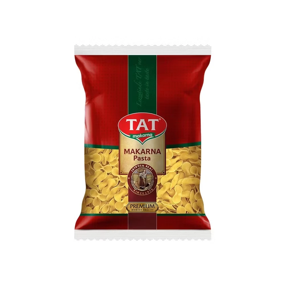
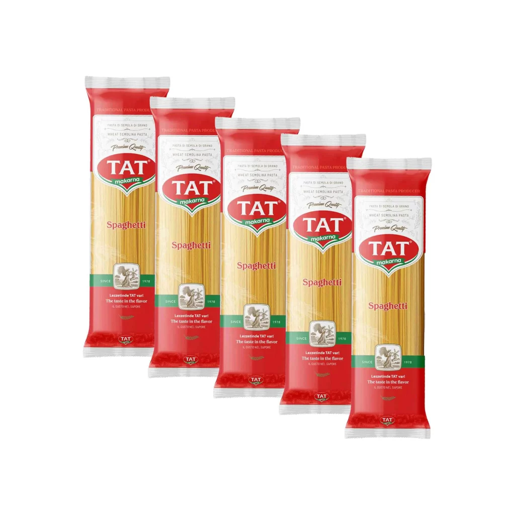
Centered on a seamless white background, the vertical package features a bold red outer frame with a central green stripe running down its length. The TAT brand name appears prominently in white serif lettering inside a red oval, positioned above a golden-yellow panel that displays 'SPAGHETTI' in dark brown capital letters. Below this text sits a circular brown emblem containing an illustration of a figure with wheat stalks and the phrase 'SINCE 1978', while a gold 'PREMIUM' badge anchors the bottom of the composition.
Vertical orientation dominates the visual hierarchy here, creating a strong sense of height that mirrors the long pasta shape contained within. The color blocking technique—alternating between deep crimson, forest green, and metallic gold—establishes clear zones for branding versus product information without feeling cluttered. Traditional typography choices combined with the heritage seal evoke established quality, making this packaging feel both authoritative and approachable in retail environments.
Food packaging designers studying classic European market aesthetics would find valuable lessons in how this layout balances multiple information tiers. Brand identity specialists could analyze the effective use of the oval logo treatment as a repeatable asset across product lines. Students learning about color theory in commercial applications might examine how the red-green-gold palette communicates premium positioning while maintaining shelf visibility.