TAT Spaghetti Bag Design
Topics
Details
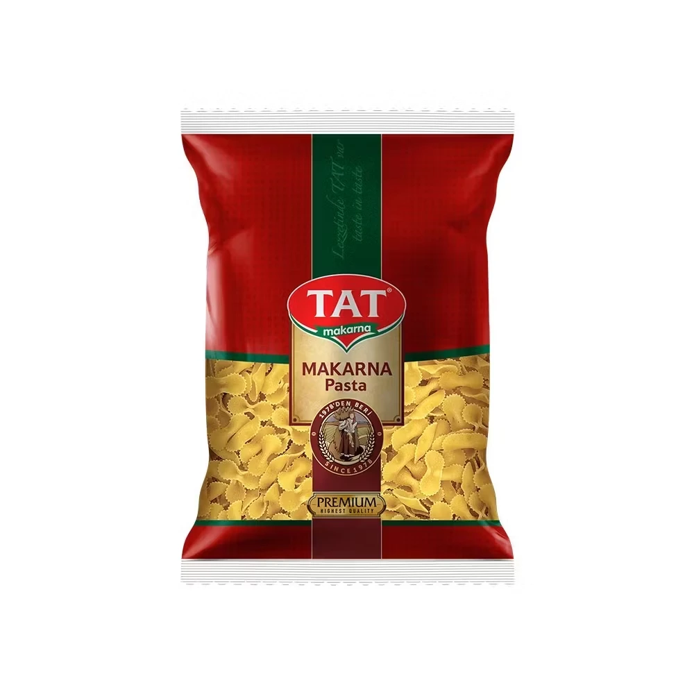
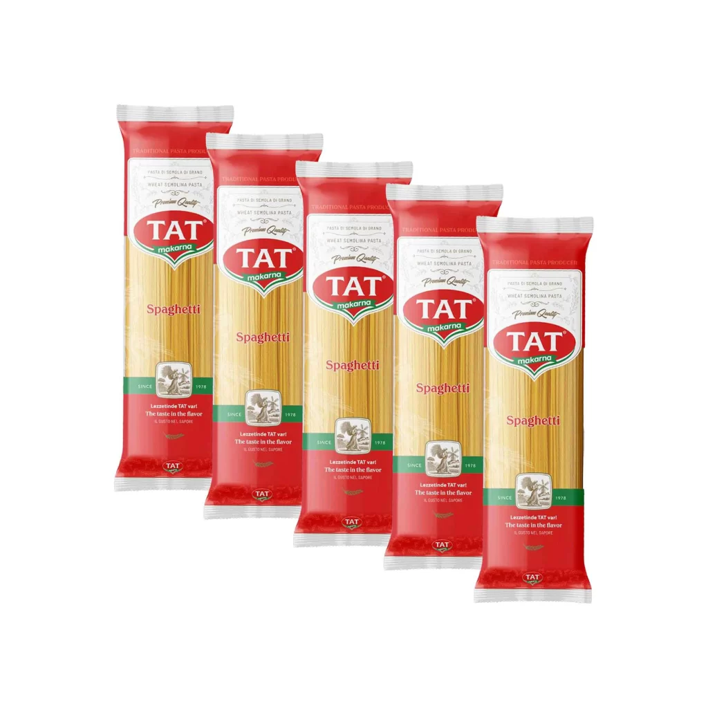
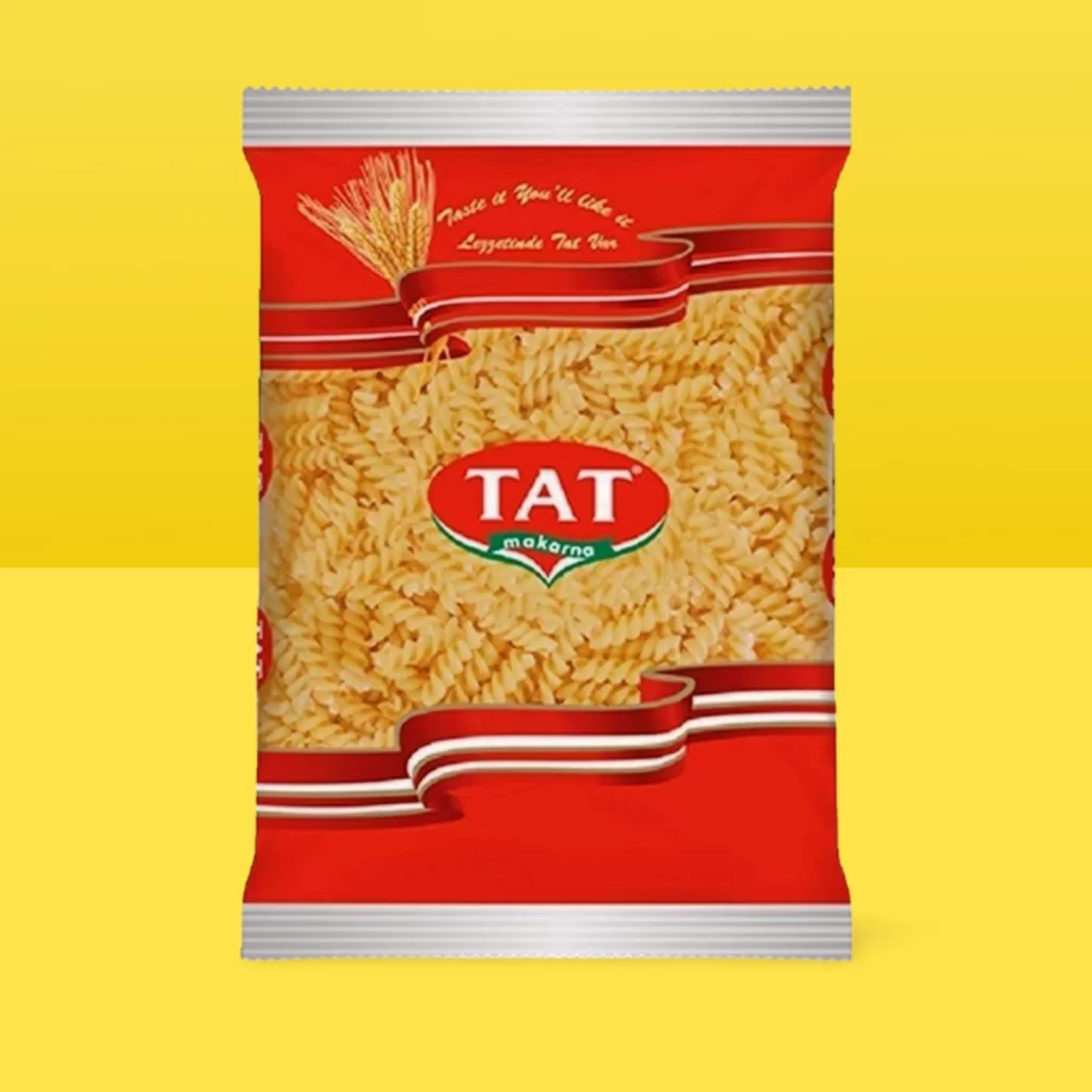
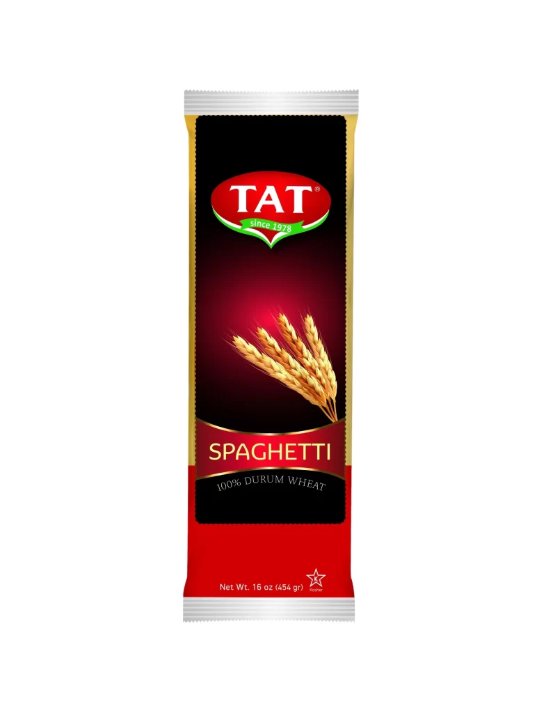
Centered within a sterile white void, the vertical packaging presents a striking tripartite color scheme of black, crimson, and gold. A bold red oval containing the white 'TAT' logotype anchors the upper third, underscored by a green ribbon marking the brand's 1973 origin. Below this, three golden wheat stalks emerge from a dark gradient, leading the eye down to the serifed 'SPAGHETTI' title and the '100% DURUM WHEAT' subtext, all framed by metallic gold side borders and a silver crimped seal at the top and bottom edges.
Visual hierarchy is established through a sophisticated interplay of matte and glossy textures, where the deep black background creates high contrast for the luminous gold typography and photographic elements. The composition relies on a rigid central axis, utilizing the organic curvature of the wheat graphic to soften the otherwise geometric rigidity of the rectangular form. Such deliberate use of negative space around the central imagery ensures that the product name remains legible while conveying a sense of premium quality through the restrained palette.
Brand strategists might analyze this artifact to understand how traditional food packaging utilizes color psychology to signal authenticity and agricultural purity. Packaging engineers could study the structural layout to determine optimal placement for nutritional information or regulatory compliance text in similar vertical formats. Students of commercial illustration would benefit from deconstructing how the lighting on the wheat kernels is rendered to suggest texture and freshness without overwhelming the primary branding elements.