TAT Makarna Pasta Pouch
Topics
Details
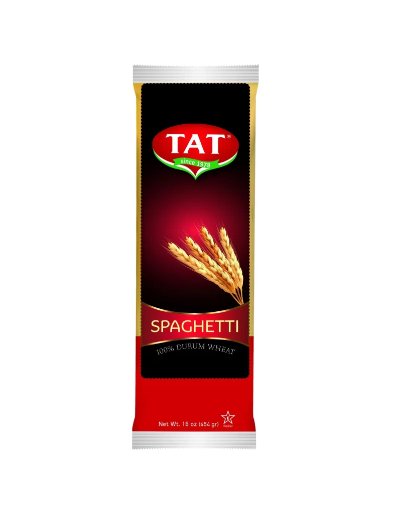
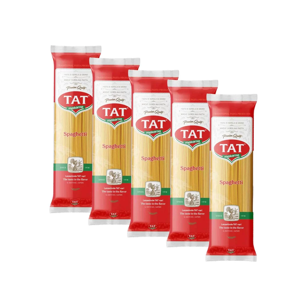
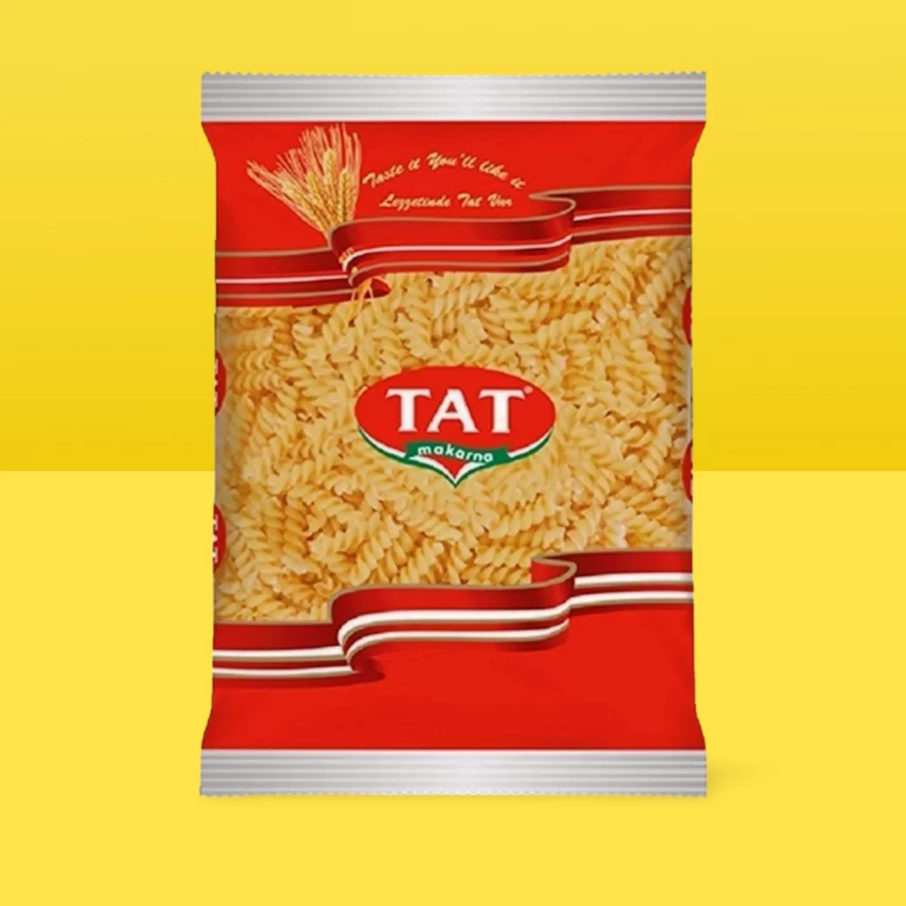
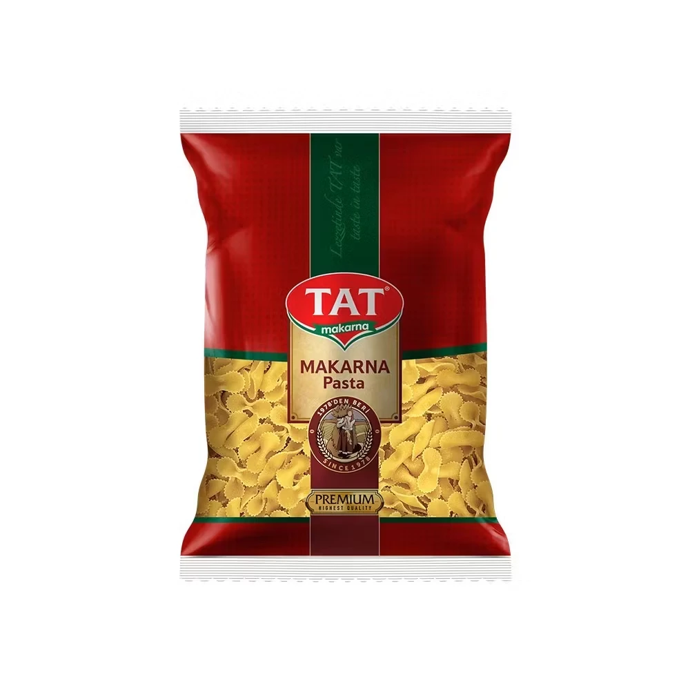
Centered within a clean white void, the TAT Makarna pouch displays a bold red body bisected by a dark green vertical stripe. The brand name appears in white sans-serif letters inside a red oval, positioned above a gold rectangular field containing the product title in brown serif type. Below this, a circular seal with a vintage illustration and the text 'SINCE 1976' anchors the composition, while the lower portion reveals yellow bow-tie pasta shapes visible through the transparent window.
Visual hierarchy drives the packaging's appeal through its disciplined use of contrasting color blocks and typographic weight. The marriage of traditional serif fonts for product identification with modern, rounded lettering for the brand creates a balanced aesthetic that feels both established and accessible. That central gold panel acts as a focal point, drawing the eye to heritage details while the vibrant pasta photography provides immediate appetite appeal without overwhelming the structured layout.
Food photographers studying commercial packaging compositions will find value in how lighting interacts with the glossy film material and matte printed areas. Brand identity designers examining color psychology in grocery retail can analyze how the red-green-gold palette communicates quality and tradition. 3D artists building supermarket environments might reference the precise crease patterns and seal textures to achieve realistic plastic deformation in their renders.