1921 Gin Bottle
Topics
Details
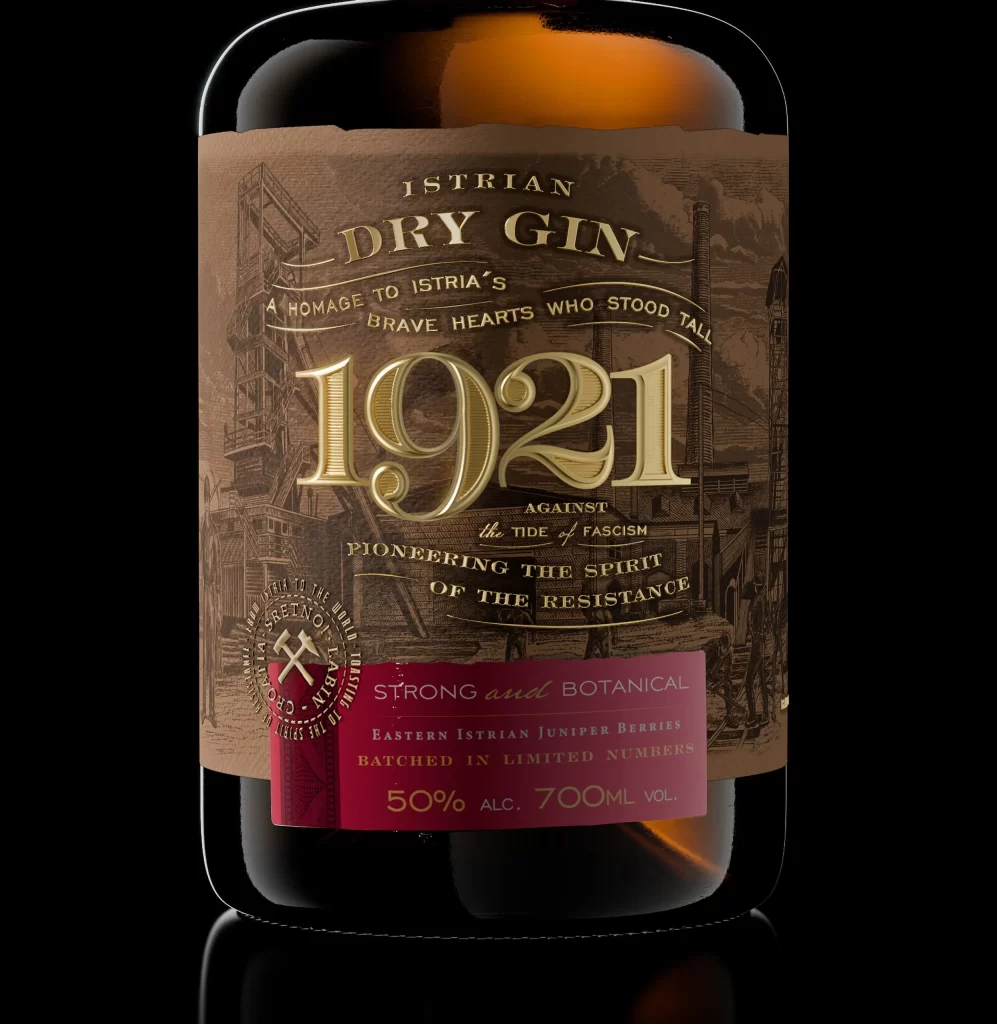
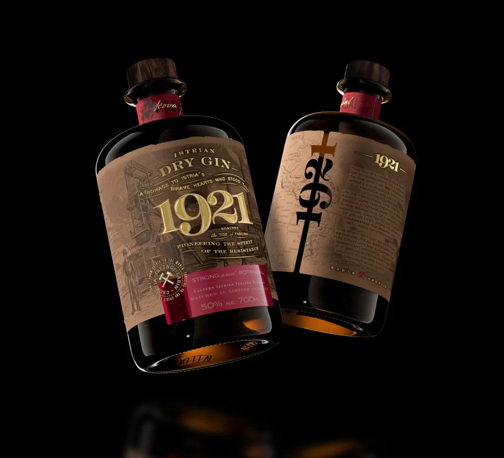
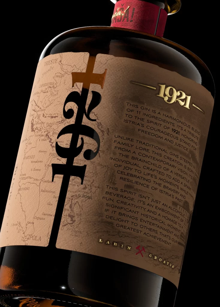
Set against a void of absolute black, a dark glass bottle leans diagonally from the lower left toward the upper right, catching a sharp highlight along its curved shoulder. The label features a textured kraft-paper background printed with a faint sepia map of the Istrian coastline, overlaid with a massive, black serif monogram that intersects the cartography. Gold foil typography announces the year 1921 at the upper right, while smaller text blocks detail the gin's eleven-ingredient composition and its origins in Labin, Croatia.
Visual interest is generated through the sophisticated layering of historical and modern elements, specifically the juxtaposition of antique map aesthetics against bold, contemporary typography. The choice of raw, fibrous paper stock combined with metallic gold accents creates a tactile quality that suggests premium craftsmanship and regional authenticity. Furthermore, the integration of geographical data directly into the branding narrative anchors the product firmly to its physical location.
Art directors studying luxury packaging will find value in the typographic hierarchy and material contrasts demonstrated here. Brand strategists looking to evoke heritage might analyze how cartographic elements are woven into the product story without overwhelming the primary logo. Additionally, 3D artists requiring reference for glass refraction and label adhesion can observe the specific way light interacts with the bottle's curvature and the paper's edge.