Packaging View
Topics
Details
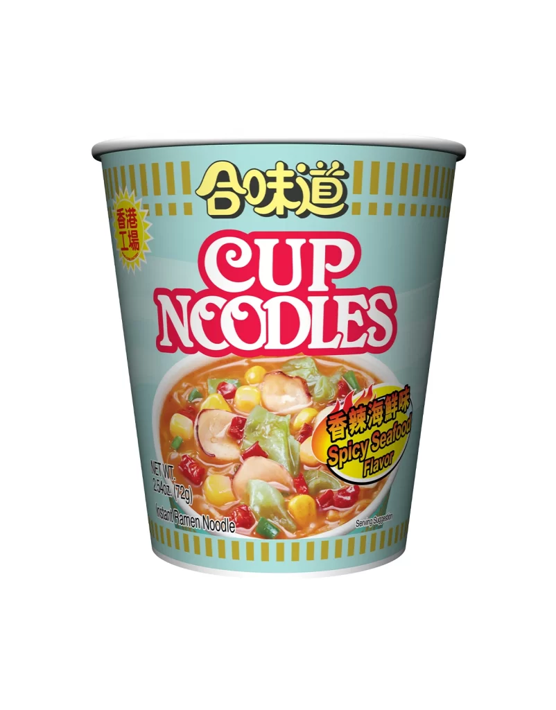
Centered within a seamless white void, a cylindrical instant noodle cup stands upright, captured from a direct, eye-level perspective that emphasizes its symmetrical form. The container's body is wrapped in a pale cyan sleeve decorated with vertical golden-yellow stripes along the upper and lower rims. Dominating the visual field are bold typographic elements: the brand name '合味道' appears in thick yellow characters with a black drop shadow, positioned directly above the iconic 'CUP NOODLES' logotype rendered in red with white outlining.
Visual interest is driven by the specific regional variant indicated by the yellow starburst badge containing the text '香港工場', which identifies this as a product manufactured in Hong Kong. The flavor designation 'Spicy Seafood' is highlighted in an oval graphic featuring fiery red accents, distinguishing it from standard international versions through its localized culinary identity. A photographic window reveals a rich, orange-hued broth filled with visible ingredients like corn, cabbage, and sliced mushrooms, creating an appetizing contrast against the cool-toned packaging background.
Brand historians and packaging analysts might utilize this view to study Nissin's regional adaptation strategies across Asian markets. Industrial designers could examine the structural proportions of the cup's curvature and rim thickness for comparative studies in food container engineering. Marketing teams reviewing this reference would likely focus on the hierarchy between English and Chinese typography to understand bilingual labeling conventions for export products.