Vaseline Body Lotion Bottle Lineup
Topics
Details
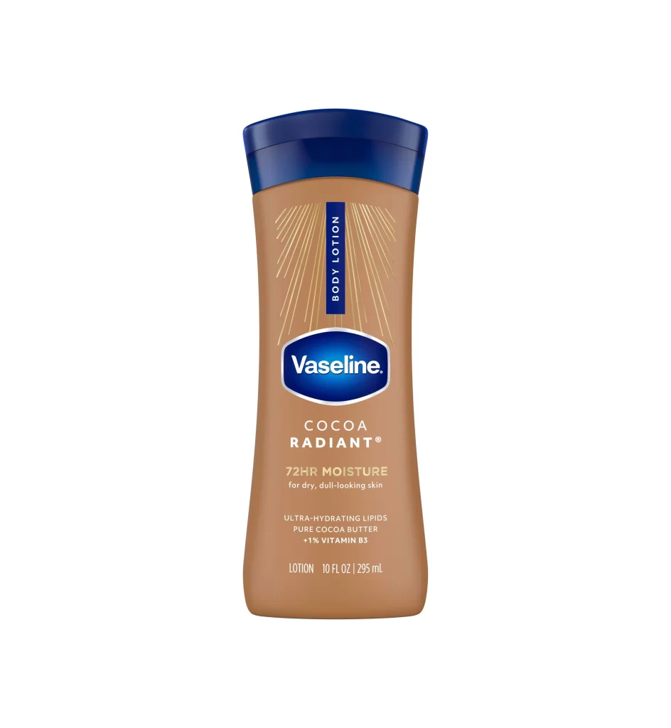
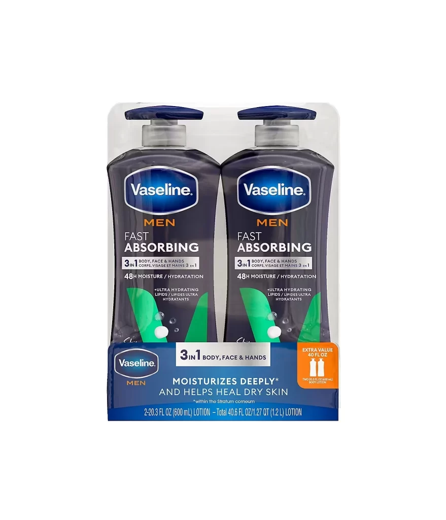
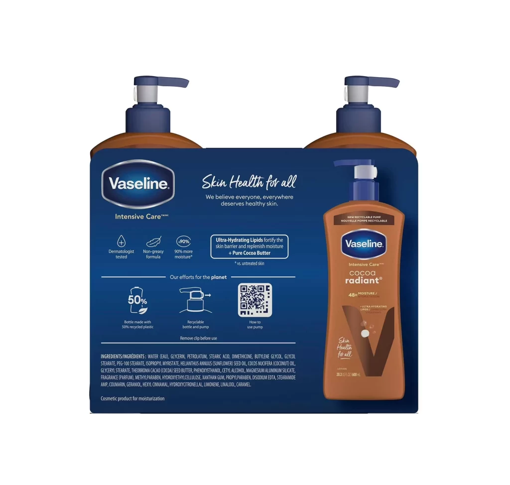
Centered in the frame, a dual-pack of Vaseline Intensive Care Cocoa Radiant lotion sits against a deep navy blue cardboard backing. The composition features two brown plastic bottles with pump dispensers flanking a larger front-facing bottle that displays the full product label. White text on the backing highlights claims like 'Skin Health for all' and '90% more moisture,' while small icons indicate sustainability features such as 50% recycled plastic content.
Visual interest stems from the contrast between the warm cocoa-toned bottles and the cool dark blue of the carrier card. The layout effectively balances technical information—including ingredient lists and QR codes—with lifestyle branding elements like the 'Cocoa Radiant' typography. Notable is the integration of eco-conscious messaging directly alongside dermatological claims, creating a cohesive narrative about both skin health and environmental responsibility.
Product photographers might study this arrangement to understand how to showcase multi-pack configurations without cluttering the visual field. Packaging designers could examine the hierarchy of information, noting how the brand logo anchors the eye while secondary details remain legible but subordinate. Marketing teams reviewing this reference would find it useful for analyzing how color psychology—specifically the use of brown to suggest natural ingredients—reinforces the product's positioning in the skincare market.