Vaseline Aloe Moisturizing Jelly Jar
Topics
Details
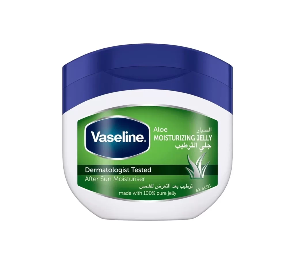
Centered within a seamless white void, the container presents a distinct tripartite structure: a deep navy blue lid with a subtle recessed indentation, a curved white body, and a prominent green label. The Vaseline logo occupies a dark blue oval on the left side of the label, while the right displays 'Aloe MOISTURIZING JELLY' in white sans-serif typeface above Arabic script. A dark horizontal band bisects the green field, bearing the claim 'Dermatologist Tested' and 'After Sun Moisturiser' in contrasting white text, accompanied by a stylized silver aloe leaf graphic near the bottom right corner.
Visual hierarchy is established through the strategic layering of color fields, where the saturated green label creates a focal point against the clinical white plastic and authoritative blue cap. The bilingual typography integrates English and Arabic text without disrupting the horizontal flow, while the metallic sheen of the aloe illustration adds a tactile quality to the otherwise flat graphic design. Such deliberate color coding—green for natural ingredients, blue for trust, white for purity—communicates product benefits instantaneously to diverse consumer markets.
Packaging designers analyzing cosmetic branding conventions would examine this specimen to understand how multinational corporations balance global identity with regional localization requirements. Marketing teams developing after-sun care products might reference the specific typographic weight and placement of dermatological claims to ensure regulatory compliance while maintaining aesthetic appeal. Industrial designers could study the ergonomic curvature of the jar's profile and the functional geometry of the lid's grip surface for similar personal-care container applications.