Vaseline Hand Cream Tube
Topics
Details
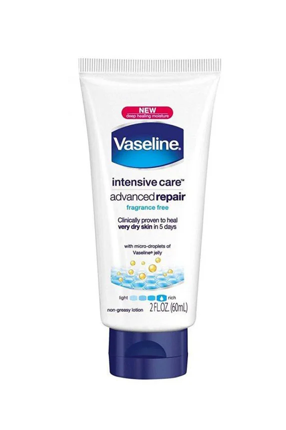
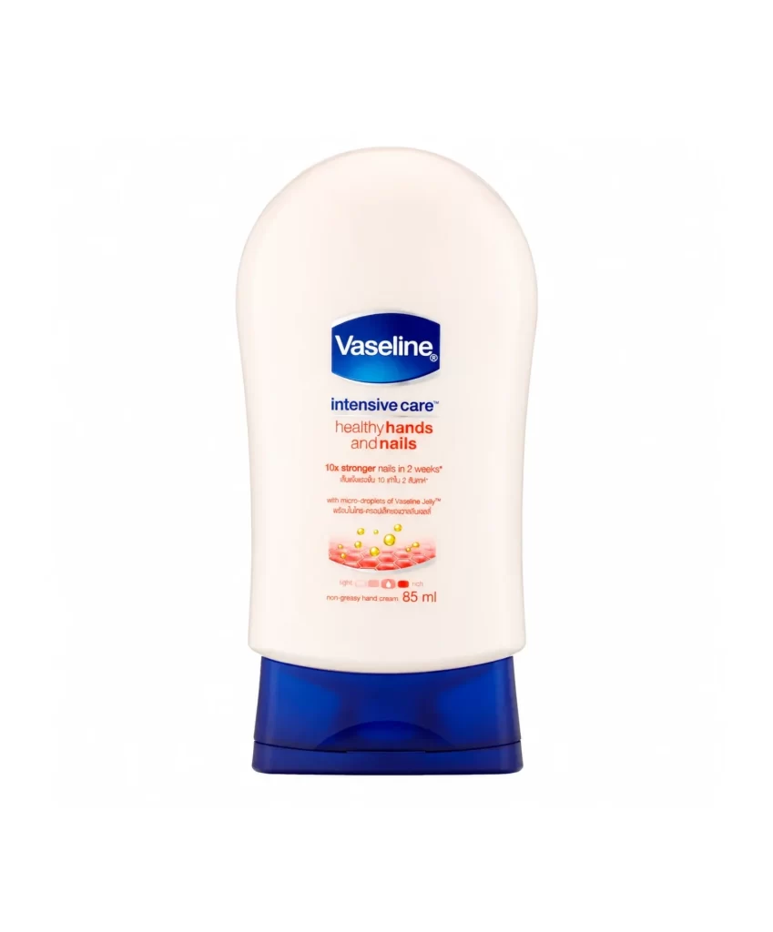
Centered within a seamless white void, the Vaseline hand cream tube presents a soft, ergonomic silhouette that widens at the shoulders before tapering toward a sturdy cobalt blue base. The main body features a matte, pale pink finish, providing a clean canvas for the branding elements stacked vertically in the center. A deep blue oval containing the white 'Vaseline' wordmark anchors the composition, followed by 'intensive care' in navy and 'healthy hands and nails' in a contrasting terracotta hue, with smaller Thai text and an 85ml volume indicator completing the typographic hierarchy.
Visual interest arises from the sophisticated interplay between the cool blue accents and the warm coral typography, creating a balanced yet dynamic color palette that feels both clinical and nurturing. The inclusion of a small graphic depicting golden micro-droplets over a honeycomb texture effectively communicates the product's moisturizing technology without cluttering the minimalist layout. Furthermore, the subtle gradient on the cap and the specific curvature of the bottle offer excellent case study material for understanding how soft geometry can imply tactile comfort in personal care packaging.
Product photographers might utilize this shot to analyze standard e-commerce lighting setups, noting how the even illumination eliminates harsh shadows while maintaining the integrity of the tube's matte texture. Packaging designers could reference the specific font weights and spacing used here to understand how to organize complex multilingual information within a confined vertical space. Additionally, 3D artists modeling cosmetic containers will find the distinct transition between the opaque body and the translucent blue cap particularly useful for studying material properties and light refraction.