Vaseline Body Lotion Bottle Studio Shot
Topics
Details
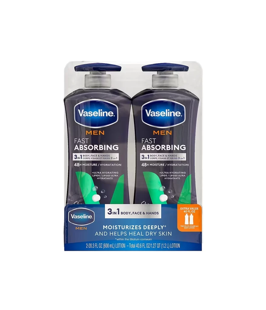
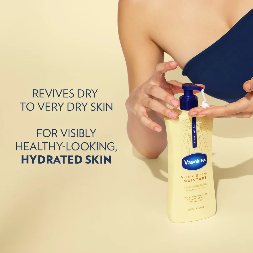
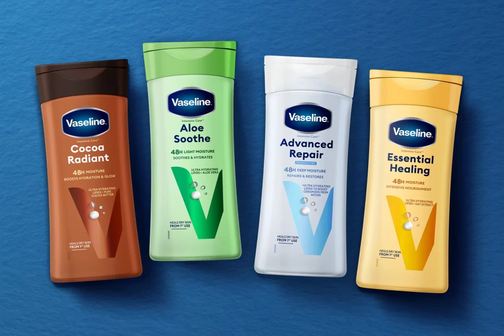
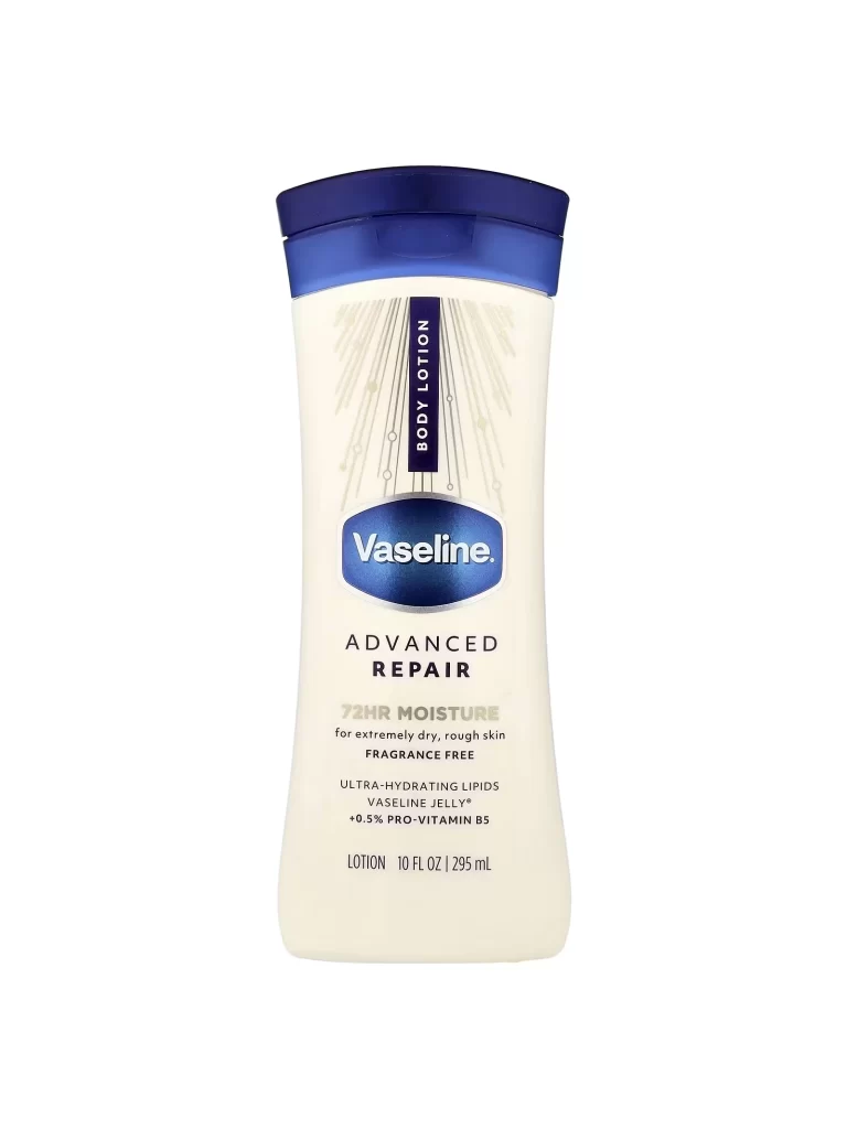
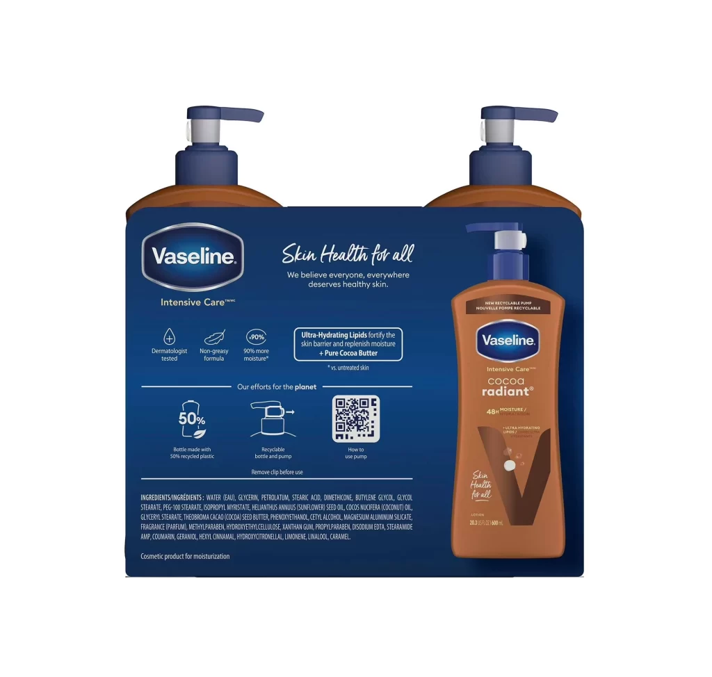
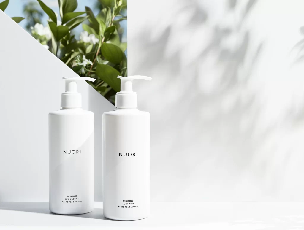
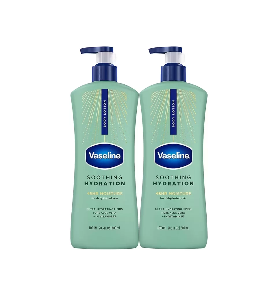
Centered within a void of pure white, two identical bottles of Vaseline Soothing Hydration body lotion stand in parallel formation. Each container features a soft sage-green plastic body that tapers gently toward the base, crowned by a navy-blue pump mechanism with a translucent dispensing nozzle. The composition presents a symmetrical arrangement where the iconic Vaseline oval logo sits prominently above bold black typography announcing 'SOOTHING HYDRATION' and '48HR MOISTURE' for dehydrated skin, while delicate golden radial lines emanate from behind the central branding elements.
Visual distinction emerges from the harmonious interplay between the muted botanical green hue and the crisp white background, creating a clinical yet approachable aesthetic typical of pharmaceutical-grade skincare packaging. The vertical dark blue strip bearing the words 'BODY LOTION' provides a strong architectural element that breaks up the otherwise smooth surface, while the subtle gold accents suggest premium positioning without overwhelming the minimalist design language. Such careful color coordination and typographic hierarchy demonstrate how mass-market products can achieve visual sophistication through restrained graphic elements.
Product photographers and e-commerce specialists might study this arrangement to understand optimal lighting techniques for capturing pump-dispenser mechanisms without harsh reflections. Packaging designers could analyze the spatial relationships between logo placement and descriptive text to inform their own label layouts for personal care items. Marketing teams developing visual assets for retail displays would find value in examining how dual-product presentations create perceived value while maintaining brand consistency across multiple units.