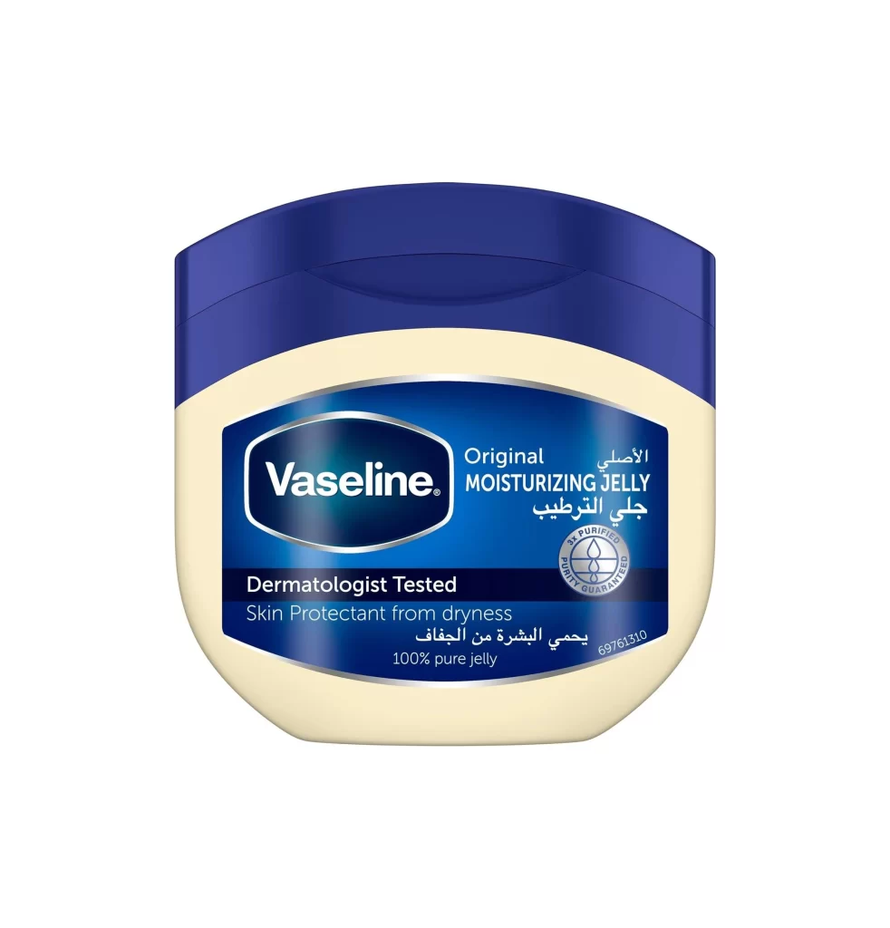
Vaseline Moisturizing Jelly Jar
Topics
Details
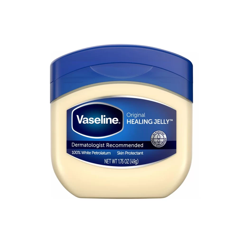
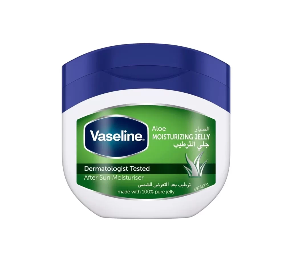
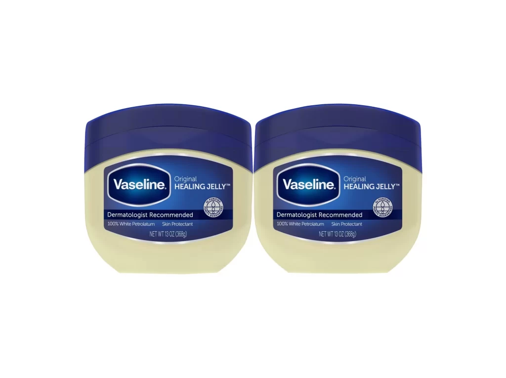
Centered within a seamless white void, the iconic Vaseline jar presents a study in classic cosmetic packaging geometry. A deep navy blue lid crowns a pale cream-colored body, creating a bold two-tone silhouette that immediately signals brand recognition. The front label features a rich blue gradient background, upon which the white Vaseline logotype sits inside its signature oval frame, flanked by bilingual text declaring 'Original Moisturizing Jelly' in both English and Arabic script. Additional details include a circular purity seal, dermatologist testing claims, and product codes rendered in crisp white typography against the darker field.
What distinguishes this particular presentation is its meticulous attention to color hierarchy and international localization. The contrast between the cool blue upper portion and the warm ivory lower half creates visual weight that draws the eye directly to the central branding area. Arabic typography integrated alongside English text indicates this version targets Middle Eastern markets, offering valuable insight into how global brands adapt their visual identity for regional audiences while maintaining core design elements like the distinctive oval logo container and the trusted blue palette.
Product photographers studying commercial cosmetics packaging will find this composition useful for understanding standard e-commerce lighting setups and center-framing techniques. Brand designers examining cross-cultural adaptation strategies can analyze how the layout accommodates multiple languages without sacrificing readability or aesthetic balance. 3D artists building texture libraries for personal care products might reference the specific material finishes shown here, from the glossy plastic sheen of the cap to the matte opacity of the jar body.