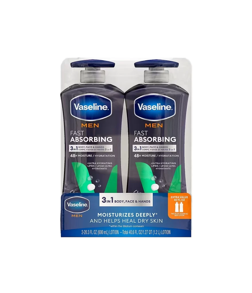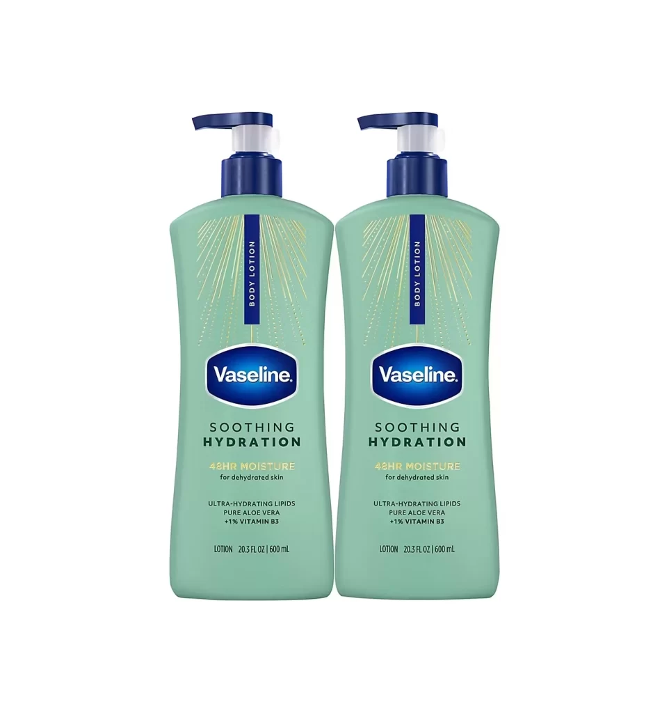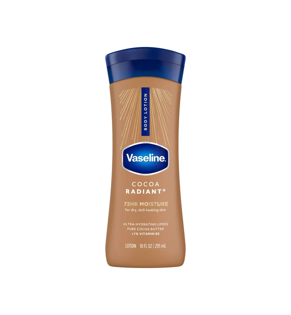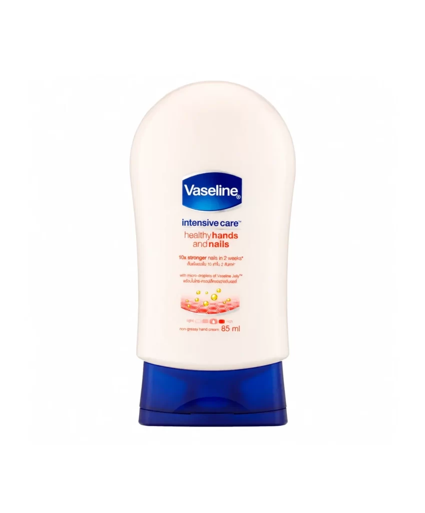
Vaseline Lotion Tube
Topics
Details
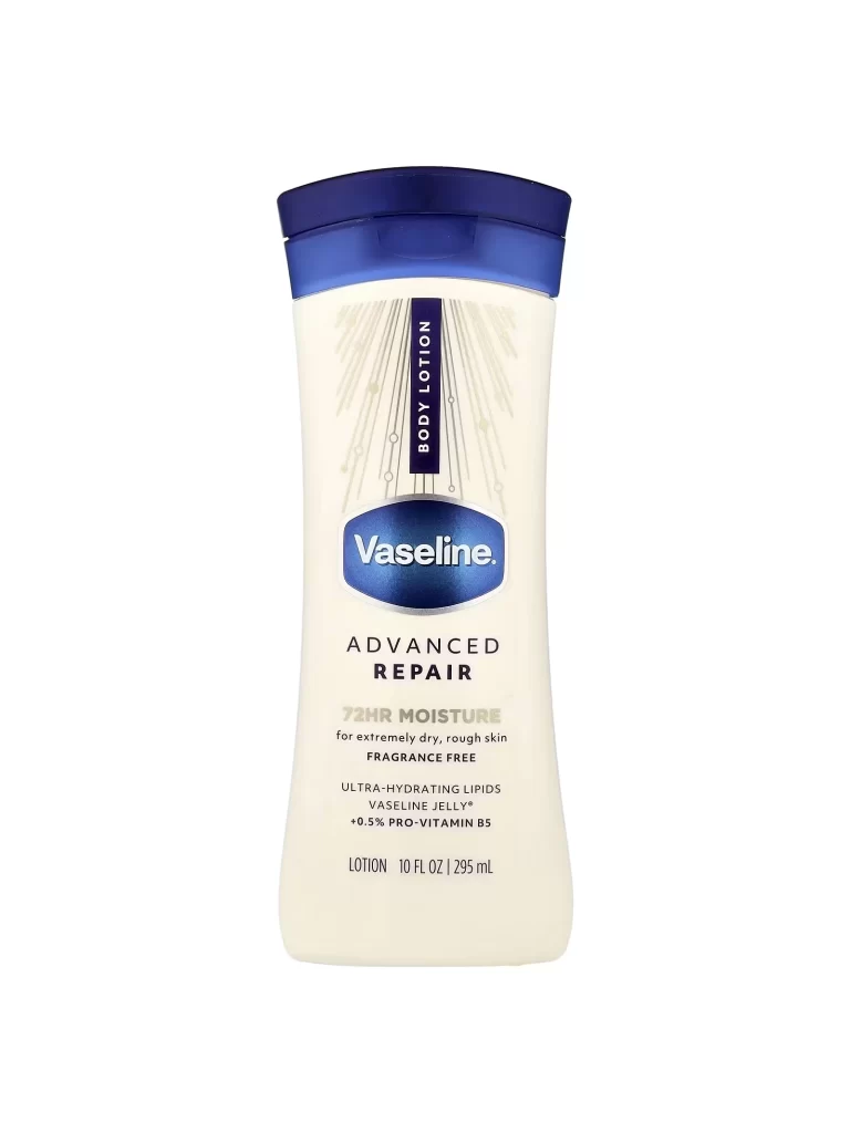
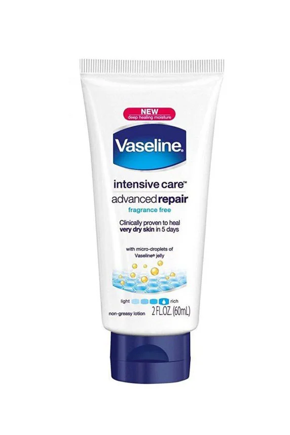
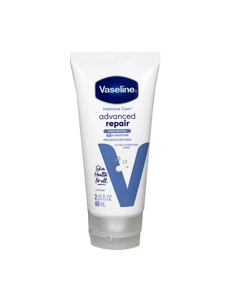
Centered within a seamless white void, a 60 mL tube of Vaseline Intensive Care Advanced Repair lotion stands upright, facing the viewer directly. The container features a white flexible body capped with translucent grey plastic at the base, while the upper portion displays a dark blue oval logo containing white serif lettering. Below this branding, black sans-serif text announces the product line and variant, accompanied by smaller blue claims regarding 48-hour moisture and unscented formulation. A large, solid blue 'V' graphic dominates the lower right quadrant, partially obscuring handwritten-style script that reads 'Skin Health for all', with three small droplet illustrations floating near its left edge.
Visual interest arises from the deliberate contrast between rigid corporate typography and organic handwritten elements, creating a layered informational hierarchy on a curved surface. The oversized blue 'V' acts as both a brand identifier and a structural design anchor, drawing the eye downward toward volume measurements and product specifications printed in dual units. Subtle shadows beneath the grey cap suggest physical weight and three-dimensionality, while the complete absence of background texture forces absolute focus onto typographic details and color blocking.
Packaging designers studying pharmaceutical or personal care aesthetics will find value in analyzing how limited color palettes establish brand recognition across different product lines. Marketing teams developing copy for skincare ranges can reference the specific placement of benefit claims versus legal disclaimers to optimize consumer readability. 3D artists modeling cosmetic containers might utilize this view to understand how light interacts with semi-opaque plastic materials and how condensation droplets should render against saturated backgrounds.