Vaseline Body Lotion Bottle View
Topics
Details
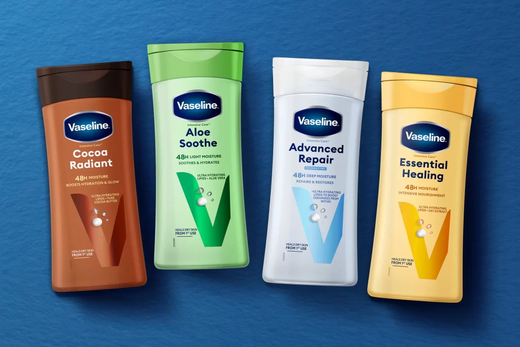
Against a textured blue backdrop, four Vaseline Intensive Care bottles stand in a neat horizontal row, captured from a slightly elevated frontal perspective. The collection features distinct colorways: a warm brown Cocoa Radiant with a dark cap, a vibrant green Aloe Soothe, a crisp white Advanced Repair, and a sunny yellow Essential Healing. Each container displays the signature blue Vaseline oval logo above bold product names, accompanied by claims like '48H Moisture' and 'Heals Dry Skin From 1st Use', while large translucent 'V' graphics with water droplet accents dominate the lower labels.
Visual differentiation across the line relies heavily on the strategic use of saturated background colors that immediately signal ingredient benefits to consumers. The consistent typographic hierarchy and the recurring water-drop motif create brand unity, while the unique cap colors—ranging from deep brown to bright green—provide additional tactile cues for shelf identification. Such systematic variation allows for instant product recognition even when the text is not fully legible from a distance.
Product photographers might study this arrangement to understand how to effectively group multiple SKUs within a single frame without visual clutter. Packaging designers could analyze the balance between the prominent logo placement and the descriptive copy to inform their own label layouts. Marketing teams reviewing this reference would likely focus on how the lighting highlights the matte finish of the plastic while maintaining color accuracy across different hues.