Only Natural Pet Cat Food Bag
Topics
Details
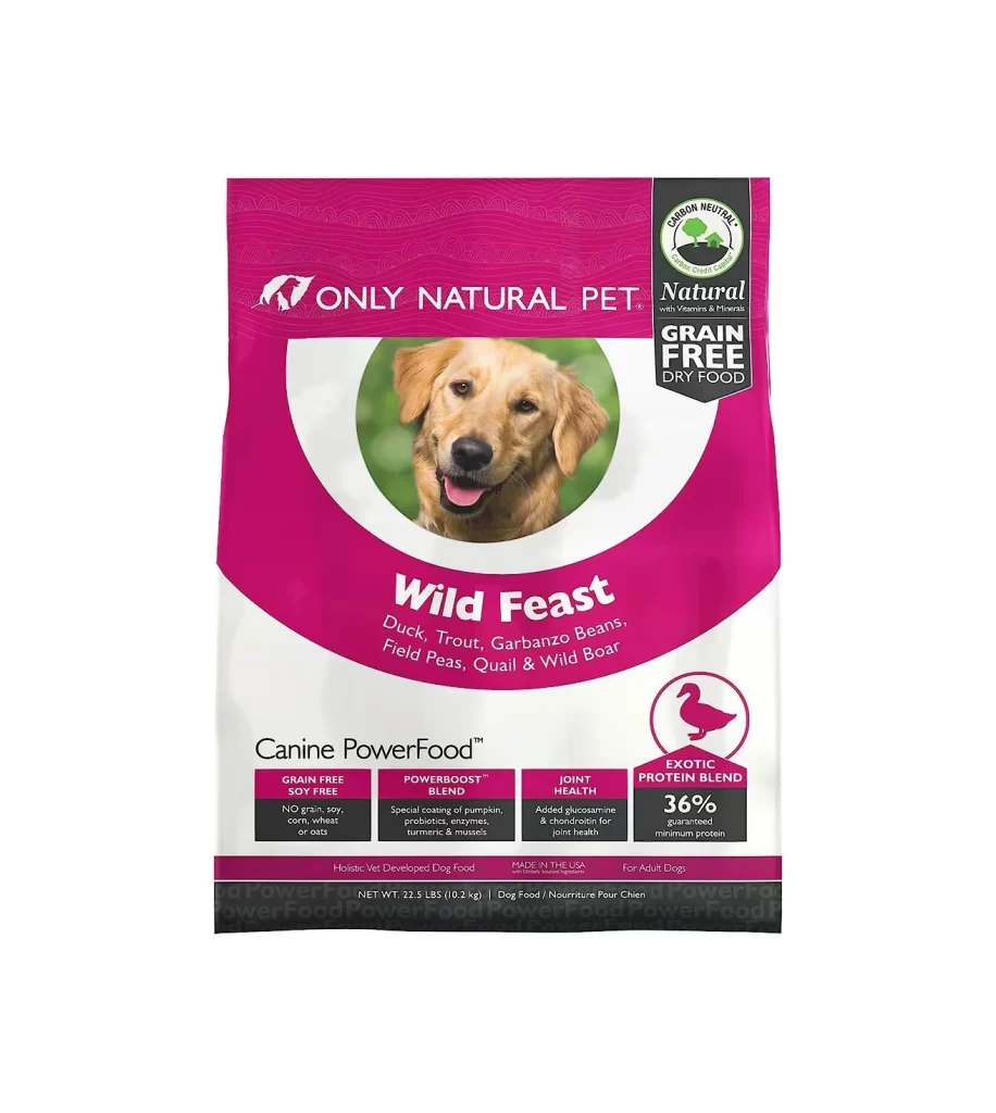
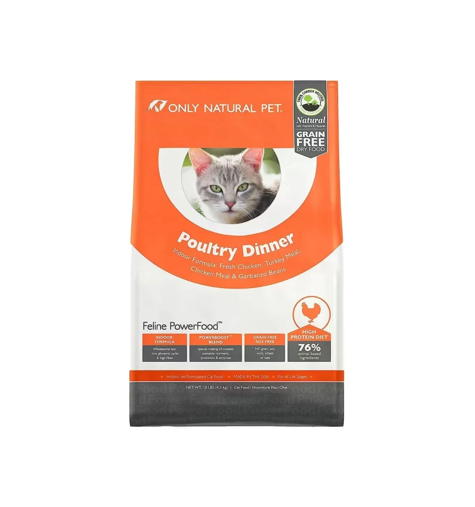
Dominating the upper half of the package is a bold orange field that transitions into a clean white lower section, creating a distinct two-tone vertical composition. Centered within the orange area, a circular frame contains a close-up photograph of a grey tabby cat with striking green eyes, looking directly at the viewer. The typography features the brand name 'ONLY NATURAL PET' in white sans-serif capitals at the top, while the product name 'Poultry Dinner' appears in large white script below the feline portrait.
Visual hierarchy is established through the strategic use of color blocking and iconography, particularly the dark charcoal badge in the upper right corner denoting the grain-free status. Four rectangular information boxes line the bottom white section, utilizing a grid layout to organize technical details such as the 'POWERBOOST BLEND' and '76% animal based ingredients' claim. An orange chicken silhouette inside a circle serves as a quick visual signifier for the protein source, reinforcing the product's dietary focus without cluttering the primary messaging.
Packaging designers studying pet food branding would find this composition useful for analyzing how to balance photographic elements with dense nutritional information. Marketing teams could utilize this visual structure as a benchmark for positioning premium attributes like 'Holistic Vet Formulated' within a constrained retail footprint. Additionally, color theorists might reference the specific orange-to-white gradient to understand how warm tones are employed to evoke appetite and energy in animal nutrition products.